AI Readiness Arcade

Frank Rudzicz

What is this?

This is a readiness arcade to prepare you to study AI & machine learning (ML).

This is not a course on ML, nor do we go into depth. Rather, this is a refresher on these topics, so you can be more ready:

  1. Linear algebra: vectors, matrices, shape, dot products, and distances;
  2. Calculus: derivatives as local change;
  3. Probability/statistics: base rates, conditionals, sampling, distributions;
  4. Python/data science: tables, NumPy, masks, broadcasting, and vectorization;
  5. Evidence: baselines, validation, leakage checks, plots, and responsible claims.

Examples of topics you will learn elsewhere:

  • fitting regression by gradient descent;
  • learning-rate tuning;
  • SGD / mini-batch SGD;
  • logistic-loss gradients;
  • backpropagation;
  • neural-network training.

Your path

These slides are a map of topics.
The notebook is a gym to practice them.

For each arcade (in the 🔗 classic sense):

  1. 🤔 predict the math or output before running code;
  2. 🧩 complete the notebook cells;
  3. 🏃 run the check cell;
  4. 🛠️ repair failures immediately;
  5. ✍️ write \(\geq\) one sentence explaining what changed in your thinking.

Making mistakes will be important to your journey, if you notice and investigate them.

Start screen diagnostic

Before Arcade 1, open the notebook and complete the Start Screen Diagnostic.

You won’t be graded. This is a map of:

  • shape and matrix multiplication;
  • standardization and leakage;
  • derivatives and gradients;
  • conditional probability and base rates;
  • validation, baselines, and evidence.

Use the score to identify what needs focus.

How to use the diagnostic

After you run the diagnostic cell:

Score Suggested route
0–3 Watch all videos carefully and do every notebook check.
4–7 Watch all videos, but spend extra time repairing failed checks.
8–10 Move faster, then use the Final Boss as your main readiness test.

Rules vs learning

A traditional program follows rules that a human wrote down.

An ML system learns a rule-like pattern from examples.

Traditional program Machine learning
Humans write rules Humans supply examples
Program follows those rules Model learns a pattern
Good when rules are clear Useful when rules are complex or unknown
Output is computed directly Output is predicted, scored, or ranked

Rules vs learning

Gate-machine example

  • Rule-based: “If the bronze casing is hot and the pressure needle trembles, mark the gate as unsafe.”
  • ML-based: “Here are 2112 gate-machine records: temperature, pressure, vibration, age, and whether the gate later failed. Learn a pattern.”

The archive mostly contains calm summer readings from well-maintained inner gates. What might go wrong when we use the model on weathered outer gates in winter?

A stereotypical shape

Many supervised ML problems can usually be described with one table.

student hours studied sleep practice score passed?
A 3 7 61 no
B 8 8 86 yes
C 5 5 72 yes
Rows      = examples / cases / observations
Columns   = features / variables / measurements
X         = feature matrix (e.g., hours studied, sleep, practice score)
y         = target / label / outcome
model     = function that maps X to predictions
ŷ         = prediction (e.g., passed?)
error     = difference between prediction and target, measured by a metric or 'loss'

Which column would you never include in X if it was created after the final grade was known?

How to make decisions in a noisy world

We can organize our thoughts systematically.

---
config:
  theme: 'neutral'
  look: 'handDrawn'
---
flowchart LR
  W["<b>Noisy world</b>"] --> D["<b>Data</b><br>recorded values"]
  D --> I["<b>Information</b><br>organized patterns"]
  I --> E["<b>Evidence</b><br>claim + comparison +<br>uncertainty"]
  E --> A["<b>Action</b><br>a decision someone<br> can inspect"]

A number by itself is rarely evidence.

Data Information Evidence
10,000 clicks Click rate rose from 3% to 4% The new UI beat a baseline on held-out users
Model accuracy is 94% It beats the 90% majority baseline It also improves recall for the rare class without leakage
Average score is 78 Scores rose after tutoring The comparison uses a fair reference group and uncertainty check

Which is stronger evidence: “the model got 98% accuracy” or “the model beat a baseline on held-out data without leakage”? Why?

How to make decisions in a noisy world

These tools help in organizing your thoughts:

  • Linear algebra holds and manipulates data.
  • Calculus describes local change. It is a major engine in ML.
  • Probability/statistics measures uncertainty and variation.
  • NumPy does (some of) the computation work.
  • Plots/evidence help us interpret our claims.

The three doors of readiness

Door I

Concept
What does the symbol or picture mean?

Door II

Calculation
What should happen before a machine computes it?

Door III

Code
Can Python reproduce, test, and visualize it?

Like any scientific discipline, we are not studying magic.

ML is understandable, predictable, and falsifiable.

Free reference compass

There are many free resources for you.

Need Start here Then deepen with
Visual intuition 🔗3Blue1Brown lessons 🔗MIT OpenCourseWare math
Linear algebra 🔗Essence of Linear Algebra 🔗MIT 18.06SC Linear Algebra
Calculus 🔗Essence of Calculus 🔗MIT 18.01SC Single Variable Calculus
Probability/statistics 🔗Seeing Theory 🔗OpenIntro Statistics
Python/arrays/tables 🔗NumPy absolute basics 🔗Python Data Science Handbook
Evaluation and leakage 🔗scikit-learn common pitfalls 🔗scikit-learn model evaluation

🏛️ I also highly recommend my introductory class on 🔗Data Science, which goes into much more depth on important topics. 🏛️

Don’t get stuck on the intuition phase. Your intuition will increase with exercises and coding.

How to use this arcade

Do not worry about being fast 🏃. Finishing without learning is a waste of time.

Before you learn ML, you ought to be able to say these sentences, truthfully:

  • “I can manipulate matrices, weights, shapes, and predictions.”
  • “I know how a derivative is local change.”
  • “I know why P(A | B) is not the same as P(B | A).”
  • “I know why one score or one plot is not automatically evidence.”
  • “I know why prediction is not causation.”

Remember: this is not a replacement for your course pre-requisites.

Ancora imparo!

Let’s dive in!

Arcade 1: Vectors, Matrices, Dot Products

Outcome

By the end of Arcade 1, you can:

  • identify scalars, vectors, matrices, and tensors
  • read rows as examples and columns as features
  • predict shapes for X, w, Xw, and X.T @ X
  • explain dot products as scores, similarity, or weighted sums
  • notice when scaling changes distances or model behaviour

Tell me, where are data bred;
In the world, or in the head?

As a Scientist, you will study data from the real world that comes to you measured by imperfect tools and passed by imperfect hands.

---
config:
  theme: 'neutral'
  look: 'handDrawn'
---
flowchart LR
  World["<b>World / system</b><br>people, sensors, choices"]
  Measure["<b>Measurement process</b><br>logs, surveys, devices"]
  Table["<b>Table</b><br>rows and columns"]
  Matrix["<b>Feature matrix X</b><br>numbers we can compute with"]

  World --> Measure --> Table --> Matrix

A vector of data only makes sense after we know:

  • what each entry measures;
  • whether arithmetic on that entry is meaningful;
  • whether the value came from a reliable measurement process;
  • whether the values have been manipulated in some way, even with good intentions.

A row of numbers is not automatically a good feature vector.

What arithmetic is allowed?

Before a measure becomes part of a vector, ask what kind of variable it is.

Variable kind Example Safe operations Danger
Quantitative heart rate, steps, age differences, averages, distances units can dominate
Binary has symptom: yes/no counts, proportions, masks coding choice matters
Nominal category province, colour, diagnosis code equality, counts, one-hot encoding fake numeric order
Ordinal category low / medium / high order comparisons fake distances

If we code low = 0, medium = 1, high = 2, what distance claim have we smuggled in?

Vector = one measurement bundle

A vector is an ordered list of measurements. Its arithmetic only makes sense if each entry has a meaning.

Code
v = np.array([3, 2])
fig, ax = plt.subplots(figsize=(5, 5))
ax.set_aspect("equal", adjustable="box")
ax.set_xlim(-1, 5)
ax.set_ylim(-1, 5)
ax.axhline(0)
ax.axvline(0)
ax.arrow(0, 0, v[0], v[1], length_includes_head=True, head_width=0.2)
ax.scatter([v[0]], [v[1]])
ax.text(v[0] + 0.1, v[1] + 0.1, r"$\mathbf{v}=[3,2]$", fontsize=12)
ax.set_xlabel("feature 1")
ax.set_ylabel("feature 2")
plt.show()
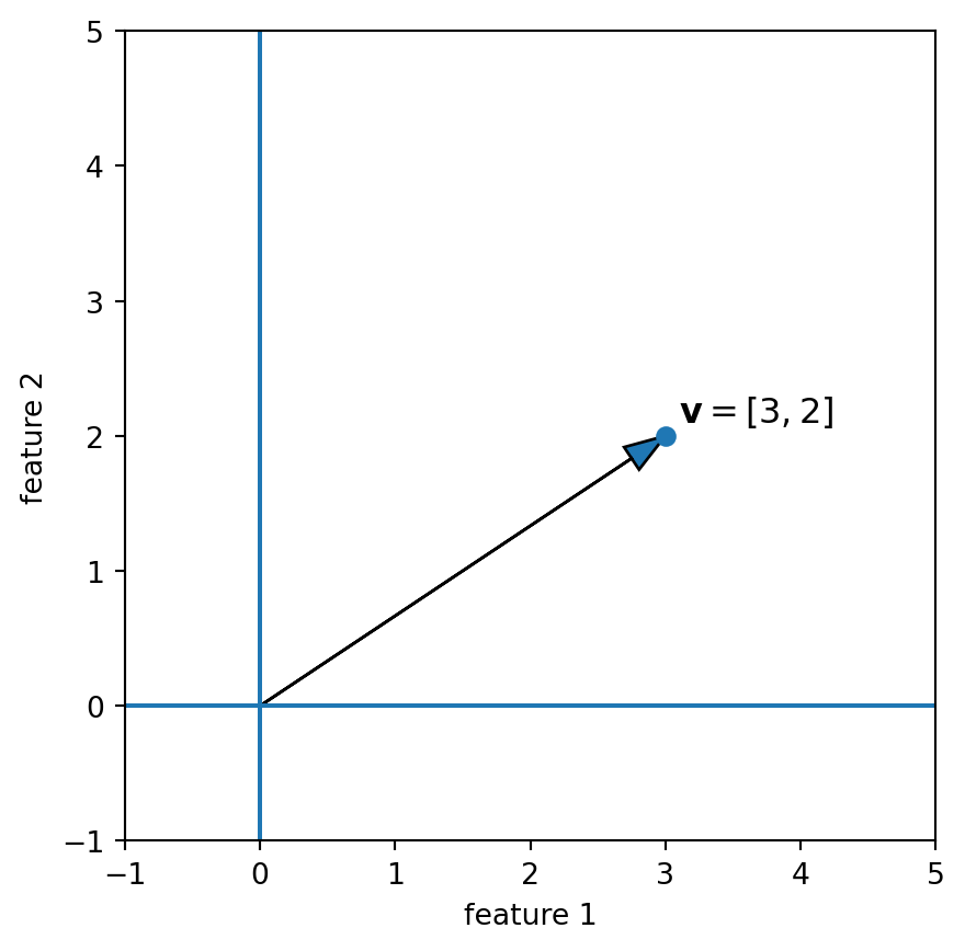
Two-dimensional vector drawn as an arrow from the origin, showing direction and length.

Vector differences

If two vectors use the same entries in the same order, we can perform arithmetic. E.g., the difference vector tells us how one measurement bundle must move to become the other.

Code
x = np.array([3, 2])
z = np.array([1, 4])
d = x - z

fig, ax = plt.subplots(figsize=(5, 5))
ax.set_aspect("equal", adjustable="box")
ax.set_xlim(-1, 5)
ax.set_ylim(-1, 5)
ax.axhline(0)
ax.axvline(0)

# x and z as arrows from the origin
ax.arrow(0, 0, x[0], x[1], length_includes_head=True, head_width=0.2)
ax.arrow(0, 0, z[0], z[1], length_includes_head=True, head_width=0.2, linestyle="--")

# x - z as the arrow from z to x
ax.arrow(z[0], z[1], d[0], d[1], length_includes_head=True, head_width=0.2)

ax.scatter([x[0], z[0]], [x[1], z[1]])

ax.text(x[0] + 0.1, x[1] + 0.1, r"$\mathbf{x}=[3,2]$", fontsize=12)
ax.text(z[0] + 0.1, z[1] + 0.1, r"$\mathbf{z}=[1,4]$", fontsize=12)
ax.text(2.0, 3.2, r"$\mathbf{x}-\mathbf{z}=[2,-2]$", fontsize=12)

ax.set_xlabel("feature 1")
ax.set_ylabel("feature 2")
plt.show()
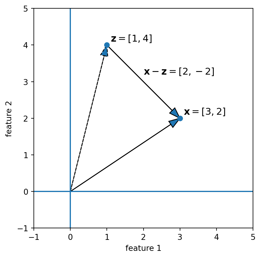
Two vectors and their difference vector, illustrating displacement from one point to another.

If feature 1 is “temperature” and feature 2 is “pressure,” what does
\(\mathbf{x}-\mathbf{z}=[2,-2]\) mean in words?

Matrix = many measurement bundles

Rows are examples. Columns are features.

Code
X_demo = np.array([
    [2, 0, 1, 3],
    [1, 2, 0, 1],
    [0, 1, 3, 2],
])
fig, ax = plt.subplots(figsize=(6, 2.8))
im = ax.imshow(X_demo, aspect="auto", cmap="Blues", vmin=0, vmax=3)
#im = ax.imshow(X_demo, aspect="auto")
for i in range(X_demo.shape[0]):
    for j in range(X_demo.shape[1]):
        ax.text(j, i, str(X_demo[i, j]), ha="center", va="center")
ax.set_title("Matrix = many vectors together")
ax.set_xlabel("columns = features")
ax.set_ylabel("rows = observations")
ax.set_xticks(range(X_demo.shape[1]))
ax.set_yticks(range(X_demo.shape[0]))
plt.colorbar(im, ax=ax, fraction=0.03, pad=0.04)
plt.show()
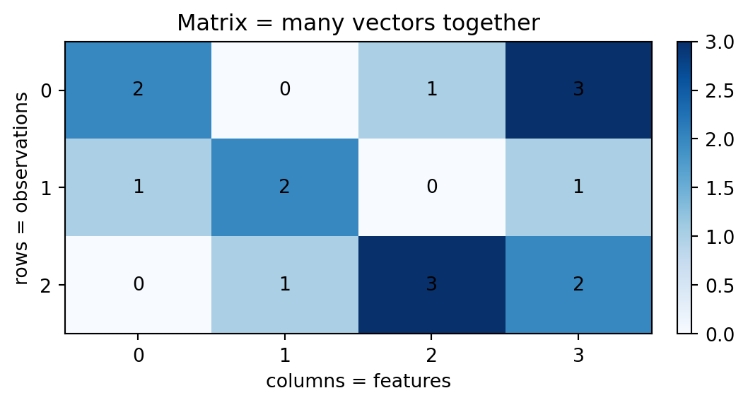
Small matrix visualized as rows of examples and columns of features.

Rows are examples, columns are features

Convention for this arcade (and generally):

X.shape = (n_examples, n_features)

Example:

X.shape = (1000, 5)

means:

1000 examples
5 features per example

Norms: length before agreement

A norm measures how large a vector is.

For

\[ x=[x_1,x_2,\ldots,x_d], \]

the Euclidean norm is

\[ \lVert x\rVert_2=\sqrt{x_1^2+x_2^2+\cdots+x_d^2}. \]

Norms: length before agreement

\[ \lVert x\rVert_2=\sqrt{x_1^2+x_2^2+\cdots+x_d^2}. \]

Why norms matter in ML:

  • distance is the norm of a difference: \(d(x,z)=\lVert x-z\rVert_2\);
  • cosine similarity divides by vector lengths;
  • projections use dot products and lengths;
  • nearest-neighbour methods are built out of distances.

Imagine a feature vector where one feature (salary) is in $CAD and another is in GPA. Might the scales themselves affect the norm? How?

Dot product: coordinate rule

For two vectors of the same length,

\[ x \cdot w = \sum_{j=1}^{d} x_j w_j. \]

An example:

A bronze gate is described by three readings.
The weight vector says how much each reading contributes to the inspection score.

Code
feature_names = ["heat", "vibration", "seal_wear"]

x = np.array([3.0, 2.0, 5.0])
w = np.array([0.7, 1.8, 0.4])

weighted_terms = x * w
score = x @ w

for name, reading, weight, term in zip(feature_names, x, w, weighted_terms):
    print(f"{name:>12}: {reading:4.1f} × {weight:3.1f} = {term:4.1f}")

print("dot product:", float(score))
        heat:  3.0 × 0.7 =  2.1
   vibration:  2.0 × 1.8 =  3.6
   seal_wear:  5.0 × 0.4 =  2.0
dot product: 7.699999999999999

Each term is one reading multiplied by its matching weight.
The dot product adds those terms into one number:

\[ \mathbf{x}\cdot\mathbf{w} = (3.0)(0.7) + (2.0)(1.8) + (5.0)(0.4). \]

Warning

The order matters. If the readings are rearranged, the weights must move with them.

Dimensions first: matrix-vector sanity check

Let \(A\in\mathbb R^{m\times n}\) and let \(v\in\mathbb R^n\) be a column vector.

\[ (m\times n)(n\times 1) \to (m\times 1). \]

So \(Av\) is defined only when the length of \(v\) equals the number of columns of \(A\).

In Python, the @ operator is used for matrix multiplication.

🧩 Shape puzzle

If A.shape == (7, 4) and v.shape == (4,), what is (A @ v).shape? What goes wrong if v.shape == (7,)?

Shape shifter

This is a tiny checker for the most common products in early ML notation.

Code
def matmul_shape(left, right):
    """Predict shape for simple 1D/2D NumPy matmul cases."""
    left = tuple(left)
    right = tuple(right)
    if len(left) == 2 and len(right) == 1:
        m, n = left
        d, = right
        return (m,) if n == d else "not allowed"
    if len(left) == 2 and len(right) == 2:
        m, n = left
        d, p = right
        return (m, p) if n == d else "not allowed"
    if len(left) == 1 and len(right) == 1:
        n, = left
        d, = right
        return () if n == d else "not allowed"
    return "case not covered by this small oracle"

cases = [
    ((8, 3), (3,)),
    ((8, 3), (8,)),
    ((100, 5), (5, 2)),
    ((5,), (5,)),
]

for left, right in cases:
    print(f"{left} @ {right} -> {matmul_shape(left, right)}")
(8, 3) @ (3,) -> (8,)
(8, 3) @ (8,) -> not allowed
(100, 5) @ (5, 2) -> (100, 2)
(5,) @ (5,) -> ()

Change one shape in cases. Can you predict the new result before running it?

Shape debugger mini-game

For each expression, predict whether it is allowed or not and the resulting shape.

X.shape == (8, 3)
w.shape == (3,)
y.shape == (8,)
Expression Allowed? Shape Meaning
X @ w ? ? one weighted score per row
X * w ? ? elementwise feature scaling
X.T @ X ? ? feature-by-feature Gram matrix
X @ X.T ? ? row-by-row Gram matrix
X @ X ? ? usually not allowed here
X.T @ y ? ? one target-weighted sum per feature

Why can X * w run correctly but answer a different question than X @ w?

Matrix-vector multiplication:
row dot products

If \(A=[a_{ij}]\) and \(v=(v_1,\dots,v_n)^\top\), then the \(i\)-th entry of \(Av\) is

\[ (Av)_i=\sum_{j=1}^{n}a_{ij}v_j. \]

Interpretation: each output entry is a dot product:

\[ \text{row }i\text{ of }A \;\cdot\; v. \]

Matrix-vector multiplication:
worked example

\[ A=\begin{bmatrix} 2 & -1 & 0\\ 1 & 3 & 4 \end{bmatrix}, \qquad v=\begin{bmatrix} 5\\-2\\1 \end{bmatrix}. \]

\[ (Av)_1=2(5)+(-1)(-2)+0(1)=12, \]

\[ (Av)_2=1(5)+3(-2)+4(1)=3. \]

\[ Av=\begin{bmatrix}12\\3\end{bmatrix}. \]

Same product, column-combination view

The same matrix has columns

\[ a_1=\begin{bmatrix}2\\1\end{bmatrix},\quad a_2=\begin{bmatrix}-1\\3\end{bmatrix},\quad a_3=\begin{bmatrix}0\\4\end{bmatrix}. \]

Then

\[ Av=5a_1+(-2)a_2+1a_3=\begin{bmatrix}12\\3\end{bmatrix}. \]

Same kind of calculation, different intuition: the entries of \(v\) weight the columns of \(A\).

Learning to view the same problem from multiple ‘angles’ is a core strength for a Scientist!

Matrix-vector multiplication as a transformation

A matrix itself can be read as a linear transformation.

  • \(A\) is a transformation rule.
  • \(v\) is the input location or measurement bundle.
  • \(Av\) is how \(v\) is changed after applying the rule.

Common traps:

  • Order matters: generally \(Av\ne vA\), and \(vA\) may not even be defined.
  • ML/linear algebra usually treats vectors as columns unless stated otherwise.
  • Dimension mismatch is a quick way to detect problems before running Python.

Matrix-matrix multiplication

When both operands are matrices,

\[ (AB)_{ik} = \sum_{j} A_{ij} B_{jk}. \]

For \(A \in \mathbb{R}^{m \times n}\) and \(B \in \mathbb{R}^{n \times p}\), the result is in \(\mathbb{R}^{m \times p}\).
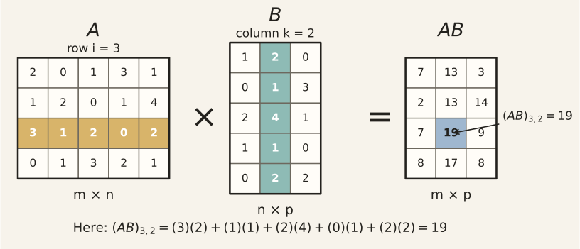
Matrix-matrix multiplication

Two products that appear early in ML math:

\[ X^\top X \in \mathbb{R}^{d \times d}, \qquad X^\top y \in \mathbb{R}^{d}. \]

Code
X_mm = np.array([[1.0, 2.0], [3.0, 4.0], [5.0, 6.0]])
print("X shape:       ", X_mm.shape)
print("X.T @ X shape: ", (X_mm.T @ X_mm).shape)   # (d, d)
print("X.T @ X:\n", X_mm.T @ X_mm)
X shape:        (3, 2)
X.T @ X shape:  (2, 2)
X.T @ X:
 [[35. 44.]
 [44. 56.]]

What is the shape of \(X^\top X\) if X.shape == (100, 5)?

What is the shape of \(X^\top y\) if y.shape == (100,)?

Two Gram matrices: features or rows?

A Gram matrix stores dot products. The orientation decides what gets compared.

If X.shape == (n, d), then:

Expression Shape Entry means
X.T @ X (d, d) feature \(j\) dotted with feature \(k\) across rows
X @ X.T (n, n) row \(i\) dotted with row \(k\) across features

Look for these in the associated notebook.

Code
Z = np.array([
    [1.0, 0.0],
    [0.0, 1.0],
    [1.0, 1.0],
])
print("Z @ Z.T =\n", Z @ Z.T)
print("diagonal = squared row norms:", np.diag(Z @ Z.T))
Z @ Z.T =
 [[1. 0. 1.]
 [0. 1. 1.]
 [1. 1. 2.]]
diagonal = squared row norms: [1. 1. 2.]

Why does the diagonal contain each row dotted with itself?

Try it before Python

\[ A=\begin{bmatrix} 1 & 2\\ -3 & 0\\ 4 & 5 \end{bmatrix}, \qquad v=\begin{bmatrix}3\\-1\end{bmatrix}. \]

Compute \(Av\) by hand first.

Answer on the next slide.

Python check: matrix-vector exercise

Code
A = np.array([[1, 2], [-3, 0], [4, 5]])
v = np.array([[3], [-1]])
print(A @ v)
[[ 1]
 [-9]
 [ 7]]

The output shape is \((3,1)\) because \(A\) has three rows.

Bias/intercept: the starting score

A very common ML scoring pattern is

\[ \text{score} = x\cdot w + b. \]

Read it as:

  • \(x\cdot w\): points contributed by the features;
  • \(w_j\): weight; how much feature \(j\) contributes per unit;
  • \(b\): bias; the starting score before feature contributions.

Game analogy:

\[ \text{power} = 10 + 2(\text{strength}) + 1.5(\text{speed}) - 3(\text{exhaustion}). \]

Here:

b = 10
w = [2, 1.5, -3]
x = [strength, speed, exhaustion]

If exhaustion increases by 1 while everything else stays fixed, what happens to the score?

Bias column: absorbing the intercept

Sometimes we fold the intercept into the matrix by adding a leading column of ones.

\[ Xw+b = X_{\text{bias}}\tilde{w}, \qquad X_{\text{bias}}=[\mathbf{1}\;X], \qquad \tilde{w}=[b,w_1,\ldots,w_d]^\top. \]

Code
X_small = np.array([[2.0, 3.0],
                    [4.0, 5.0]])
w = np.array([10.0, -1.0])
b = 7.0

X_bias = np.c_[np.ones(X_small.shape[0]), X_small]
w_tilde = np.r_[b, w]

print("separate b: ", X_small @ w + b)
print("bias column:", X_bias @ w_tilde)
print("X_bias =\n", X_bias)
separate b:  [24. 42.]
bias column: [24. 42.]
X_bias =
 [[1. 2. 3.]
 [1. 4. 5.]]

Notebook A7 asks you to build this column of ones.

Why must the ones column be added to every row, not just once?

Dot product as an explainable score

Consider that we can decompose the final score in terms of its components. That can help us explain why a particular outcome occurred.
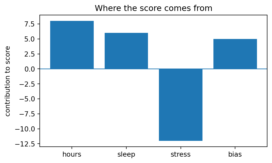
Bar chart showing how feature contributions add to a dot-product score.

contributions: {'hours': 8.0, 'sleep': 6.0, 'stress': -12.0, 'bias': 5.0}
score = 7.0

Which feature helped most? Which feature hurt? Why does the bias count as a contribution?

Encoding trap:
categories are not coordinates

A dot product and a distance both assume the coordinates mean something numerically.

So we know our feature vectors need to be numbers. Suppose we write:

\[ \text{small}=0,\qquad \text{medium}=1,\qquad \text{large}=2. \]

That implicitly claims:

  • medium is exactly halfway between small and large;
  • large is exactly two units away from small;
  • distances like \(|2-0|\) are meaningful.

Sometimes that is defensible, but often it is not.

How can we solve this?

One-hot encoding: categories become axes

For unordered categories, use separate yes/no columns instead of a fake number line.

employment status emp_student emp_part_time emp_full_time
student 1 0 0
part-time 0 1 0
full-time 0 0 1
Code
points = np.eye(3)
labels = ["student", "part-time", "full-time"]

if go is not None:
    axis_len = 1.1
    traces = [
        go.Scatter3d(x=[0, axis_len], y=[0, 0], z=[0, 0], mode="lines", showlegend=False),
        go.Scatter3d(x=[0, 0], y=[0, axis_len], z=[0, 0], mode="lines", showlegend=False),
        go.Scatter3d(x=[0, 0], y=[0, 0], z=[0, axis_len], mode="lines", showlegend=False),
        go.Scatter3d(
            x=points[:, 0], y=points[:, 1], z=points[:, 2],
            mode="markers+text", text=labels, textposition="top center",
            marker=dict(size=6), showlegend=False,
        ),
    ]
    fig = go.Figure(data=traces)
    fig.update_layout(
        title="One-hot encoding as coordinate axes",
        scene=dict(
            xaxis=dict(title="emp_student", range=[-0.1, 1.1], tickvals=[0, 1]),
            yaxis=dict(title="emp_part_time", range=[-0.1, 1.1], tickvals=[0, 1]),
            zaxis=dict(title="emp_full_time", range=[-0.1, 1.1], tickvals=[0, 1]),
            aspectmode="cube",
        ),
        margin=dict(l=0, r=0, b=0, t=40),
    )
    fig.show()
else:
    for label, row in zip(labels, points):
        print(f"{label:10s} -> {row.astype(int)}")

This avoids saying student < part-time < full-time. It says each category is its own axis.

What has one-hot encoding fixed? What has it not fixed?

Dot product: geometric rule

The dot product can be also read as length times length times directional agreement:

\[ x \cdot y = \lVert x\rVert\lVert y\rVert\cos\theta. \]

We can compare the angles \(\theta\) between \(x\) and \(y\): - similar direction: positive; - right angle (i.e., ‘orthogonal’): zero; - opposing direction: negative.

Dot product has two meanings

Be comfortable with both meanings:

View Formula Intuition
Coordinate view \(x\cdot w = \sum_j x_jw_j\) multiply matching entries and add
Geometric view \(x\cdot w = \lVert x\rVert\lVert w\rVert\cos\theta\) large when vectors point in similar directions

This dual meaning powers many ML ideas:

  • linear model scores;
  • projections;
  • cosine similarity;
  • attention-like alignment scores;
  • nearest-neighbour methods in ‘representation space’.

Remember our earlier invocation to observe things, as a Scientist, from multiple angles (pun intended).

Cosine similarity preview

Cosine similarity is a dot product after removing length effects:

\[ \cos(\theta)=\frac{x\cdot y}{\lVert x\rVert\lVert y\rVert}. \]

It is useful when direction matters more than magnitude, e.g.:

  • playlist similarity;
  • document similarity;
  • image embedding similarity;
  • recommendation systems.

Why might two documents with different lengths still be similar by cosine similarity?

Cosine retrieval micro-lab

Real embedding vectors are learned by models you will study later. The retrieval step often uses math you already know: normalize, dot, rank.

Code
items = np.array([
    "ancient stone puzzle",
    "robot learns from examples",
    "cat sleeps in sunlight",
    "matrix transforms a vector",
])

# Toy hand-made coordinates: [ancient, machine-learning, animal, linear-algebra]
E = np.array([
    [1.0, 0.0, 0.0, 0.4],
    [0.0, 1.0, 0.0, 0.2],
    [0.0, 0.0, 1.0, 0.0],
    [0.0, 0.1, 0.0, 1.0],
])
q = np.array([[0.2, 0.7, 0.0, 0.6]])  # query: technological + algebraic

E_unit = normalize_rows(E)
q_unit = normalize_rows(q)
similarity = E_unit @ q_unit.ravel()

for rank, idx in enumerate(np.argsort(-similarity), start=1):
    print(f"{rank}. cosine={similarity[idx]:.3f} :: {items[idx]}")
1. cosine=0.852 :: robot learns from examples
2. cosine=0.707 :: matrix transforms a vector
3. cosine=0.433 :: ancient stone puzzle
4. cosine=0.000 :: cat sleeps in sunlight

This is why a dot product can become a search engine primitive.

Which coordinate would you increase to make “ancient stone puzzle” rank higher?

Interactive unit vectors: seeing \(\theta\) and \(\cos\theta\)

For unit vectors, the dot product is exactly \(\cos\theta\).

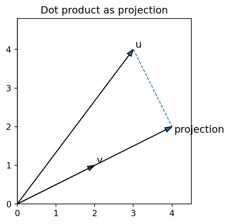
Projection: one vector’s shadow on another

The projection of \(u\) onto nonzero \(v\) is

\[ \operatorname{proj}_v(u)=\frac{u\cdot v}{v\cdot v}v. \]

Read it as: measure how much \(u\) points in the \(v\) direction, then scale \(v\) by that amount.

Projection picture

Vector projection diagram showing one vector shadowed onto another vector.

Batch scores: one row, one score

Suppose

\[ X \in \mathbb{R}^{n \times d}, \quad w \in \mathbb{R}^{d}, \quad b \in \mathbb{R}. \]

Then

\[ Xw+b \in \mathbb{R}^{n}. \]

Code
X = np.array([[1.0, 0.0, 2.0], [0.0, 1.0, 1.0], [1.0, 1.0, 0.0], [2.0, -1.0, 1.0]])
w = np.array([0.5, -2.0, 1.0])
b = 1.5
scores = X @ w + b
print("X shape:", X.shape)
print("w shape:", w.shape)
print("scores:", scores)
print("scores shape:", scores.shape)
X shape: (4, 3)
w shape: (3,)
scores: [4.  0.5 0.  5.5]
scores shape: (4,)

Broadcasting trap

Broadcasting lets NumPy stretch smaller arrays so their shapes match.

Useful, but dangerous: two different shapes can both “work” while meaning different things.

Code
import numpy as np

# rows = examples, columns = features
X = np.array([[1.0, 10.0],
              [3.0, 14.0],
              [5.0, 18.0]])

# GOOD: one mean per feature/column
feature_means = X.mean(axis=0)      # shape: (2,)
X_good = X - feature_means          # broadcast across rows

# BAD: one mean per example/row
row_means = X.mean(axis=1)[:, None] # shape: (3, 1)
X_bad = X - row_means               # broadcast across columns

print("feature means:", feature_means)
print("row means:", row_means.ravel())

print("good column means:", X_good.mean(axis=0))
print("bad row means:", X_bad.mean(axis=1))
feature means: [ 3. 14.]
row means: [ 5.5  8.5 11.5]
good column means: [0. 0.]
bad row means: [0. 0. 0.]

In the good version, each feature is centred across examples.
In the bad version, each row is forced to have mean zero.

Which version keeps column meanings intact? Why is the row-centred version suspicious?

Standardization is a fitted object

A standardized value is not just “the value divided by something.” It depends on which rows were allowed to compute the mean and standard deviation.

Code
X_train = np.array([[10.0, 1.0],
                    [12.0, 2.0],
                    [14.0, 3.0]])
X_new = np.array([[100.0, 4.0]])

mean_train, std_train = safe_standardize_fit(X_train)
print("train mean:", mean_train)
print("train std: ", std_train)
print("new point transformed legally:", safe_standardize_transform(X_new, mean_train, std_train))

X_leaky = np.vstack([X_train, X_new])
mean_leaky, std_leaky = safe_standardize_fit(X_leaky)
print("new point transformed leaky:  ", safe_standardize_transform(X_new, mean_leaky, std_leaky))
train mean: [12.  2.]
train std:  [1.633  0.8165]
new point transformed legally: [[53.8888  2.4495]]
new point transformed leaky:   [[1.7309 1.3416]]

The new point is still transformed in both cases. Which version let the new point teach the transformation?

Scaling sneak preview

Scaling means using numbers from one dataset to adjust another.

Example: to centre values, subtract a mean.

Values we use to choose the mean: 10, 12, 14
New value we want to evaluate:   100

Bad:

mean = mean([10, 12, 14, 100])  # the new value helped choose the mean

Good:

mean = mean([10, 12, 14])       # choose the mean first
# later: subtract that same mean from 100

Key rule:

Data used for evaluation can be adjusted by the scale, but it should not help choose the scale.

Why does including 100 make the scale less honest?

Additional preparation

Arcade 1 quiz cards

  1. If X.shape == (800, 3) and w.shape == (3,), what is (X @ w).shape?
  2. Why is X * w not the same as X @ w?
  3. What does a negative dot product say about the angle between two vectors?
  4. What does the intercept b do in X @ w + b?
  5. Why should standardization use training statistics only?
  6. If X.shape == (100, 5), what are the shapes of X.T @ X and X.T @ y where y.shape == (100,)?

Notebook handoff: Arcade 1

Notebook checks A1–A11 cover: A1 dot/norm/cosine, A2 toy weighted score and contributions, A3 angle from dot product, A4 projection, A5 batch scores, A6 shape brainteaser, A7 bias column, A8 train-only standardization, A9 broadcasting, A10 row-wise Gram matrix, and A11 operator choice.

Bridge: from scores to sensitivity

Arcade 1 gave us scores such as

\[ s = x\cdot w+b. \]

But data science often asks a second question:

If one input changes a little, how much does the output change?

That is the job of derivatives.

Arcade 2: Calculus & Local Change

Outcome

By the end of Arcade 2, you can:

  • read a derivative as local rate of change
  • explain slope, gradient, and partial derivative
  • connect small changes in inputs to changes in outputs
  • recognize the chain rule as “change flowing through steps”
  • see why ML uses gradients to adjust parameters

Local change: zoom in

A rate of change asks:

\[ \frac{\text{change in output}}{\text{change in input}} \]

For a big step, this is an average rate of change.

For a tiny step, it becomes a local rate of change.

A derivative is what the slope looks like when you zoom in until the curve is almost straight.
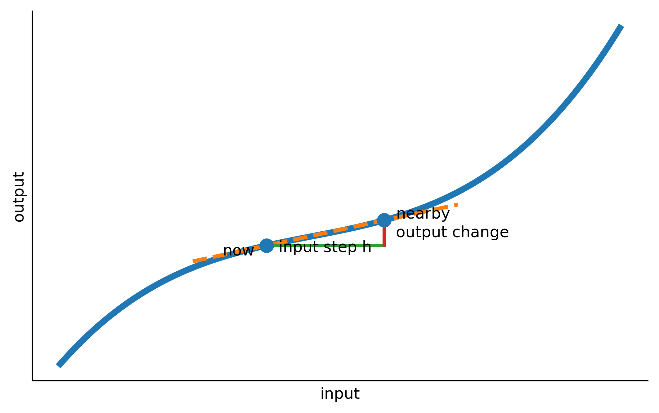
Plot illustrating the concept described in the slide text and code comments.

What is h?

In the derivative formula,

\[ f'(x)=\lim_{h\to 0}\frac{f(x+h)-f(x)}{h}, \]

h is a tiny move in the input.

x       = where you are now
x + h   = a nearby input
f(x)    = output now
f(x+h)  = output after the tiny move

So

\[ f(x+h)-f(x) \]

means “how much the output changed,” and

\[ \frac{f(x+h)-f(x)}{h} \]

means “output change per input step.”

Plain-language derivative:

If I nudge the input a tiny bit, how fast does the output change?

Finite-difference microscope

  • Consider the function \(f(x) = \sin(x) + \frac{1}{4}x^2\).
  • We actually know what the rate of change should be for any \(x\); for reasons we can skip for now, the rate of change at \(x\) will be \(f'(x) = \cos(x) + \frac{x}{2}\).
  • Imagine we don’t have the theory and have to compute it from scratch.
  • A finite difference is a numerical estimate of a derivative. It is not the definition, but it is an excellent sanity check.
Code
f = lambda x: np.sin(x) + 0.25*x**2
fprime = lambda x: np.cos(x) + 0.5*x
x0 = 1.2
hs = np.array([1, 0.5, 0.1, 0.01, 0.001, 1e-4])

print("true derivative at x=", x0, ":", fprime(x0))
for h in hs:
    forward = (f(x0 + h) - f(x0)) / h
    centered = (f(x0 + h) - f(x0 - h)) / (2*h)
    print(f"h={h:>7g}  forward={forward: .6f}  centered={centered: .6f}")
true derivative at x= 1.2 : 0.9623577544766736
h=      1  forward= 0.726457  centered= 0.904914
h=    0.5  forward= 0.844251  centered= 0.947447
h=    0.1  forward= 0.940191  centered= 0.961754
h=   0.01  forward= 0.960192  centered= 0.962352
h=  0.001  forward= 0.962142  centered= 0.962358
h= 0.0001  forward= 0.962336  centered= 0.962358

Centred differences often converge faster because they balance the error on both sides of the point.

Why does making h smaller help at first but eventually become numerically fragile on real computers?

Why not just set h = 0?

Because the difference quotient would become

\[ \frac{f(x+0)-f(x)}{0} = \frac{f(x)-f(x)}{0} = \frac{0}{0}, \]

which is undefined.

The derivative does not plug in h = 0.

It asks what happens as h gets closer and closer to zero.

What does the phrase “as h gets closer to zero” protect us from?

Derivatives are local change detectors

For a one-variable function \(f(x)\),

\[ f'(x)=\lim_{h\to 0}\frac{f(x+h)-f(x)}{h}. \]

This is information about a point, not an algorithm for choosing what to do next.

A derivative is like a local speedometer: it tells you how fast the output is changing right here.

Corners and cliffs:
derivatives can fail to exist

The derivative exists only when the limiting slope settles to one value. Corners are a useful warning for future ML.
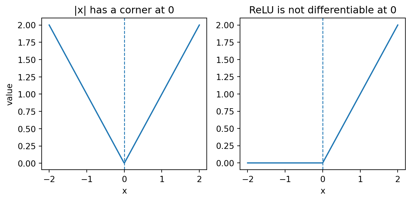
Plot of a function with a corner, illustrating a point where the derivative is not defined.

For ReLU (a popular function in ML), the derivative is 0 for negative inputs and 1 for positive inputs. At exactly 0, the classical derivative is undefined. ML libraries typically choose a convenient convention there.

Why is “undefined at one point” not the same as “useless everywhere”?

Derivative units

A derivative has units:

Function Input unit Output unit Derivative unit
position over time seconds metres metres/second
cost by users users dollars dollars/user
loss by weight weight units loss units loss per weight unit

In ML language, often:

partial derivative = how loss (e.g., error) changes per tiny change in one parameter of the model

Rules of derivation:
powers, sums, and trig

These are enough for the first notebook calculus checks.

\[ \frac{d}{dx}c=0, \qquad \frac{d}{dx}\left(cf(x)\right)=c f'(x), \qquad \frac{d}{dx}\left(f(x)+g(x)\right)=f'(x)+g'(x). \]

\[ \frac{d}{dx}x^n=nx^{n-1}, \qquad \frac{d}{dx}\sin x=\cos x, \qquad \frac{d}{dx}\cos x=-\sin x. \]

For partial derivatives, use the same rules while holding the other variables fixed.

For \(g(a,b)=a^2b+\sin b\), what is held fixed when computing \(\partial g/\partial a\)?

Partial derivative notation

When a function has more than one input, we measure one input at a time.

For a function \(g(a,b)\),

\[ \frac{\partial g}{\partial a} \]

means:

tiny change in \(g\) per tiny change in \(a\), while holding \(b\) fixed.

Likewise,

\[ \frac{\partial g}{\partial b} \]

means:

tiny change in \(g\) per tiny change in \(b\), while holding \(a\) fixed.

The symbol \(\partial\) reminds us: this is a partial rate of change.

Gradients collect partial derivatives

For a differentiable multivariate function \(g(a,b)\), the gradient is:

\[ \nabla g(a,b)= \left[ \frac{\partial g}{\partial a}(a,b), \frac{\partial g}{\partial b}(a,b) \right]. \]

A directional derivative in a unit direction \(d\) is

\[ \nabla g(a,b)\cdot d. \]

This tells us the local rate of change if we take a tiny step in direction \(d\).

The gradient points in the direction where the function increases fastest locally, as long as \(\nabla g(a,b)\neq 0\). The negative gradient points downhill locally.

Directional derivative lab

If the gradient is an uphill arrow, the directional derivative is the dot product between that arrow and a proposed unit step.

Code
grad = np.array([3.0, 4.0])
directions = {
    "east": np.array([1.0, 0.0]),
    "north": np.array([0.0, 1.0]),
    "uphill unit": grad / np.linalg.norm(grad),
    "downhill unit": -grad / np.linalg.norm(grad),
    "sideways unit": np.array([4.0, -3.0]) / 5.0,
}

for name, d in directions.items():
    print(f"{name:13s}  d={d}  grad·d={grad @ d: .3f}")
east           d=[1. 0.]  grad·d= 3.000
north          d=[0. 1.]  grad·d= 4.000
uphill unit    d=[0.6 0.8]  grad·d= 5.000
downhill unit  d=[-0.6 -0.8]  grad·d=-5.000
sideways unit  d=[ 0.8 -0.6]  grad·d= 0.000

The sideways direction has dot product zero: locally, it does not change the function to first order.

What does a negative directional derivative promise only locally, not globally?

Gradient as compass 🧭

For a loss (e.g., error) surface, the gradient is an uphill compass. Training methods often move roughly the opposite way.

Code
x_grid = np.linspace(-3, 3, 100)
y_grid = np.linspace(-3, 3, 100)
Xg, Yg = np.meshgrid(x_grid, y_grid)
Z = Xg**2 + 2*Yg**2
point = np.array([1.5, 1.0])
grad = np.array([2*point[0], 4*point[1]])
neg_grad = -grad / np.linalg.norm(grad)
fig, ax = plt.subplots(figsize=(6,4))
ax.contour(Xg, Yg, Z, levels=12)
ax.scatter([point[0]], [point[1]], zorder=5)
ax.arrow(point[0], point[1], grad[0]/3, grad[1]/3, head_width=0.12, length_includes_head=True, label="gradient")
ax.arrow(point[0], point[1], neg_grad[0], neg_grad[1], head_width=0.12, length_includes_head=True, linestyle="--")
ax.text(point[0] + grad[0]/3, point[1] + grad[1]/3, "uphill")
ax.text(point[0] + neg_grad[0], point[1] + neg_grad[1], "downhill")
ax.set_xlabel("parameter 1")
ax.set_ylabel("parameter 2")
ax.set_title("Gradient points uphill; -gradient points downhill")
plt.show()
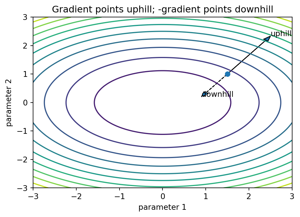
Contour plot with a gradient arrow showing local steepest-ascent direction.

If the gradient is [3, 4], what unit direction increases fastest? What unit direction decreases fastest?

Common derivative rules:
powers and polynomials

Power rule:

\[ \frac{d}{dx}x^n=nx^{n-1}. \]

If \(p(x)=\sum_{k=0}^{K}a_kx^k\), then

\[ p'(x)=\sum_{k=1}^{K}k\,a_kx^{k-1}. \]

Why does the \(k=0\) term disappear?

Common derivative rules:
exponentials and logs

Remembering that \(\ln(x) = \log_e (x)\) is the ’_natural log’…

\[ \frac{d}{dx}e^x=e^x, \qquad \frac{d}{dx}a^x=a^x\ln(a)\quad(a>0,\;a\ne1). \]

\[ \frac{d}{dx}\ln x=\frac{1}{x}\quad(x>0), \qquad \frac{d}{dx}\ln|x|=\frac{1}{x}\quad(x\ne0). \]

Log chain rule:

\[ \frac{d}{dx}\ln(g(x))=\frac{g'(x)}{g(x)}\quad(g(x)>0). \]

Sigmoid

One common S-shaped function is the sigmoid:

\[ \sigma(z)=\frac{1}{1+e^{-z}}. \]

Its derivative has a convenient form:

\[ \sigma'(z)=\sigma(z)(1-\sigma(z)). \]
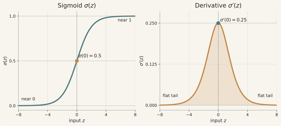
Side-by-side plots of the sigmoid function and its derivative.

The derivative is largest near \(z=0\) and small when the curve has saturated near 0 or 1.

Why does \(\sigma'(0)=0.25\)?

Product and quotient

Product (given \(f=f(x)\), \(g=g(x)\)):

\[ \frac{d}{dx}(fg)=f'g+fg'. \]

Quotient:

\[ \frac{d}{dx}\left(\frac{f}{g}\right)=\frac{f'g-fg'}{g^2}\quad(g\ne0). \]

These are useful, but you’ll usually be able to look them up, if needed.

🔬 Bonus vault: chain rule

If

\[ z=f(u),\qquad u=g(x,y), \]

then

\[ \frac{\partial z}{\partial x}=f'(u)\frac{\partial u}{\partial x}, \qquad \frac{\partial z}{\partial y}=f'(u)\frac{\partial u}{\partial y}. \]

Outside derivative times inside partial.

🔬 Bonus vault: chain rule (add dependency paths)

If

\[ z=f(u,v),\qquad u=g(x,y),\qquad v=h(x,y), \]

then

\[ \frac{\partial z}{\partial x}=\frac{\partial f}{\partial u}\frac{\partial u}{\partial x}+\frac{\partial f}{\partial v}\frac{\partial v}{\partial x}, \]

\[ \frac{\partial z}{\partial y}=\frac{\partial f}{\partial u}\frac{\partial u}{\partial y}+\frac{\partial f}{\partial v}\frac{\partial v}{\partial y}. \]

Read this as: add contributions along each dependency path.

🔬 Bonus vault: chain rule picture

flowchart LR
  x((x)) --> u((u))
  y((y)) --> u
  x --> v((v))
  y --> v
  u --> z((z))
  v --> z

Read the diagram as a dependency map: changing \(x\) can change \(z\) through more than one path.

Later AI/ML material will likely use larger dependency maps (you can hopefully see how networks like this are likely to be used in AI/ML), so this can be crucial to understand🔎.

🔬 Bonus vault: partial-chain worked example

Let

\[ u=x^2+y^2,\qquad z=\log u. \]

Then

\[ \frac{dz}{du}=\frac{1}{u}, \qquad \frac{\partial u}{\partial x}=2x, \qquad \frac{\partial u}{\partial y}=2y. \]

Therefore

\[ \frac{\partial z}{\partial x}=\frac{2x}{x^2+y^2}, \qquad \frac{\partial z}{\partial y}=\frac{2y}{x^2+y^2}. \]

Derivative practice cards

Compute these before revealing the answer.

  1. \(\dfrac{d}{dx}\left(3x^5-2x+7\right)\)
  2. \(\dfrac{d}{dx}\left(\ln(1+x^2)\right)\)
  3. \(\dfrac{\partial}{\partial x}\left(x^2y+\ln y\right)\), treating \(y\) as constant
  4. \(\dfrac{\partial}{\partial y}\left(x^2y+\ln y\right)\), treating \(x\) as constant

Answers on the next slide.

Derivative practice cards: answers

  1. Term-by-term:

\[ \frac{d}{dx}\left(3x^5-2x+7\right)=15x^4-2. \]

  1. Let \(u=1+x^2\):

\[ \frac{d}{dx}\ln(1+x^2)=\frac{2x}{1+x^2}. \]

  1. Treat \(y\) as constant:

\[ \frac{\partial}{\partial x}(x^2y+\ln y)=2xy. \]

  1. Treat \(x\) as constant:

\[ \frac{\partial}{\partial y}(x^2y+\ln y)=x^2+\frac{1}{y}. \]

Additional preparation

🤔 Arcade 2 questions

  1. In the derivative definition, what is h?
  2. Why not plug in h = 0?
  3. If \(f'(2)=0\), does that always mean \(x=2\) is a minimum?
  4. If \(\nabla g=[3,4]\), what is the length of the gradient?
  5. In what unit direction is local increase fastest?
  6. What is the difference between “a derivative” and “an optimization algorithm”?

Notebook handoff: Arcade 2

Notebook checks B1–B8 connect to this sequence: B1 scalar derivative, B2 polynomial derivative at a point, B3 partial derivatives and gradients, B4 directional derivative, B5 centred finite difference, B6 sigmoid and derivative, B7 tangent-line values, and B8 a short explanation distinguishing local-change information from optimization algorithms.

Bridge: from local change to uncertainty

Derivatives describe how a function changes near one point.

But real data are not one clean point. They vary because of:

  • sampling;
  • measurement noise;
  • hidden groups;
  • missing values;
  • rare events;
  • changing conditions.

So we need probability and distributions to answer:

How surprising is this value?

How much should this evidence change what I believe?

Arcade 3: Probability, Base Rates, Distributions

Outcome

By the end of Arcade 3, you can:

  • read \(P(A \mid B)\) as “among \(B\) cases, how often is \(A\) true?”
  • identify the denominator in a conditional probability
  • explain base rates and false-positive traps
  • distinguish population, sample, and sampling variability
  • describe why a test score is a noisy statistic

Probability grammar:
the language of uncertainty

Probability is a way to think carefully about uncertain experiments.

Our running example:

One play of an arcade claw machine.

🐉
dragon
⛵️
sailboat
⏱️
clock

empty

Illustration of an arcade claw machine used as a toy probability experiment.
Word Meaning Claw-machine example
Experiment a process with an uncertain outcome one claw-machine play
Outcome one possible result dragon
Sample space all possible outcomes {dragon, sailboat, clock, empty}
Event a set of outcomes wins any prize
Complement the event does not happen empty grab
Intersection both events happen wins prize and prize is dragon
Union at least one event happens wins dragon or sailboat

Events are sets of outcomes

The sample space is the full list of possible outcomes:

\[ S = \{\text{dragon}, \text{sailboat}, \text{clock}, \text{empty}\} \]

Now define two events:

\[ A = \{\text{dragon}, \text{sailboat}, \text{clock}\} \]

\[ B = \{\text{dragon}\} \]

In words:

  • A = wins any prize
  • B = wins dragon
Key idea: an event does not necessarily mean one outcome. It can be a collection of outcomes.

If A = wins any prize and B = wins dragon, is B “inside” A?

Show answer

Yes. Every dragon win is also a prize win, so:

\[ B \subseteq A \]

Probability pictures: tiles, Venn diagrams, tables, trees

The same probability idea can be shown in several ways.

Picture Best for seeing Example question
Tiles / natural frequencies counts and base rates “How often do we win?”
Venn diagram sample space, events, overlap, complements “What happens in A, B, both, or neither?”
2×2 table exact counts for two yes/no events “Among B, how many are also A?”
Tree diagram step-by-step stories and multiplication “What happens first, then next?”

Tiles: probability as counting

Suppose we watch 20 claw-machine plays. These counts are empirical frequencies; treating them as probabilities we can use to make predictions in the future is a modelling choice.

🐉
🐉
⛵️
⛵️
⛵️
⏱️
⏱️
⏱️
⏱️
⏱️

There are:

  • 10 prize wins
  • 10 empty grabs
  • 20 plays total

So:

\[ P(\text{wins any prize}) = \frac{10}{20} = \frac{1}{2} \]

Run it: frequency estimates probability

Frequency and probability are not quite the same thing but the former becomes a better estimate of the latter when we see many more examples.

Code
rng_freq = np.random.default_rng(315103)
p_win = 0.50
n_plays = 300
wins = rng_freq.binomial(1, p_win, size=n_plays)
running_win_rate = np.cumsum(wins) / np.arange(1, n_plays + 1)

fig, ax = plt.subplots(figsize=(7, 3.5))
ax.plot(np.arange(1, n_plays + 1), running_win_rate, linewidth=1.5)
ax.axhline(p_win, linestyle="--", linewidth=2, label="model probability")
ax.set_ylim(0, 1)
ax.set_xlabel("number of plays observed")
ax.set_ylabel("observed win frequency")
ax.set_title("A short-run frequency can wander before settling")
ax.legend()
plt.show()

print("first 20-play win rate:", wins[:20].mean())
print("final 300-play win rate:", wins.mean())
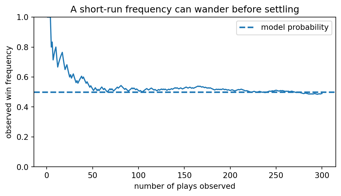
Simulation plot showing sample frequency settling toward probability over repeated trials.

first 20-play win rate: 0.65
final 300-play win rate: 0.49

If the first 20 plays looked unlucky, has the true probability necessarily changed?

Tables: probability as overlap

Now track two events:

\[ A = \text{wins a prize} \]

\[ B = \text{claw closes around a toy} \]

A: wins prize not A: no prize Total
B: claw closes 8 4 12
not B: claw does not close 2 6 8
Total 10 10 20

The intersection is the cell where both events happen:

\[ A \cap B = \text{claw closes and wins prize} \]

Here:

\[ P(A \cap B) = \frac{8}{20} \]

Venn diagrams: probability as regions

A Venn diagram helps visualize probability space. Using the same claw table:

\[ A = \text{wins a prize}, \qquad B = \text{claw closes around a toy}. \]
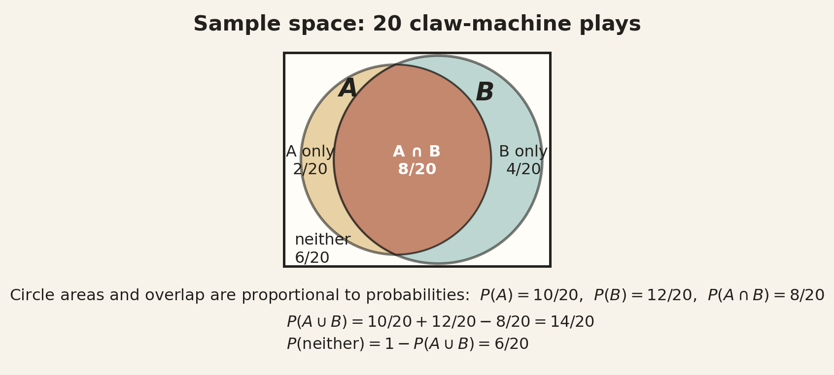
Venn-style probability diagram showing overlapping events in the claw-machine example.

Which region is counted twice by \(P(A)+P(B)\)? Which region is the complement of \(A\cup B\)?

Run it: events as boolean masks

In real use, an event is often a boolean mask over rows.

Code
closes = np.array([True] * 12 + [False] * 8)
wins = np.array([True] * 8 + [False] * 4 + [True] * 2 + [False] * 6)

A = wins
B = closes
A_and_B = A & B
A_or_B = A | B
neither = ~(A_or_B)

print("P(A) wins:", A.mean())
print("P(B) closes:", B.mean())
print("P(A and B):", A_and_B.mean())
print("P(A or B):", A_or_B.mean())
print("P(A | B):", A[B].mean())
print("P(B | A):", B[A].mean())
print("neither count:", neither.sum())

if pd is not None:
    table = pd.crosstab(
        closes,
        wins,
        rownames=["B: closes"],
        colnames=["A: wins"],
        margins=True,
    )
    print("\n2x2 table from row-level data:")
    print(table)
P(A) wins: 0.5
P(B) closes: 0.6
P(A and B): 0.4
P(A or B): 0.7
P(A | B): 0.6666666666666666
P(B | A): 0.8
neither count: 6

2x2 table from row-level data:
A: wins    False  True  All
B: closes                  
False          6     2    8
True           4     8   12
All           10    10   20

This is the common technique in ML; e.g., a condition such as score >= threshold or y_true == 1 is a mask.

Which line changed the denominator for \(P(A\mid B)\)?

Probability rules

For events \(A\) and \(B\):

Rule Formula Plain reading
Complement \(P(\neg A)=1-P(A)\) everything outside \(A\)
Union \(P(A\cup B)=P(A)+P(B)-P(A\cap B)\) add both circles, subtract double-counted overlap
Conditional \(P(A\mid B)=P(A\cap B)/P(B)\) zoom into \(B\), then ask how much is also \(A\)
Multiplication \(P(A\cap B)=P(B)P(A\mid B)=P(A)P(B\mid A)\) build an overlap by first choosing a denominator
Total probability \(P(E)=P(H)P(E\mid H)+P(\neg H)P(E\mid \neg H)\) count all roads into the same evidence

Using the claw table:

\[ P(A)=\frac{10}{20},\quad P(B)=\frac{12}{20},\quad P(A\cap B)=\frac{8}{20}, \]

so

\[ P(A\cup B)=\frac{10}{20}+\frac{12}{20}-\frac{8}{20}=\frac{14}{20}. \]

The multiplication rule gives the same overlap from either denominator:

\[ P(A\cap B)=P(B)P(A\mid B)=\frac{12}{20}\cdot\frac{8}{12}=\frac{8}{20}. \]

If two events have no overlap, what does the union formula reduce to? Does “no overlap” automatically mean independent?

Same overlap, different denominator

The overlap \(A\cap B\) is the same physical region. The denominator changes the question.

Using the claw table:

Question Denominator Calculation
\(P(A\mid B)\): among claws that close, how many win? \(B=12\) \(8/12=2/3\)
\(P(B\mid A)\): among wins, how many had the claw close? \(A=10\) \(8/10=0.8\)

Trees: probability as a process

Tree diagrams help when the experiment happens in stages.

flowchart LR
  S((Play)) -- "claw closes: 12/20" --> B((Closes))
  S -- "doesn't close: 8/20" --> NB((Doesn't close))

  B -- "wins: 8/12" --> BW["Prize"]
  B -- "no win: 4/12" --> BL["Empty"]

  NB -- "wins: 2/8" --> NW["Prize"]
  NB -- "no win: 6/8" --> NL["Empty"]

A path probability comes from multiplying along the path:

\[ P(\text{closes and wins}) = P(B)P(A\mid B) \]

\[ = \frac{12}{20}\cdot\frac{8}{12} = \frac{8}{20} \]

Independence

Two events are independent when learning that one happened does not change the probability of the other, i.e.:

\[ P(A\mid B)=P(A) \quad \text{when } P(B)>0. \]

Equivalent multiplication rule:

\[ P(A\cap B)=P(A)P(B). \]

Do not assume independence unless you have good reason. ML is replete with hidden dependencies.

If students who sleep more also tend to study more, should sleep and studied be treated as independent by default?

Mutually exclusive is not independent

Two events are mutually exclusive when they do not happen together:

\[ P(A\cap B)=0. \]

Two events are independent when learning one happened does not change the probability of the other:

\[ P(A\mid B)=P(A). \]

For nonzero events, these ideas usually point in opposite directions. If \(A\) and \(B\) cannot both happen, then knowing \(B\) happened makes \(P(A\mid B)=0\).

Can “wins dragon” and “wins sailboat” be independent on a single claw-machine play?

Checkpoint

Let:

\[ A = \text{wins any prize} \]

\[ B = \text{wins dragon} \]

Can you already know:

\[ P(A \mid B)? \]

Show answer

\[ P(A \mid B)=1 \]

Because every dragon win is automatically a prize win. In set language, \(B \subseteq A\).

Conditioning direction mini-game

Translate each sentence.

Sentence Probability notation
Among students who studied, how many passed? ?
Among students who passed, how many studied? ?
Among positive tests, how many are real cases? ?
Among real cases, how many test positive? ?
Among emails flagged as spam, how many truly are spam? ?
Show answers
P(pass | studied)
P(studied | pass)
P(real case | positive)
P(positive | real case)
P(spam | flagged)

Which pairs sound similar but answer different questions?

Base-rate quick check

Before calculating, predict the scale of the answer.

A condition affects 1% of people. A test catches 90% of true cases and falsely flags 9% of non-cases.

After a positive test, is \(P(\text{condition}\mid +)\) closer to:

  1. 90%?
  2. 50%?
  3. 10%?

Commit to one answer now.

Natural frequencies

Suppose:

1000 people
1% have a condition -> 10 people
99% do not -> 990 people

Test behaviour:

sensitivity = 90%  -> catches 9 of 10 condition cases
specificity = 91%  -> falsely flags 9% of 990 non-cases ≈ 89 people

So:

positive tests = 9 true positives + 89 false positives = 98 positives
true cases among positives = 9 / 98 ≈ 9.2%

That is the base-rate lesson: a positive result is not automatically likely to be true when the condition is rare.

Base-rate demo: positives are not all true positives

This is a reasoning exercise, not medical advice.

Code
N = 1000
prevalence = 0.01
sensitivity = 0.90
specificity = 0.91
n_condition = int(round(N * prevalence))
n_no = N - n_condition
tp = int(round(n_condition * sensitivity))
fn = n_condition - tp
fp = int(round(n_no * (1 - specificity)))
tn = n_no - fp

rng_demo = np.random.default_rng(1109)
all_idx = np.arange(N)
condition_idx = rng_demo.choice(all_idx, size=n_condition, replace=False)
tp_idx = rng_demo.choice(condition_idx, size=tp, replace=False)
noncondition_idx = np.setdiff1d(all_idx, condition_idx)
fp_idx = rng_demo.choice(noncondition_idx, size=fp, replace=False)
positive_idx = np.sort(np.concatenate([tp_idx, fp_idx]))
cols = 40
x = all_idx % cols
y = all_idx // cols
fig, ax = plt.subplots(figsize=(10, 5))
ax.scatter(x, y, marker="s", s=55, facecolors="none", edgecolors=(0, 0, 0, 0.18), linewidths=0.5)
ax.scatter(x[positive_idx], y[positive_idx], marker="s", s=55, alpha=0.30, linewidths=0.5, label="positive test")
ax.scatter(x[tp_idx], y[tp_idx], marker="s", s=55, alpha=0.75, linewidths=0.5, label="true positive")
ax.scatter(x[condition_idx], y[condition_idx], marker="x", s=45, linewidths=1.1, label="condition")
ax.set_aspect("equal")
ax.set_xticks([]); ax.set_yticks([])
ax.set_ylim(N//cols, -1)
ax.set_title(f"Among {tp+fp} positive tests, {tp} are true positives: {tp/(tp+fp):.1%}")
#ax.legend(loc="lower right")
ax.legend(
    loc="center left",
    bbox_to_anchor=(1.03, 0.5),
    frameon=True,
    facecolor=paper,
    edgecolor=ink,
    fontsize=10,
    title="Prediction"
)

fig.subplots_adjust(right=0.76)
plt.show()
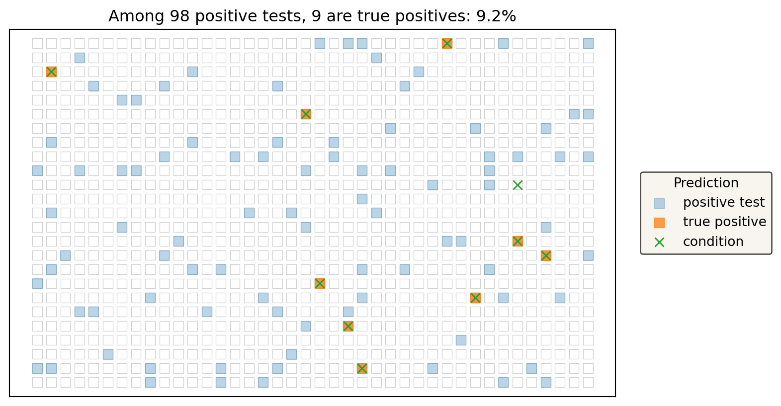
Natural-frequency tile plot showing true positives and false positives under a low base rate.

Bayes’ rule

We often know:

  • prior beliefs like \(P(X)\),
  • how likely data are under a hypothesis, like \(P(Y \mid X)\).

However, we may actually want to know \(P(X \mid Y)\).

Bayes’ rule lets us flip the conditioning:

\[ P(X \mid Y) = \frac{P(X, Y)}{P(Y)} = \frac{P(X)\,P(Y \mid X)}{P(Y)}. \]

For a positive test (‘\(+\)’), the probability of having condition \(C\) is:

\[ P(C\mid +)=\frac{P(C)P(+\mid C)}{P(C)P(+\mid C)+P(\neg C)P(+\mid \neg C)}. \]

With prevalence 1%, sensitivity 90%, and specificity 91%, the posterior is about 9.2%, not 90%.

Which part of the formula contains the base rate?

Bayes prevalence curve: base rate changes everything

Keep the same test. Change only the base rate.

prevalence= 0.1% -> P(condition | positive)= 1.0%
prevalence= 0.5% -> P(condition | positive)= 4.8%
prevalence= 1.0% -> P(condition | positive)= 9.2%
prevalence= 2.0% -> P(condition | positive)=16.9%
prevalence= 5.0% -> P(condition | positive)=34.5%
prevalence=10.0% -> P(condition | positive)=52.6%
prevalence=20.0% -> P(condition | positive)=71.4%
prevalence=50.0% -> P(condition | positive)=90.9%

Which part of the plot would mislead someone who thinks sensitivity and posterior probability are the same thing?

Conditional probability meets confusion matrices

Classification metrics are conditional probabilities hiding in a table.

Actually positive Actually negative
Predicted positive TP FP
Predicted negative FN TN

\[ \text{recall}=P(\text{predicted positive}\mid \text{actually positive}) \]

\[ \text{precision}=P(\text{actually positive}\mid \text{predicted positive}) \]

Which metric conditions on the model saying “positive”? Which metric conditions on the case actually being positive?

Run it: thresholds change denominators

A model score becomes a yes/no decision only after we choose a threshold. Moving the threshold changes TP, FP, FN, TN, and therefore the conditional probabilities.

Code
y_true = np.array([1, 1, 1, 1, 0, 0, 0, 0, 1, 0])
scores = np.array([0.95, 0.85, 0.70, 0.40, 0.65, 0.55, 0.30, 0.20, 0.45, 0.10])
thresholds = np.arange(0.20, 0.91, 0.10)

rows = []
for th in thresholds:
    y_pred = (scores >= th).astype(int)
    m = metric_summary(y_true, y_pred)
    rows.append({
        "threshold": round(float(th), 2),
        "TP": m["TP"], "FP": m["FP"], "FN": m["FN"], "TN": m["TN"],
        "precision": m["precision"],
        "recall": m["recall"],
    })

if pd is not None:
    threshold_table = pd.DataFrame(rows)
    print(threshold_table.to_string(index=False, float_format=lambda z: f"{z:.2f}"))
else:
    for row in rows:
        print(row)

precision = np.array([row["precision"] for row in rows], dtype=float)
recall = np.array([row["recall"] for row in rows], dtype=float)
fig, ax = plt.subplots(figsize=(7, 3.5))
ax.plot(thresholds, precision, marker="o", label="precision = P(true + | predicted +)")
ax.plot(thresholds, recall, marker="o", label="recall = P(predicted + | true +)")
ax.set_ylim(0, 1.05)
ax.set_xlabel("decision threshold")
ax.set_ylabel("metric value")
ax.set_title("Same scores, different thresholds, different denominators")
ax.legend(fontsize=8)
plt.show()
 threshold  TP  FP  FN  TN  precision  recall
      0.20   5   4   0   1       0.56    1.00
      0.30   5   2   0   3       0.71    1.00
      0.40   4   2   1   3       0.67    0.80
      0.50   3   2   2   3       0.60    0.60
      0.60   3   1   2   4       0.75    0.60
      0.70   2   0   3   5       1.00    0.40
      0.80   2   0   3   5       1.00    0.40
      0.90   1   0   4   5       1.00    0.20
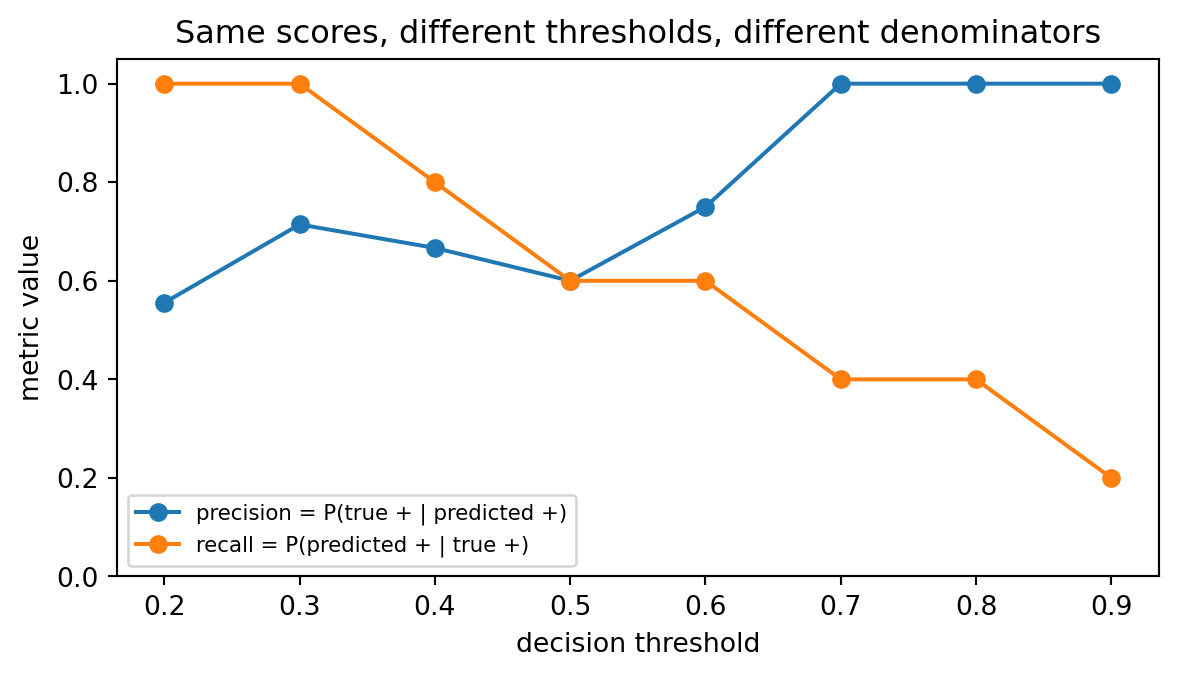
Plot showing how changing a threshold changes confusion-matrix denominators.

When the threshold goes up, which denominator usually shrinks: predicted positives, true positives, or both?

Statistics: the work of probabilities

Random variables: outcomes become numbers

A random variable is a rule that turns an uncertain outcome into a value.

Outcome idea Random variable Possible values
Did the claw win? \(W\) 0 or 1
Which prize appeared? \(T\) dragon, sailboat, clock, empty
What was the prize worth? \(X\) 0, 1, 10, 100, …

A distribution tells us how probability is spread across those values. Expected value and variance summarize numeric random variables, but they do not replace the distribution.

Expected value: long-run average

Expected value is a weighted average using probabilities.

Arcade loot box:

Prize Value Probability
common coin 1 0.70
rare gem 10 0.25
dragon crown 100 0.05

\[ E[\text{value}] = 0.70(1) + 0.25(10) + 0.05(100) = 8.2. \]

Expected value is the long-run average over many plays, not a promise for one play.

Why should you not expect to receive exactly 8.2 value on a single play?

Expected value appears gradually

Expected value is a long-run centre under repeated draws. One short run can still look strange.

Code
rng_ev = np.random.default_rng(2026)
values = np.array([1, 10, 100])
probs = np.array([0.70, 0.25, 0.05])
draws = rng_ev.choice(values, size=400, p=probs)
running_mean = np.cumsum(draws) / np.arange(1, len(draws) + 1)
true_ev = np.sum(values * probs)

fig, ax = plt.subplots(figsize=(6, 3.5))
ax.plot(running_mean)
ax.axhline(true_ev, linestyle="--", linewidth=2)
ax.set_xlabel("number of plays")
ax.set_ylabel("running average value")
ax.set_title("One run wanders; the long-run average becomes visible")
plt.show()
print("theoretical expected value:", true_ev)
print("final running average:", running_mean[-1])
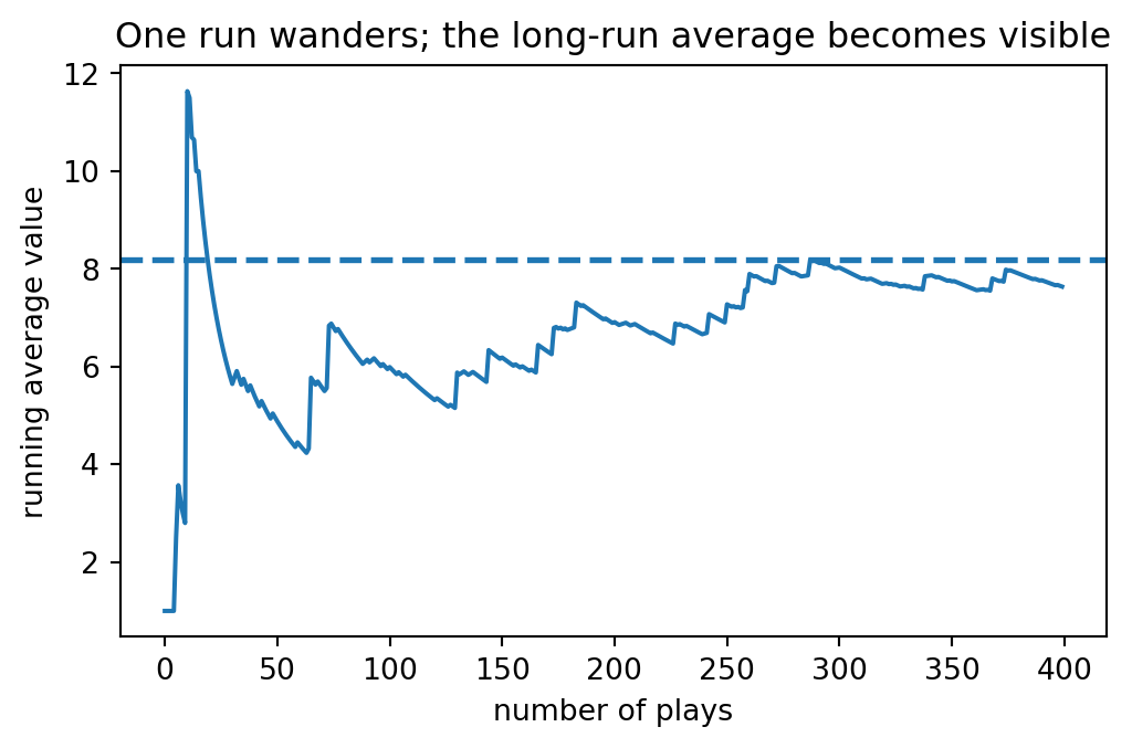
Simulation plot showing a running average approaching expected value.

theoretical expected value: 8.2
final running average: 7.6375

Why can the running average move sharply upward even late in the run?

Same average, different risk

Two games can have the same expected value and very different spread.

For a discrete random variable:

\[ \operatorname{Var}(X)=\sum_i p_i\left(x_i-E[X]\right)^2. \]

Game Outcomes Probabilities Expected value Variance
Calm 4 or 6 50%, 50% 5 1
Wild 0 or 10 50%, 50% 5 25

Variance measures spread around the expected value. See Notebook C5.

Which game would you prefer if you needed at least 4 points to survive the level?

Same mean, different distributions

A mean is not a distribution.

Code
class_A = np.array([69, 70, 71, 68, 72, 70, 69, 71])
class_B = np.array([20, 30, 40, 70, 100, 100, 100, 100])
fig, axes = plt.subplots(1, 2, figsize=(8, 4), sharey=True)
axes[0].hist(class_A, bins=np.arange(15, 106, 10), edgecolor="black")
axes[0].set_title(f"Class A: mean={class_A.mean():.0f}")
axes[1].hist(class_B, bins=np.arange(15, 106, 10), edgecolor="black")
axes[1].set_title(f"Class B: mean={class_B.mean():.0f}")
for ax in axes:
    ax.set_xlabel("score")
    ax.set_ylabel("count")
plt.tight_layout()
plt.show()
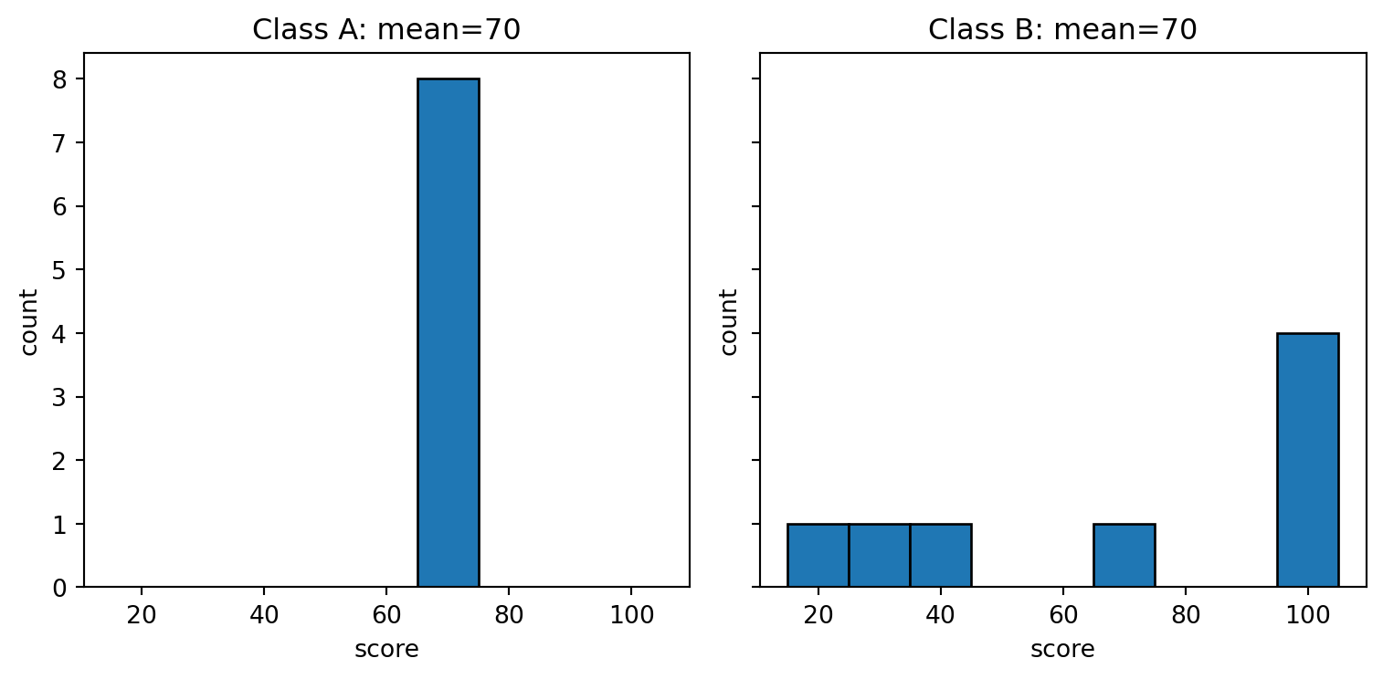
Plots of distributions with similar means but different spread and shape.

Distribution checklist: centre, spread, shape, tails
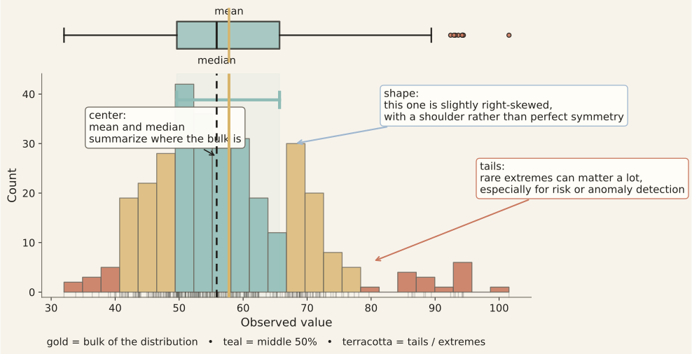
Before compressing data to one number, ask what kind of distribution you are looking at.

Lens Question Typical tools
Centre Where is the bulk? mean, median
Spread How variable are values? standard deviation, IQR, range
Shape Symmetric, skewed, multimodal? histogram, density, dot plot
Tails Are rare extreme values important? quantiles, boxplot, tail counts
Groups Are distributions different across groups? grouped histograms, boxplots, stratified summaries

Distribution checklist: centre, spread, shape, tails

Histogram and boxplot annotated with centre, spread, shape, and tail information.

Sample summaries: centre and spread

For a sample \(x_1,\ldots,x_n\):

Summary Plain meaning Python habit
mean arithmetic centre np.mean(x)
median middle after sorting np.median(x)
population standard deviation typical distance from the mean np.std(x, ddof=0)
range max minus min np.max(x) - np.min(x)

The notebook uses population standard deviation for this readiness check so the formula matches NumPy’s default.

Which summaries are most sensitive to one extreme value?

Quantiles and IQR: the middle 50%

Quantiles mark positions in sorted data.

  • \(Q_1\): ~25% of observations are at or below this value.
  • Median: ~50% are at or below this value.
  • \(Q_3\): ~75% are at or below this value.

\[ \operatorname{IQR}=Q_3-Q_1. \]
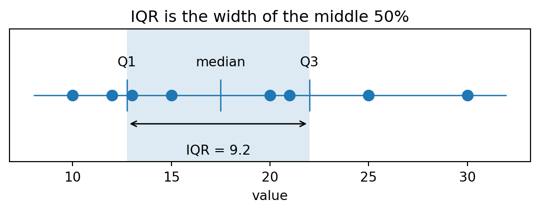
Q1, median, Q3, IQR: 12.75 17.5 22.0 9.25

Why might IQR be a safer summary of spread than range?

IQR outlier rule

One common heuristic (among others) flags values outside these fences:

\[ \text{lower fence}=Q_1-1.5\operatorname{IQR}, \qquad \text{upper fence}=Q_3+1.5\operatorname{IQR}. \]

Code
x = np.array([10, 11, 12, 13, 14, 100])
q1, q3 = np.quantile(x, [0.25, 0.75])
iqr = q3 - q1
lower = q1 - 1.5 * iqr
upper = q3 + 1.5 * iqr
mask = (x < lower) | (x > upper)
print("lower, upper:", lower, upper)
print("flagged values:", x[mask])
lower, upper: 7.5 17.5
flagged values: [100]

This is a rule of thumb, not a law of nature. Flagged rows still need context.

What is the difference between “flag for review” and “delete from the dataset”?

How one outlier drags the mean

Code
base = np.array([20, 22, 21, 19, 20, 23, 22, 21], dtype=float)
outliers = np.linspace(25, 140, 10)

if go is not None:
    frames = []
    for i, o in enumerate(outliers):
        x_all = np.r_[base, o]
        mean_val = x_all.mean()
        median_val = np.median(x_all)
        frames.append(go.Frame(
            name=f"step{i}",
            data=[
                go.Scatter(x=base, y=np.zeros_like(base), mode="markers", name="base waits"),
                go.Scatter(x=[o], y=[0], mode="markers", name="moving outlier"),
            ],
            layout=go.Layout(
                title_text=f"outlier={o:.0f}; mean={mean_val:.1f}; median={median_val:.1f}",
                shapes=[
                    dict(type="line", x0=mean_val, x1=mean_val, y0=-0.35, y1=0.35, line=dict(dash="dash")),
                    dict(type="line", x0=median_val, x1=median_val, y0=-0.35, y1=0.35, line=dict(dash="dot")),
                ],
            ),
        ))
    o0 = outliers[0]
    x0 = np.r_[base, o0]
    fig = go.Figure(data=frames[0].data, frames=frames)
    fig.update_layout(
        title_text=f"outlier={o0:.0f}; mean={x0.mean():.1f}; median={np.median(x0):.1f}",
        xaxis_title="wait time", yaxis=dict(showticklabels=False, range=[-1, 1]),
        xaxis=dict(range=[15, 150]), showlegend=False,
        shapes=frames[0].layout.shapes,
        updatemenus=[dict(type="buttons", buttons=[
            dict(label="Play", method="animate", args=[None, dict(frame=dict(duration=350, redraw=True), fromcurrent=True)]),
            dict(label="Pause", method="animate", args=[[None], dict(frame=dict(duration=0, redraw=False), mode="immediate")]),
        ])],
        sliders=[dict(steps=[dict(label=f"{o:.0f}", method="animate", args=[[f"step{i}"], dict(frame=dict(duration=0, redraw=True), mode="immediate")]) for i, o in enumerate(outliers)])],
    )
    fig.show()
else:
    fig, ax = plt.subplots(figsize=(7, 2.2))
    for o in [25, 140]:
        x_all = np.r_[base, o]
        ax.scatter(x_all, np.full_like(x_all, o), s=18)
        ax.axvline(x_all.mean(), linestyle="--", linewidth=1)
        ax.axvline(np.median(x_all), linestyle=":", linewidth=1)
    ax.set_xlabel("wait time")
    ax.set_yticks([25, 140], labels=["small outlier", "large outlier"])
    ax.set_title("Dashed = mean; dotted = median")
    plt.show()

When the outlier moves from 25 to 140, which summary changes more?

Outlier rules are choices

Outliers are not automatically “bad data.” They can be:

  • measurement errors;
  • rare but real cases;
  • a sign that the data-generating process changed;
  • exactly the events you care about.

A rule like “flag heart rate below 35 or above 120” should be documented as a choice, not treated as a universal law.

Interactive outlier rule

Bootstrap intuition

Bootstrapping asks: how much might a statistic change if sampling were repeated? Or, how much do our statistics depend on the small sample we happened to have obtained?

For many subsamples of your data, compute your statistic (e.g., mean), and then resample again and again.

  • you can see how your statistic changes over the many samples, which can give you a more correct idea of the expected statistic, and its spread.
Code
rng_boot = np.random.default_rng(42)
sample = np.array([72, 75, 78, 80, 95])
boot_means = []
for _ in range(2000):
    resample = rng_boot.choice(sample, size=len(sample), replace=True)
    boot_means.append(resample.mean())
boot_means = np.array(boot_means)
fig, ax = plt.subplots(figsize=(6,3.5))
ax.hist(boot_means, bins=25, edgecolor="black")
ax.axvline(sample.mean(), linestyle="--", linewidth=2)
ax.set_xlabel("bootstrap sample mean")
ax.set_ylabel("count")
plt.show()
print("sample mean:", sample.mean())
print("middle 90% of bootstrap means:", np.quantile(boot_means, [0.05, 0.95]))
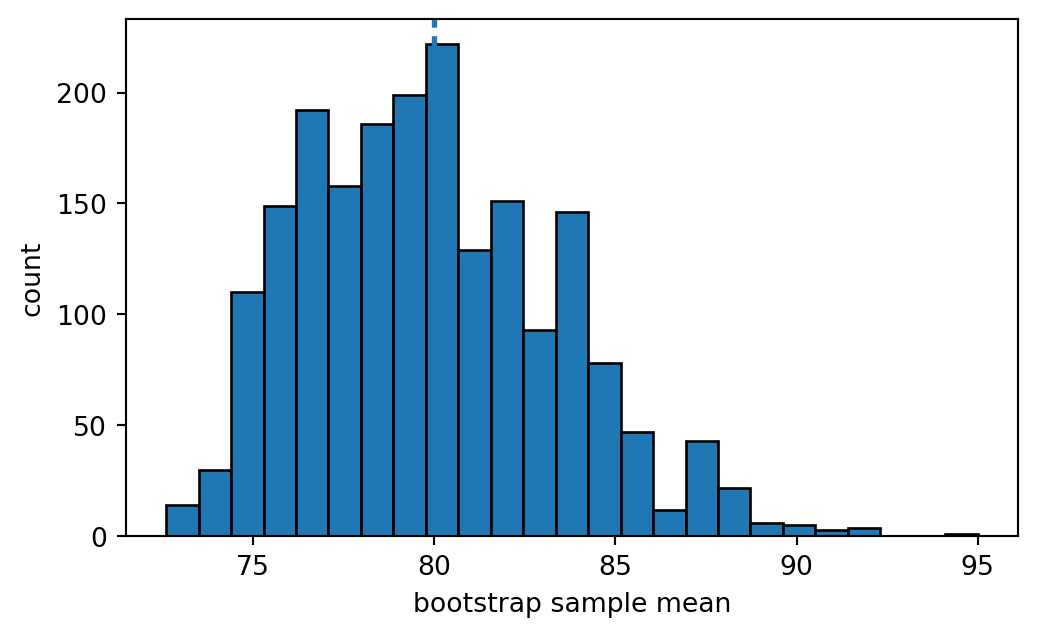
Bootstrap simulation plot showing variability in resampled means.

sample mean: 80.0
middle 90% of bootstrap means: [74.8 86. ]

Remember that statistics depend greatly on the data from which they were obtained.

ML evaluation bridge: train, validation, test

Obviously, models should not be evaluated on the same data that shaped them.

Split Statistical role What can go wrong?
training estimate parameters and preprocessing statistics sample is too small or unrepresentative
validation compare choices, thresholds, and other hyper-parameters repeated tuning overfits the validation sample
test estimate final performance once repeatedly trying to win the test is dishonest

Safe pattern:

---
config:
  theme: 'neutral'
  look: 'handDrawn'
---
flowchart LR
  train["fit on<br/>train"] --> valid["choose using<br/>validation"]
  valid --> test["report<br/>test once"]

Run it: a test score is a noisy statistic

Even if a model’s true accuracy were fixed (e.g., at 80%), the measured test accuracy would vary from one finite test sample to another.

Code
rng_score = np.random.default_rng(315104)
true_accuracy = 0.80
test_sizes = [50, 200, 1000]
repeats = 5000
bins = np.linspace(0.50, 1.00, 26)

fig, axes = plt.subplots(1, 3, figsize=(8, 3.2), sharex=True, sharey=True)
for ax, n_test in zip(axes, test_sizes):
    observed_accuracy = rng_score.binomial(n_test, true_accuracy, size=repeats) / n_test
    lo, hi = np.quantile(observed_accuracy, [0.05, 0.95])
    ax.hist(observed_accuracy, bins=bins, edgecolor="black", alpha=0.75)
    ax.axvline(true_accuracy, linestyle="--", linewidth=2)
    ax.set_title(f"test n={n_test}\n90% data range: {lo:.2f}{hi:.2f}")
    ax.set_xlabel("observed accuracy")
axes[0].set_ylabel("simulation count")
plt.suptitle("Reported test accuracy depends on the test sample")
plt.tight_layout()
plt.show()
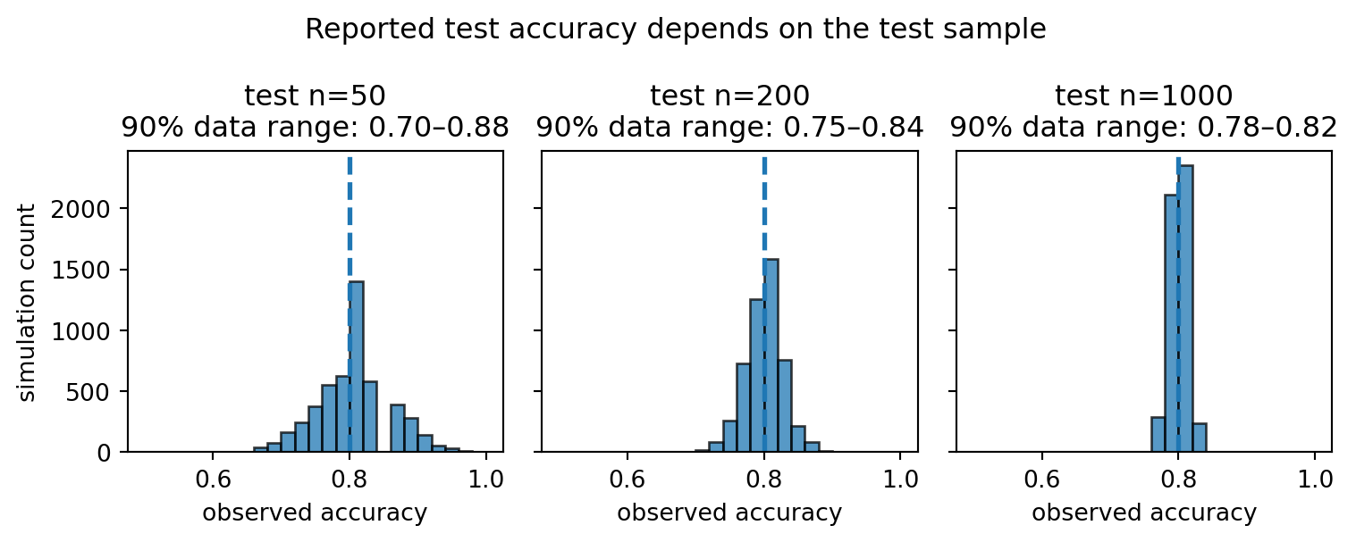
Simulation plot showing that a test accuracy estimate varies across samples.

A bigger held-out test set usually gives a more certain estimate. A peeked-at test set gives a dishonest estimate.

Why might a jump from 0.80 to 0.86 mean something different when the test set has 50 rows versus 1000 rows?

Arcade 3 quiz cards

  1. What is a sample space? What is an event?
  2. In a Venn diagram, what region is \(A\cap B\)? What region is \(A\cup B\)?
  3. In \(P(A\mid B)\), what is the denominator?
  4. Translate: “Among flagged emails, how many were truly spam?”
  5. Why can a 90% sensitive test still have a low posterior probability after a positive result?
  6. Why are mutually exclusive nonzero events usually not independent?
  7. What is hidden by a mean, and why might median/IQR/boxplots help?
  8. What is a sampling distribution, and how is it different from a sample distribution?
  9. What is the IQR outlier fence rule?
  10. What is the difference between an outlier and an error?
  11. Which split should be used to choose settings? Which split should be reserved for a final check?
  12. How can the same model have different measured test accuracy on two test samples?
  13. When a threshold moves, why can precision and recall move in different directions?

Notebook handoff: Arcade 3

Notebook checks C1–C16 cover: C1 probability arithmetic, C2 conditional probability from a confusion table, C3 Bayes’ rule, C4 natural-frequency counts, C5 expected value and variance, C6 sample statistics, C7 same-mean/different-shape distributions, C8 IQR outlier flags, C9 rule-based flags, C10 split counts, C11 leakage explanation, C12 event masks from rows, C13 reusable Bayes function, C14 threshold metrics, C15 score uncertainty, and C16 split base-rate preservation. The Venn and sampling-distribution slides are concept bridges for these checks rather than isolated extras.

Additional preparation

Bridge: from one example to many rows

So far, we have reasoned about one vector, one derivative, or one probability calculation.

You’ll have to automate this and run many, many experiments.

Can we do the same thing for every experiment, safely?

Let’s look at how ML is written.

Arcade 4: Python, NumPy & Vectorization

Outcome

By the end of Arcade 4, you can:

  • use NumPy arrays instead of slow row-by-row loops
  • predict and debug array shapes
  • explain broadcasting without guessing
  • compute distances, scores, and summaries vectorially
  • avoid common indexing, mutation, and leakage mistakes

Data table preflight

Before modelling, inspect the table.

df.shape
df.head()
df.info()
df.isna().sum()
df["target"].value_counts()

Ask:

  • What does one row mean?
  • Which column is the target?
  • Which columns are features?
  • Which columns are numeric, categorical, text, timestamps, or IDs?
  • Are values missing?
  • Are ranges suspicious?
  • Could any feature contain the answer or future information?

Why might an ID column be dangerous even if it is numeric?

Tidy enough for modelling

A common data-cleaning rule:

One row    = one observation
One column = one variable
One cell   = one value

But the right shape depends on the task.

student math_score english_score passed?
A 80 74 yes
B 91 69 yes

This is useful when the prediction target is one row per student.

student subject score
A math 80
A english 74
B math 91
B english 69

This is useful when subject is itself an observation dimension.

Dtype traps

Numbers stored as strings are not numbers.

Code
as_strings = np.array(["1", "2", "10"])
as_numbers = np.array([1, 2, 10])
print("string sorted order:", sorted(as_strings.tolist()))
print("string max by lexicographic order:", sorted(as_strings.tolist())[-1])
print("numeric max:", as_numbers.max())
string sorted order: ['1', '10', '2']
string max by lexicographic order: 2
numeric max: 10

Common traps:

  • "7" is not the same as 7;
  • "unknown" in a numeric column can break math operations;
  • dates and IDs are not automatically meaningful coordinates;
  • category labels are not automatically meaningful numbers.

Why is "10" smaller than "2"?

Axis compass: which direction did you reduce?

In a feature matrix, axis=0 summarizes down rows for each column. axis=1 summarizes across columns for each row.

Code
X_axis = np.array([[1, 10, 100],
                   [2, 20, 200],
                   [3, 30, 300],
                   [4, 40, 400]])
print("X shape:", X_axis.shape)
print("mean(axis=0):", X_axis.mean(axis=0), "<- one mean per feature")
print("mean(axis=1):", X_axis.mean(axis=1), "<- one mean per row")
X shape: (4, 3)
mean(axis=0): [  2.5  25.  250. ] <- one mean per feature
mean(axis=1): [ 37.  74. 111. 148.] <- one mean per row

Which axis would you use to compute training-column means for imputation or standardization?

Boolean masks

A mask is a vector of yes/no answers, one answer per row.

Code
heart_rate = np.array([72, 88, 41, 130, 64, 55])
mask = (heart_rate < 50) | (heart_rate > 120)
print("heart_rate:", heart_rate)
print("mask:      ", mask)
print("flagged:   ", heart_rate[mask])
print("number flagged:", mask.sum())
heart_rate: [ 72  88  41 130  64  55]
mask:       [False False  True  True False False]
flagged:    [ 41 130]
number flagged: 2

The mask has the same length as the data. Indexing with it keeps the rows where the answer is True.

Why does mask.sum() count flagged rows?

One-hot encoding: categories become axes

For unordered categories, do not invent fake numeric distances. Make one coordinate per category. We’ve seen this 🔗 before

Code
labels = np.array(["red", "blue", "green", "red", "green"])
classes = np.array(["blue", "green", "red"])
one_hot = (labels[:, None] == classes[None, :]).astype(int)
print("classes:", classes)
print(one_hot)
classes: ['blue' 'green' 'red']
[[0 0 1]
 [1 0 0]
 [0 1 0]
 [0 0 1]
 [0 1 0]]

Each row has a 1 in the coordinate matching its category.

What geometric claim would blue = 0, green = 1, red = 2 make that one-hot encoding avoids?

Missingness can mean something

Missing values are not always random noise.

Examples:

  • income missing because someone chose not to report it;
  • lab result missing because a doctor did not (need to) order the test;
  • rating missing because a user never watched the movie;
  • sensor reading missing because the sensor failed under extreme conditions.

Filling in missing values can be useful, but it is a modelling choice; it does not recover reality.

Why might “missing lab test” itself be predictive in a hospital dataset?

Missing-value repair: training-column means

A common preprocessing repair is to replace missing values with training-column means. This is one form of imputation.

Code
X_train_missing = np.array([[1.0, np.nan], [3.0, 10.0], [5.0, 14.0]])
X_val_missing = np.array([[np.nan, 12.0], [9.0, np.nan]])

train_col_means = np.nanmean(X_train_missing, axis=0)

def fill_with_training_means(X, means):
    X_filled = X.copy()
    rows, cols = np.where(np.isnan(X_filled))
    X_filled[rows, cols] = means[cols]
    return X_filled

print("training means:", train_col_means)
print("filled train:\n", fill_with_training_means(X_train_missing, train_col_means))
print("filled validation:\n", fill_with_training_means(X_val_missing, train_col_means))
training means: [ 3. 12.]
filled train:
 [[ 1. 12.]
 [ 3. 10.]
 [ 5. 14.]]
filled validation:
 [[ 3. 12.]
 [ 9. 12.]]

Why should missing values in a validation set not change the imputation means?

Train-only preprocessing pattern

Bad:

scaler.fit(X_all)
X_train_scaled = scaler.transform(X_train)
X_test_scaled  = scaler.transform(X_test)

Good:

scaler.fit(X_train)
X_train_scaled = scaler.transform(X_train)
X_test_scaled  = scaler.transform(X_test)

You can transform the test set, under particular conditions, but you can’t use the test set to learn the transformation.

This applies to scaling, imputation, feature selection, encoding decisions, and hyperparameter choices.

Split discipline: random is not always balanced

If a class is rare, a purely random split can produce a validation or test set that does not contain the rare class.

Code
rng_split = np.random.default_rng(7)
y = np.array([0]*95 + [1]*5)

for trial in range(8):
    test_idx = rng_split.choice(np.arange(len(y)), size=20, replace=False)
    positives = y[test_idx].sum()
    print(f"trial {trial}: positives in test = {positives}")
trial 0: positives in test = 1
trial 1: positives in test = 2
trial 2: positives in test = 1
trial 3: positives in test = 1
trial 4: positives in test = 0
trial 5: positives in test = 2
trial 6: positives in test = 2
trial 7: positives in test = 1

Stratification tries to preserve class proportions across splits. The principle matters even when you use library functions for this purpose.

What would recall mean on a test set with zero actual positives?

Vectorization and operating on arrays directly

We want to compute all pairwise distances between two small sets of points at once.

Instead of computing one distance at a time in nested for-loops, compute a whole distance table.

Code
A = np.array([[0, 0], [1, 0]], dtype=float)
B = np.array([[0, 1], [1, 1], [2, 0]], dtype=float)
diff = A[:, None, :] - B[None, :, :]
distances = np.sqrt(np.sum(diff**2, axis=2))
print("diff shape:", diff.shape)
print(distances)
diff shape: (2, 3, 2)
[[1.     1.4142 2.    ]
 [1.4142 1.     1.    ]]

Vectorization duel: same math, different route

Start your engines! 3…2…1…

Code
import time
rng_vec = np.random.default_rng(123)
A_big = rng_vec.normal(size=(1500, 5))
query = rng_vec.normal(size=5)

start = time.perf_counter()
loop_dist = np.array([np.sqrt(np.sum((row - query)**2)) for row in A_big])
loop_time = time.perf_counter() - start

start = time.perf_counter()
vec_dist = np.sqrt(np.sum((A_big - query)**2, axis=1))
vec_time = time.perf_counter() - start

print("same answers:", np.allclose(loop_dist, vec_dist))
print(f"loop time:       {loop_time:.6f}s")
print(f"vectorized time: {vec_time:.6f}s")
same answers: True
loop time:       0.002759s
vectorized time: 0.000057s

The conceptual simplicity may be just as important as the speed win.

Why scaling matters for distance

Distance is sensitive to units. A large-scale feature can dominate even when it is not more important.

Code
A = np.array([1.0, 1000.0])
B = np.array([2.0, 1010.0])
C = np.array([5.0, 1001.0])

print("raw distance A-B:", np.linalg.norm(A - B))
print("raw distance A-C:", np.linalg.norm(A - C))

X = np.vstack([A, B, C])
X_scaled = (X - X.mean(axis=0)) / X.std(axis=0, ddof=0)
print("scaled distance A-B:", np.linalg.norm(X_scaled[0] - X_scaled[1]))
print("scaled distance A-C:", np.linalg.norm(X_scaled[0] - X_scaled[2]))
raw distance A-B: 10.04987562112089
raw distance A-C: 4.123105625617661
scaled distance A-B: 2.300262765687606
scaled distance A-C: 2.3638764959092273

The nearest neighbour can change after scaling. Scaling needs to be part of your math.

K nearest neighbours

KNN can be written from scratch once you know arrays, distances, sorting, and voting. When distances tie, we use a stable sort so the lower original index wins consistently.

Code
X_train_knn = np.array([
    [1.0, 1.0],
    [1.2, 0.8],
    [3.0, 3.2],
    [3.3, 2.8],
    [0.8, 1.3],
])
y_train_knn = np.array([0, 0, 1, 1, 0])
x_query = np.array([2.0, 2.0])
k = 3

dist = np.linalg.norm(X_train_knn - x_query, axis=1)
nearest = np.argsort(dist, kind="stable")[:k]
votes = y_train_knn[nearest]
prediction = int(votes.mean() >= 0.5)

print("distances:", dist)
print("nearest indices:", nearest)
print("nearest labels:", votes)
print("prediction:", prediction)
distances: [1.4142 1.4422 1.562  1.5264 1.3892]
nearest indices: [4 0 1]
nearest labels: [0 0 0]
prediction: 0

Which line would change if distance were Manhattan distance instead of Euclidean distance?

Broadcasting trap

Broadcasting produces results with valid syntax but (potentially) the wrong meaning. Predict the shape of each expression before running code, then check whether the result is meaningful.

Code
X_btq = np.array([[1.0, 2.0, 3.0],
                  [4.0, 5.0, 6.0],
                  [7.0, 8.0, 9.0]])

col_means = X_btq.mean(axis=0)   # shape (3,) — mean of each feature column
row_means = X_btq.mean(axis=1)   # shape (3,) — mean of each row

# Both of these run without error here because X is 3x3.
# Which one centers each row?
version_A = X_btq - col_means              # subtracts col_means broadcast across rows
version_B = X_btq - row_means[:, None]     # subtracts row_means broadcast across columns

print("col_means:", col_means)
print("row_means:", row_means)
print("\nversion_A row 0:", version_A[0])
print("version_B row 0:", version_B[0])

X_rect = np.ones((4, 3))
print("rectangular X shape:", X_rect.shape)
print("row means shape:", X_rect.mean(axis=1).shape)
col_means: [4. 5. 6.]
row_means: [2. 5. 8.]

version_A row 0: [-3. -3. -3.]
version_B row 0: [-1.  0.  1.]
rectangular X shape: (4, 3)
row means shape: (4,)

For a rectangular X.shape == (n, d), X - X.mean(axis=1) usually fails because (n,) does not align with (n, d) unless n == d.

Correct row-centring:

X - X.mean(axis=1, keepdims=True)
# or
X - X.mean(axis=1).reshape(-1, 1)

Correct column-centring:

X - X.mean(axis=0)

Arcade 4 quiz cards

  1. What shape does A[:, None, :] - B[None, :, :] have if A is (n,d) and B is (m,d)?
  2. Why does pairwise distance sum over axis=2?
  3. What does np.argmin(distances, axis=1) choose?
  4. X - X.mean(axis=1) usually raises a ValueError for X.shape == (n,d). Why? How do you fix it to subtract each row’s mean?
  5. Why should imputation means be fitted on training data only?
  6. Why can missingness itself be information?

Notebook handoff: Arcade 4

Notebook checks D1–D12 cover vectorized sums, centring, masks, one-hot encoding, pairwise distances, nearest labels, KNN voting, top-k indices, missing-value imputation, safe standardization, and broadcasting shapes.

Additional preparation

Python fluency for ML is not memorizing functions. It is seeing the shape of the computation before typing it.

Bridge: from computation to evidence

To turn a computed result into evidence, we need to say:

  • what comparison was made;
  • what metric was used;
  • what data were used to choose settings;
  • what data were saved for the final check;
  • what failure mode would weaken the conclusion.

Our last arcade will focus on communication of results.

Arcade 5: Plots & Evidence

Outcome

By the end of Arcade 5, you can:

  • separate training, validation, and test decisions
  • compare a model against a baseline
  • choose metrics that match the real error cost
  • recognize leakage, overfitting, and unsupported claims
  • communicate what the evidence does and does not prove

Communicating truth with plots

A plot needs to communicate the truth clearly. Before judging whether it works, ask three questions.

Layer Question In plain language
Why? What task, audience, or decision is this for? What job must the plot do?
What? What data, rows, variables, and summaries are shown? What evidence is being offered?
How? What marks, channels, scales, and layout are used? How does the design guide the eye?

A good plot helps the reader understand the message effectively.

A misleading plot may use real data but still push the reader toward a conclusion the data do not support.

The practical test: would you show the table?

Before sharing a plot, ask:

  • Does it overstate the result?
  • Are the axes and units clear?
  • Are small groups or missing groups hidden?
  • Would alternative comparisons change the interpretation?
  • Would uncertainty weaken the claim?
  • Would the full data make the claim look weaker?

This is the same habit we need for ML results: a reported score is a communication of evidence.

Boxplots: compact distribution comparison

A boxplot is a compact view of median, IQR, and potential tail values.

Code
class_A = np.array([69, 70, 71, 68, 72, 70, 69, 71])
class_B = np.array([20, 30, 40, 70, 100, 100, 100, 100])

fig, ax = plt.subplots(figsize=(5.5, 3.5))
ax.boxplot([class_A, class_B], labels=["Class A", "Class B"], showmeans=True)
ax.set_ylabel("score")
ax.set_title("Same mean, different spread and tails")
plt.show()
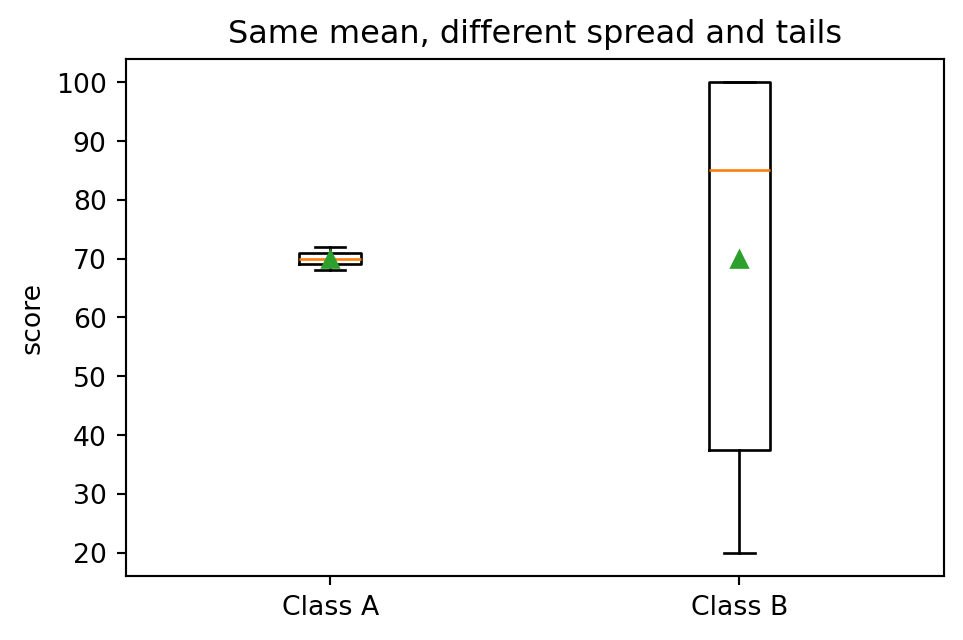
Boxplots comparing distributions across groups.

Boxplots are useful for comparing groups quickly. Histograms show shape better. Use both when stakes are high.

What does the boxplot reveal faster than the mean? What does it hide compared with the histogram?

Plots can tell the truth badly

Same values on different axes conveys meaning differently.

Code
groups = ["old", "new"]
values = [82, 86]
fig, axes = plt.subplots(1, 2, figsize=(8, 3.5))
axes[0].bar(groups, values)
axes[0].set_ylim(0, 100)
axes[0].set_title("Full scale")
axes[0].set_ylabel("score")
axes[1].bar(groups, values)
axes[1].set_ylim(80, 88)
axes[1].set_title("Truncated scale")
axes[1].set_ylabel("score")
plt.tight_layout()
plt.show()
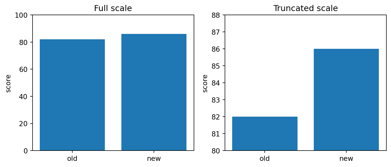
Bar charts comparing a truncated axis with a fuller axis to show how plots can mislead.

When would someone be incentivized to over-emphasize? To under-emphasize?
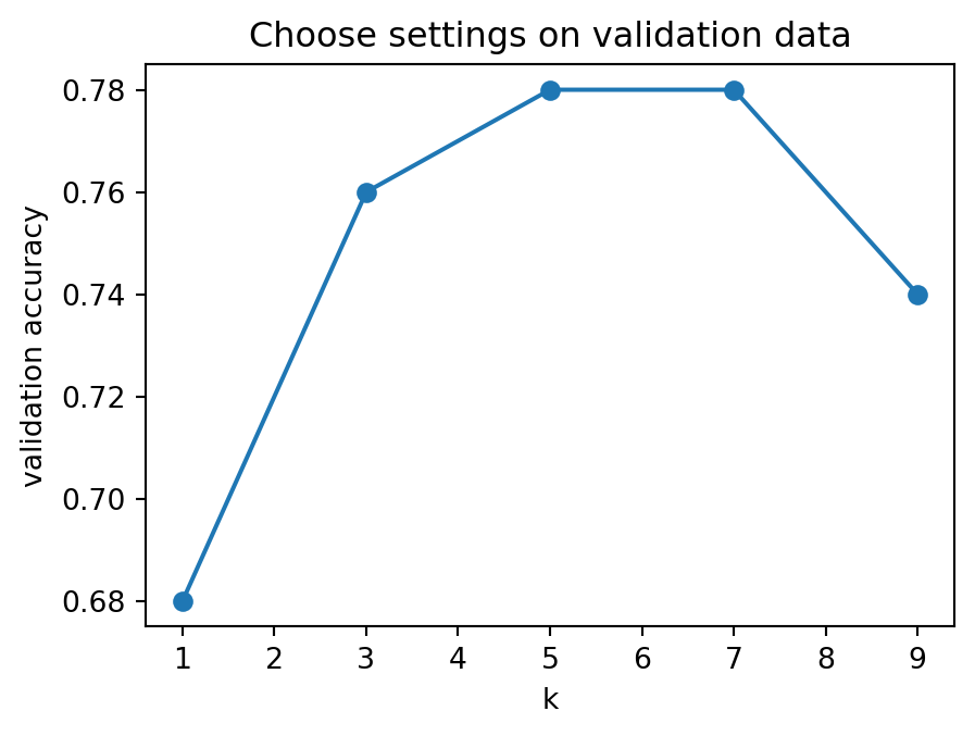
Counts need denominators

Raw counts can hide rates.

School Absences Students Absence rate
A 200 2000 10%
B 50 200 25%

School A has more absences. School B has the higher absence rate.

This is the same denominator habit as conditional probability and precision/recall.

When might raw counts be the right thing to show? When might rates be better?

Baseline first

A baseline is the simple thing your model must beat.

Task Baseline
Predict house price always predict the training mean
Classify rare disease always predict “no disease”
Recommend videos recommend most popular videos
Forecast tomorrow predict same as today
Predict pass/fail predict the majority class

Note

A fancy model that does not beat a simple baseline is not useful yet.

If a harder baseline is available, use that. There’s little value in showing superiority to easy baselines.

A model that crushes the baseline suspiciously well might be leaking.

Baseline example

Code
y_train = np.array([0, 0, 0, 0, 1, 0, 0, 1, 0, 0])
y_val = np.array([0, 1, 0, 0, 0])
majority_class = int(np.mean(y_train) >= 0.5) # this works because of the binary task and the pigeonhole principle, the coolest and most cool of all principles.
y_pred_base = np.full_like(y_val, majority_class)
print("training positive rate:", y_train.mean())
print("majority baseline prediction:", majority_class)
print(metric_summary(y_val, y_pred_base))
training positive rate: 0.2
majority baseline prediction: 0
{'TP': 0, 'FP': 0, 'FN': 1, 'TN': 4, 'accuracy': 0.8, 'precision': nan, 'recall': 0.0}

What metric would make this baseline look strong even if it never finds positives?

Clean workflow vs leaky workflow

A clean workflow keeps evaluation data out of earlier choices.

---
config:
  theme: 'neutral'
  look: 'handDrawn'
---
flowchart LR
  Raw["Raw data"] --> Split["Split into<br>train / validation / test"]
  Split --> FitPre["Fit preprocessing<br>on train only"]
  FitPre --> Choose["Choose settings using<br>train/validation"]
  Choose --> Test["Evaluate once<br>on test"]

  Raw2["Raw data"] --> BadPre["Fit preprocessing<br>on all data"]
  BadPre --> BadSplit["Then split"]
  BadSplit --> BadScore["Over-optimistic<br>score"]

Why is fitting a scaler on all rows before splitting a leak?

Stratification: a random split of an imbalanced dataset can put all rare-class examples into test. What does accuracy mean if the test set has no positives at all?

Leakage monsters

Leakage means the model got information it would not have at real prediction time.

Leakage type What happened Example
Target leakage a feature contains the answer predicting pass/fail using final grade
Train-test contamination test examples influence training duplicate rows split across train and test
Temporal leakage future information used predicting readmission using medication prescribed after readmission
Preprocessing leakage transformation learned from test data scaler fit before splitting
Repeated test tuning test set used as practice arena trying many settings and keeping the best test score

Which leakage type is “predicting final exam score using course grade after the final exam”?

Suspiciously good score?

You found a 99.9% accurate model. Are you ready to deploy it?

Checklist:

  • Did a feature copy the target?
  • Were duplicates split across train and test?
  • Was preprocessing fit before splitting?
  • Was future information used?
  • Was the test set used repeatedly?
  • Is class imbalance hiding failure?
  • Does performance collapse on a new time period or subgroup?

Why can a surprisingly good result be a warning sign rather than a victory?

Validation curve

Code
k_values = np.array([1, 3, 5, 7, 9])
val_acc = np.array([0.68, 0.76, 0.78, 0.78, 0.74])
fig, ax = plt.subplots(figsize=(5, 3.5))
ax.plot(k_values, val_acc, marker="o")
ax.set_xlabel("k")
ax.set_ylabel("validation accuracy")
ax.set_title("Choose settings on validation data")
plt.show()

Line plot of validation score against k, showing model-setting selection.

Confusion matrix decoder

Accuracy hides what kind of errors a model makes.

Actual positive Actual negative
Predicted positive TP FP
Predicted negative FN TN

\[ \text{accuracy}=\frac{TP+TN}{TP+FP+FN+TN} \]

\[ \text{precision}=\frac{TP}{TP+FP},\qquad \text{recall}=\frac{TP}{TP+FN}. \]

Plain language:

precision: When the model says yes, how often is it right?
recall:    Of the real yes cases, how many did it find?

Precision and recall practice

A spam filter flags 10 emails as spam.

8 are genuinely spam  -> TP = 8
2 are not spam        -> FP = 2
5 real spam emails are missed -> FN = 5

Therefore:

\[ \text{precision}=\frac{8}{8+2}=0.80, \qquad \text{recall}=\frac{8}{8+5}\approx 0.62. \]

Metric choice depends on error costs.

Scenario Costly error
spam filter false positive may hide real email
disease screening false negative may miss treatment
fraud detection both errors can be expensive
recommendation false positive may be annoying, not catastrophic

Thresholds should answer an error-cost question

A threshold should (usually) reflect the cost of false alarms and missed cases.

Code
scores = np.array([0.95, 0.88, 0.80, 0.73, 0.61, 0.55, 0.42, 0.35, 0.22, 0.10])
y_true = np.array([1, 1, 0, 1, 0, 1, 0, 0, 1, 0])
thresholds = np.linspace(0.1, 0.9, 17)
false_positive_cost = 1
false_negative_cost = 5

rows = []
for th in thresholds:
    pred = scores >= th
    c = confusion_counts(y_true, pred)
    cost = false_positive_cost*c["FP"] + false_negative_cost*c["FN"]
    rows.append((th, c["FP"], c["FN"], cost))

best = min(rows, key=lambda r: r[-1])
for th, fp, fn, cost in rows:
    mark = "<-- lowest cost" if th == best[0] else ""
    print(f"threshold={th:.2f}  FP={fp}  FN={fn}  cost={cost:2d} {mark}")
threshold=0.10  FP=5  FN=0  cost= 5 
threshold=0.15  FP=4  FN=0  cost= 4 <-- lowest cost
threshold=0.20  FP=4  FN=0  cost= 4 
threshold=0.25  FP=4  FN=1  cost= 9 
threshold=0.30  FP=4  FN=1  cost= 9 
threshold=0.35  FP=4  FN=1  cost= 9 
threshold=0.40  FP=3  FN=1  cost= 8 
threshold=0.45  FP=2  FN=1  cost= 7 
threshold=0.50  FP=2  FN=1  cost= 7 
threshold=0.55  FP=2  FN=1  cost= 7 
threshold=0.60  FP=2  FN=2  cost=12 
threshold=0.65  FP=1  FN=2  cost=11 
threshold=0.70  FP=1  FN=2  cost=11 
threshold=0.75  FP=1  FN=3  cost=16 
threshold=0.80  FP=1  FN=3  cost=16 
threshold=0.85  FP=0  FN=3  cost=15 
threshold=0.90  FP=0  FN=4  cost=20 

What happens to the chosen threshold if false positives become much more costly than false negatives?

Prediction is not causation

A model can predict well using patterns that are not causes.

Examples:

  • ice cream sales predict drowning risk because both rise in summer;
  • fire trucks predict fire damage because bigger fires bring more trucks;
  • hospital risk scores may reflect who gets treated more often.

Prediction question:

Can X help predict Y?

Causal question:

What would happen to Y if we intervened and changed X?

A model finds that students with laptops score higher. Does that prove giving every student a laptop will raise scores?

Simpson’s paradox

Aggregates can hide subgroup patterns.

Group Treatment A Treatment B Better within group
Easy cases 81/87 = 93% 234/270 = 87% A
Hard cases 192/263 = 73% 55/80 = 69% A
Overall 273/350 = 78% 289/350 = 83% B

Treatment A looks better inside each subgroup, but Treatment B looks better overall because the groups are mixed differently.

Fairness and responsibility checkpoint

Responsible ML asks more than “is the score high?”

This is a deep and broad topic, and I suggest 🔗this free course

Misconception:

“We removed the sensitive column, so the model is fair.”

Correction:

Other variables can act as proxies. Fairness has to be checked, not assumed.

Privacy myth card

Misconception:

“We removed names, so the data is anonymous.”

Correction:

Age, postal code, school, timestamp, rare diagnoses, or unusual combinations can still re-identify people.

Readiness habit:

Before sharing data, ask what combinations of columns could point back to a person.

Evidence statement template

A strong evidence statement includes as much relevant information as possible, but still as concisely as possible.

We asked [question] using [data]. We compared [method] against [baseline] using [metric]. Preprocessing and settings were learned using training/validation data only. The final test result was [number]. The main uncertainty is [uncertainty]. We checked for [leakage/fairness/failure mode]. I would trust the claim more if [severe test] still looked good.

That said, don’t let your Science be about filling in this template. Different claims require different evidence.

Evidence mindset

My preferred approach to communication: the three Cs

  1. Concision: Do not add fluff. Keep it to-the-point.
  2. Clarity: (alt. coherence) Explain in a way that is unambiguous and understandable.
  3. Correctness: Make every statement as close as possible to the Truth.

Additional preparation

Don’t draw plots for their own sake. Function over form – it’s more important to tell the full truth than to tell a half-truth beautifully.

Arcade 5 quiz cards

  1. Why are axis labels part of the evidence?
  2. What does a confusion matrix show that accuracy hides?
  3. A classifier has precision 0.9 and recall 0.4. What does that say about its error pattern?
  4. If two settings tie on validation accuracy, why should the tie-break rule be fixed in advance?
  5. Why is a baseline necessary?
  6. Give one example of leakage.
  7. Why is prediction not the same as causation?
  8. What should an evidence statement include besides a number?

Notebook handoff: Arcade 5

Notebook checks E1–E8 cover labeled plotting, accuracy, confusion matrices, Anscombe correlations, validation selection, validation curves, evidence statements, and legal-versus-leaky workflow checks. Precision and recall are practiced earlier in Arcade 3.

Epilogue:
The Door to Machine Learning

The Journey So Far

This readiness arcade was not meant as a course on these topics, nor does it replace your course pre-requisites.

But we want to make sure we have some of the necessary tools for learning AI/ML.

You practiced five habits ML depends on:

  • shape: vectors, matrices, features, and scores
  • change: slopes, gradients, and sensitivity
  • uncertainty: probability, sampling, and noisy evidence
  • computation: arrays, broadcasting, and vectorized code
  • evidence: baselines, splits, metrics, and honest claims

Final Boss: Gate Triage Evidence Memo

The notebook ends with a brief capstone: a synthetic gate-machine triage problem.

You will not train a modern ML model yet. You will connect the readiness pieces:

  1. read a data card;
  2. choose a majority-class baseline;
  3. standardize with training statistics only;
  4. tune KNN using validation data;
  5. evaluate once on the test set;
  6. inspect the confusion matrix;
  7. write an evidence memo.

Final Boss route

Data card
  -> train / validation / test split
  -> train-only preprocessing
  -> validation choice of k
  -> one test evaluation
  -> confusion matrix
  -> evidence memo
Habit Final Boss question
Shape What are the rows, features, and target?
Change What would change your mind about the claim?
Uncertainty How much should one small test score be trusted?
Computation Did the array operations do what you meant?
Evidence Did KNN beat a baseline without leakage?

Evidence memo template

Use this structure in the final notebook cell.

Question:
Rows / features / target:
Baseline:
Model and validation choice:
Preprocessing learned from:
Final test result:
Confusion matrix / important errors:
Leakage checks:
Main uncertainty:
Decision:
What would change my mind:

ML builds on this foundation

You should now have more of the background you’ll need.

Trying to do AI and Machine Learning without understanding the math would be like

  • trying to run a nuclear power plant without understanding Physics.
  • performing surgery on a patient without having been trained in Medicine.

I recommend courses like

What readiness should feel like

You are ready to start ML when you instinctively ask:

  • What are the rows, features, target, and units?
  • What shape should this object have?
  • What data was allowed to influence this step?
  • What baseline must this beat?
  • What error matters most?
  • What evidence would change my mind?

What readiness should feel like

The most important things to take with you are:

  • curiosity
  • patience with notation and details
  • respect for data
  • suspicion of easy wins
  • willingness to check your work and admit when you’re wrong

The more you know, the more you realize how much you don’t know.

You may never feel like you have all the tools ready to go, but you should have the confidence to go out and acquire them.

Good luck!