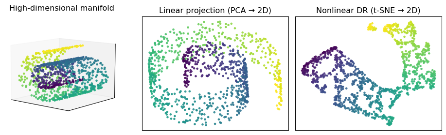
Figure 1: Manifold intuition: a 3D Swiss roll (left), linear PCA projection to 2D (middle), and a nonlinear t-SNE embedding (right) that better respects the curved manifold.
Linear vs nonlinear DR
Linear DR (e.g., PCA)
Uses linear maps \(z = W^\top x\).
Good when:
The main structure is roughly linear or gently curved.
We care about variance explained and global trends.
Limitations:
Can’t “unroll” strongly nonlinear manifolds.
Often mixes distinct clusters if they overlap in linear projections.
Nonlinear DR
Learns a nonlinear mapping \(x \mapsto z\) (often implicitly).
Tries to preserve:
Local neighbourhoods (who’s close to whom),
Sometimes approximate global geometry.
t-SNE & UMAP:
Designed mainly as visualization tools for high-dimensional data.
Produce low-dimensional embeddings where clusters are easier to see (but easy to over-interpret!).
t-SNE, informally
t-SNE (t-distributed Stochastic Neighbor Embedding) (Maaten and Hinton 2008) starts from a simple idea:
If two points are close in the original space, they should be close in the embedding.
Steps (informal):
In high dimensions, turn distances into probabilities:
For each point \(x_i\), define neighbours \(x_j\) with conditional probabilities \[p_{j\mid i} \propto \exp\Big(-\frac{\|x_i - x_j\|^2}{2\beta_i^2}\Big).\]
The bandwidth \(\beta_i\) is chosen so that each point has a fixed perplexity (an “effective # neighbours”).
Symmetrize to get joint probabilities \(P_{ij}\) for pairs \((i,j)\).
In low dimensions, we place points \(y_i\) and define \[q_{ij} \propto \Big(1 + \|y_i - y_j\|^2\Big)^{-1},\] a 🔗 Student t-distribution with heavy tails.
Choose the \(y_i\) to make \(Q\) (low-dim similarities) match \(P\) (high-dim similarities) by minimizing 🔗 KL divergence\[C = \mathrm{KL}(P \,\|\, Q) = \sum_{i,j} P_{ij} \log \frac{P_{ij}}{Q_{ij}}.\]
Optimization is done with gradient descent, from a random (or PCA) initialization.
Visual comparison: PCA vs t-SNE
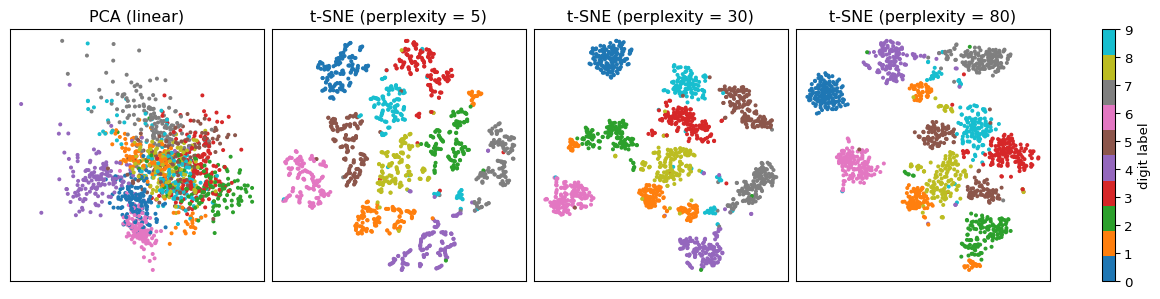
Same data, four embeddings:
Left: 2D PCA (linear, variance-focused).
Right three: 2D t-SNE with different perplexities (how many neighbours each point “cares about”).
Small perplexity → very local, can fragment clusters.
Medium perplexity → often a nice compromise.
Large perplexity → emphasizes broader structure.
Notice how t-SNE tends to produce tighter, more separated digit clusters than PCA,
while different perplexities trade off how fine-grained those clusters look.
Figure 2: PCA vs t-SNE on handwritten digits. PCA mixes many digits; t-SNE tends to form tighter, more separated clusters, with perplexity controlling how local the structure is.
🔬 Why t-SNE loves local structure
Key property:
The KL divergence \(C = \sum_{i,j} P_{ij} \log \tfrac{P_{ij}}{Q_{ij}}\) weights pairs with large \(P_{ij}\) much more than pairs with tiny \(P_{ij}\).
Consequences:
If \(P_{ij}\) is big (points are close in high-dim), but \(Q_{ij}\) is small (far apart in 2D),
The term \(P_{ij} \log \tfrac{P_{ij}}{Q_{ij}}\) is large → strong gradient push to bring \(y_i\) and \(y_j\)closer.
If \(P_{ij}\) is tiny (far in high-dim), then even large distortions in \(Q_{ij}\) barely affect \(C\).
Short reasoning sketch
For a fixed \(P_{ij}\), \(C\) as a function of \(Q_{ij}\) behaves like \(P_{ij}(-\log Q_{ij})\) plus constants.
The gradient magnitude \(\left|\frac{\partial C}{\partial Q_{ij}}\right| \approx \frac{P_{ij}}{Q_{ij}}\):
Big when \(P_{ij}\) is large and \(Q_{ij}\) is small.
Tiny when \(P_{ij}\) is small.
So t-SNE prioritizes keeping neighbours together (high \(P_{ij}\)), and is much more relaxed about global distances between far-away points.
Note
This is why t-SNE plots often show nice separated clusters, but relative distances between those clusters are not trustworthy(Maaten 2014).
t-SNE knobs you must know
Important hyperparameters:
Perplexity
Roughly, the effective number of neighbours each point “cares about” (10–50 is common).
Smaller → focus on very local structure (can fragment clusters).
Larger → consider broader neighbourhoods (can merge small clusters).
Learning rate
Too small → very slow convergence.
Too large → points can overshoot and form weird artifacts.
Initialization
init="random" vs init="pca":
PCA init can help stabilize global layout but doesn’t fix all issues.
Random seed
Different seeds → different-looking embeddings(!)
Good practice: run t-SNE multiple times and check qualitative stability.
UMAP (“Uniform Manifold Approximation and Projection”) [McInnes, Healy, and Melville (2018);mcinnes2018umap-software] starts from:
Assume data lie on a manifold with a certain local dimension and metric.
Approximate its structure with a weighted graph, then find a low-dim embedding that preserves this graph as much as possible.
Key steps (informal):
High-dimensional graph
For each point, find its \(k\)nearest neighbours.
Turn distances into edge weights (fuzzy connection strengths).
Combine these into a weighted, undirected graph.
Low-dimensional graph
Place points in 2D (or 3D) and define a similar fuzzy graph in the embedding.
Optimization
Minimize a cross-entropy between the high- and low-dimensional fuzzy graphs.
This pushes strongly-connected pairs together and weakly-connected pairs apart.
Important hyperparameters:
n_neighbors — trade-off between local vs global structure
Small: emphasizes very local neighbourhoods.
Large: more global structure, clusters less separated.
min_dist — how tightly points can pack within a cluster.
Small: tight, dense clusters.
Larger: more spread-out clusters.
UMAP is typically faster than t-SNE and scales better to very large datasets (Becht et al. 2019).
❌ Anti-example: over-interpreting a t-SNE/UMAP plot
Suppose you run t-SNE on patient embeddings from an ICU dataset and see:
A big blue cluster (patients who survived),
A smaller red cluster (patients who died),
The red cluster appears far away from the blue one.
A tempting (but wrong) story:
“Red is far from blue, so these patients are fundamentally different,
and the model has discovered a clearly separable high-risk subgroup.”
Issues:
Distances between clusters in t-SNE / UMAP are not metric distances:
Layout can change dramatically with perplexity / n_neighbors, min_dist, or random seed.
Rotation, reflection, and non-linear warping of the embedding don’t change the cost.
The embedding may hide confounders:
If you didn’t account for hospital, ward, or time, clusters may reflect data-collection quirks.
The plot mixes train and test sets, so you can’t tell if the pattern generalizes.
Better practice:
Report classification metrics (e.g., ROC–AUC, calibration) on a held-out test set.
Use t-SNE/UMAP as supporting visual evidence, not the main result.
Check robustness:
Change hyperparameters and seeds.
Compare to PCA or a simple baseline embedding.
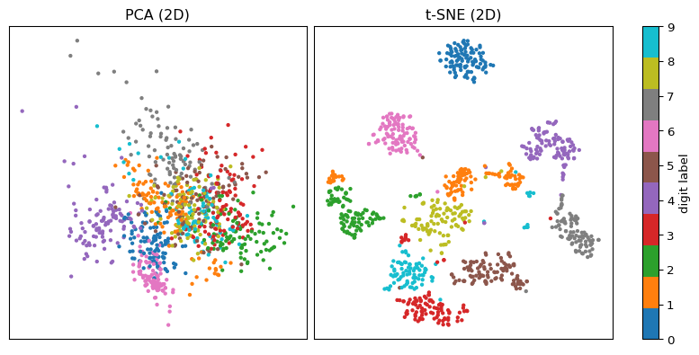
Example 1 — t-SNE vs PCA on handwritten digits
Goal: compare PCA and t-SNE as visualization tools on the digits dataset.
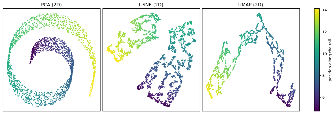
Figure 4: Swiss roll embedded into 2D using PCA, t-SNE, and UMAP. Colour encodes position along the roll.
Example 2 — what to notice
PCA
Flattens the roll but still leaves overlaps.
Nearby colours can be folded over each other — global linear projection.
t-SNE
Often produces a nicely unrolled band, but:
Global shape can be distorted.
Ends of the roll might curl or separate depending on perplexity.
UMAP
Also tends to unroll the manifold.
n_neighbors controls how much global structure is enforced.
min_dist affects how tight the band becomes.
Note
Nonlinear DR can reveal latent low-dimensional structure that linear methods miss.
But the exact appearance depends heavily on hyperparameters.
Always compare multiple runs and multiple methods.
Evaluation & quality checks for DR
Decision context: here DR is used as an exploratory visualization tool.
Useful checks:
Multiple seeds & hyperparameters
Change perplexity / n_neighbors / min_dist.
Check if the qualitative story (“there are 3-ish clusters”) is stable.
Compare to baselines
PCA, random projections, or simple feature pairs.
If t-SNE/UMAP shows patterns that never appear in simpler plots, be suspicious.
Quantitative sanity checks (optional, more advanced)
Nearest-neighbour classification accuracy using the 2D embeddings vs original space.
Trustworthiness / continuity metrics (how well local neighbourhoods are preserved).
Reproducibility
Log hyperparameters and random seeds.
Keep code + environment so figures can be regenerated.
Remember: pretty pictures do not replace proper model evaluation on held-out data.
Ethics & risks
Where can nonlinear DR go wrong ethically?
Overclaiming structure
t-SNE/UMAP plots of patients, students, or communities can make spurious clusters look real.
This can influence resource allocation, triage policies, or “risk tier” labels.
Hiding minorities
Rare subgroups can be collapsed or scattered, making them harder to see.
Visual summaries can thus hide harms or disparities.
Cherry-picking hyperparameters
It’s easy to tune perplexity / n_neighbors until you see the story you want.
Without transparency, this is a form of p-hacking for plots.
Simple mitigations (appropriate for this course):
Always show hyperparameters and seeds alongside plots.
Compare embeddings to quantitative metrics and domain knowledge.
Be explicit about what the plot does not say (e.g., no calibrated probabilities, no causal claims).
Curiosity: nonlinear DR in practice & research
Nonlinear DR methods show up in many real applications:
Single-cell genomics
t-SNE/UMAP plots of thousands of cells help biologists discover new cell types and lineages.
Representation learning
Visualizing neural network embeddings (images, text, audio) to understand structure and failure modes.
Information retrieval & recommendation
Inspecting user/item embeddings to debug weird neighbourhoods or biases.
ML research
Comparing learned representations across models or layers, e.g. how different networks cluster inputs.
Open questions (beyond this course):
How can we make embeddings that are faithful, interpretable, and robust?
How should we summarize uncertainty and instability in DR plots?
Can we design methods that give formal guarantees about neighbourhood preservation?
Quick check — M27
Q1 (MCQ).
Which statement about distances in t-SNE / UMAP plots is most accurate?
A. Euclidean distance in the plot is always proportional to the true distance in the original space.
B. Distances within clusters are somewhat meaningful, but distances between clusters are hard to interpret.
C. Distances in the plot are meaningless; only colours matter.
D. Distances are only trustworthy if perplexity is very small.
Q2 (MCQ).
Increasing t-SNE perplexity from 10 to 50 (with everything else fixed) tends to:
A. Focus more on very small local neighbourhoods, splitting clusters.
B. Emphasize a wider neighbourhood, sometimes merging small clusters.
C. Have no effect on the embedding.
D. Only change the runtime, not the layout.
Q3 (short).
Name one reason why using a 2D t-SNE embedding as features for a classifier (instead of the original data) can be problematic.
Q4 (short numeric / conceptual).
You run UMAP with n_neighbors = 5 and n_neighbors = 50 on the same dataset.
Which setting will usually emphasize more global structure, and why?
References
Becht, Etienne, Leland McInnes, John Healy, Charles-Antoine Dutertre, Immanuel WH Kwok, Lai Guan Ng, Florent Ginhoux, and Evan W Newell. 2019. “Dimensionality Reduction for Visualizing Single-Cell Data Using UMAP.”Nature Biotechnology 37 (1): 38–44. https://doi.org/10.1038/nbt.4314.
Maaten, Laurens van der. 2014. “Accelerating t-SNE Using Tree-Based Algorithms.”Journal of Machine Learning Research 15: 3221–45.
Maaten, Laurens van der, and Geoffrey Hinton. 2008. “Visualizing Data Using t-SNE.”Journal of Machine Learning Research 9: 2579–2605.
McInnes, Leland, John Healy, and James Melville. 2018. “UMAP: Uniform Manifold Approximation and Projection for Dimension Reduction.”arXiv Preprint arXiv:1802.03426. https://arxiv.org/abs/1802.03426.