M12: you learned to measure performance (MAE, ROC–AUC, PR, etc.).
M13: you learned to estimate those metrics reliably (splits, CV).
👉 M14: why those numbers behave the way they do when we change:
model complexity
regularization
dataset size
A model that gets worse when it gets “better”
You fit a richer model. Training error drops.
Validation error rises.
Code
# Animated: "A model that gets worse when it gets 'better'"# Fixes:# 1) Train/Test samples NEVER disappear during animation (we only update specific traces by index).# 2) Play/Pause + slider are placed UNDER the figure (in the bottom margin).import numpy as npimport plotly.graph_objects as go# -----------------------------# 1) Data: fixed train/test split# -----------------------------rng = np.random.default_rng(3151)def f_true(x):return np.sin(2*np.pi*x)n_train, n_test =18, 250sigma =0.18x_train = np.sort(rng.uniform(0, 1, n_train))y_train = f_true(x_train) + rng.normal(0, sigma, n_train)x_test = np.sort(rng.uniform(0, 1, n_test))y_test = f_true(x_test) + rng.normal(0, sigma, n_test)x_grid = np.linspace(0, 1, 500)y_grid_true = f_true(x_grid)# -----------------------------# 2) Polynomial regression (least squares)# -----------------------------def poly_design(x, deg): x = np.asarray(x)return np.vstack([x**k for k inrange(deg +1)]).T # [1, x, x^2, ..., x^deg]def fit_poly(x, y, deg): X = poly_design(x, deg) w, *_ = np.linalg.lstsq(X, y, rcond=None)return wdef predict_poly(w, x): deg =len(w) -1return poly_design(x, deg) @ wdef mse(yhat, y): e = yhat - yreturnfloat(np.mean(e * e))degrees =list(range(0, 21))pred_grid = []train_mse = []test_mse = []for d in degrees: w = fit_poly(x_train, y_train, d) pred_grid.append(predict_poly(w, x_grid)) train_mse.append(mse(predict_poly(w, x_train), y_train)) test_mse.append(mse(predict_poly(w, x_test), y_test))best_test_idx =int(np.argmin(test_mse))best_test_deg = degrees[best_test_idx]# -----------------------------# 3) Build figure with persistent traces + animated traces# IMPORTANT: we will update ONLY specific traces by index in frames,# so the sample points never disappear.# -----------------------------# Persistent (static) traces — these should NEVER change / disappeartrue_trace = go.Scatter( x=x_grid, y=y_grid_true, mode="lines", name="True f*(x)", hoverinfo="skip",)train_pts_trace = go.Scatter( x=x_train, y=y_train, mode="markers", name="Train", marker=dict(size=8, symbol="circle"),)test_pts_trace = go.Scatter( x=x_test[::4], y=y_test[::4], # visual subsample mode="markers", name="Test (sample)", marker=dict(size=6, symbol="x"), opacity=0.7,)train_mse_curve = go.Scatter( x=degrees, y=train_mse, mode="lines+markers", name="Train MSE", xaxis="x2", yaxis="y2",)test_mse_curve = go.Scatter( x=degrees, y=test_mse, mode="lines+markers", name="Test MSE", xaxis="x2", yaxis="y2",)# Animated traces — these WILL be updated each frameinit_i =0init_d = degrees[init_i]model_curve = go.Scatter( x=x_grid, y=pred_grid[init_i], mode="lines", name="Model ŷ(x)",)cur_train_marker = go.Scatter( x=[init_d], y=[train_mse[init_i]], mode="markers", name="Current (train)", xaxis="x2", yaxis="y2", marker=dict(size=14),)cur_test_marker = go.Scatter( x=[init_d], y=[test_mse[init_i]], mode="markers", name="Current (test)", xaxis="x2", yaxis="y2", marker=dict(size=14, symbol="diamond"),)# Assemble in a known order so we can reference indices reliablytraces = [ true_trace, # idx 0 (static) train_pts_trace, # idx 1 (static) test_pts_trace, # idx 2 (static) train_mse_curve, # idx 3 (static) test_mse_curve, # idx 4 (static) model_curve, # idx 5 (animated) cur_train_marker, # idx 6 (animated) cur_test_marker, # idx 7 (animated)]fig = go.Figure(data=traces)# Helpful static vertical reference line at best test degree (on the right panel)fig.add_vline( x=best_test_deg, xref="x2", line_width=2, opacity=0.6,)# -----------------------------# 4) Frames: update ONLY traces 5, 6, 7 so points never disappear# -----------------------------frames = []for i, d inenumerate(degrees): text = (f"<b>Degree = {d}</b><br>"f"Train MSE = {train_mse[i]:.4f}<br>"f"Test MSE = {test_mse[i]:.4f}" )if d > best_test_deg: text +=f"<br><span style='font-size:0.95em'>⚠️ Past best test degree ({best_test_deg})</span>" frames.append( go.Frame( name=str(d), data=[ go.Scatter(x=x_grid, y=pred_grid[i]), # updates trace idx 5 go.Scatter(x=[d], y=[train_mse[i]]), # updates trace idx 6 go.Scatter(x=[d], y=[test_mse[i]]), # updates trace idx 7 ], traces=[5, 6, 7], # <-- key line: only update these traces layout=go.Layout( annotations=[ go.layout.Annotation( x=0.02, y=0.98, xref="paper", yref="paper", xanchor="left", yanchor="top", text=text, showarrow=False, align="left", borderwidth=1, ) ] ) ) )fig.frames = frames# -----------------------------# 5) Layout: two panels + controls UNDER the figure# -----------------------------fig.update_layout( title="A model that gets worse when it gets “better”: capacity ↑, train error ↓, test error ↑", height=520,# Extra bottom margin so slider + buttons sit under the plotting area margin=dict(l=40, r=20, t=60, b=140), legend=dict(orientation="h", yanchor="bottom", y=1.02, xanchor="left", x=0),# Left panel axes xaxis=dict(title="x", domain=[0.0, 0.58]), yaxis=dict(title="y", domain=[0.0, 1.0]),# Right panel axes xaxis2=dict(title="Polynomial degree", domain=[0.65, 1.0], anchor="y2"), yaxis2=dict(title="MSE", domain=[0.0, 1.0], anchor="x2", rangemode="tozero"),# Play/Pause controls UNDER the figure (in bottom margin) updatemenus=[dict(type="buttons", direction="left", x=0.0, y=-0.22, # <- under plot xanchor="left", yanchor="top", pad=dict(r=10, t=10), buttons=[dict( label="Play", method="animate", args=[None, dict( frame=dict(duration=450, redraw=True), transition=dict(duration=150), fromcurrent=True, mode="immediate", )], ),dict( label="Pause", method="animate", args=[[None], dict( frame=dict(duration=0, redraw=False), transition=dict(duration=0), mode="immediate", )], ), ], ) ],# Slider just ABOVE the buttons (still under the plot, inside bottom margin) sliders=[dict( active=0, x=0.0, y=-0.20, xanchor="left",len=1.0, currentvalue=dict(prefix="Degree: "), pad=dict(t=30, b=10), steps=[dict( method="animate", args=[[str(d)], dict( frame=dict(duration=0, redraw=True), transition=dict(duration=0), mode="immediate", )], label=str(d), )for d in degrees ], ) ],)fig.show()
If it’s a bug, we fix the pipeline.
If it’s a law, we change capacity, data, or regularization.
Outcomes
By the end, you can:
derive the bias–variance decomposition (squared loss)
diagnose under/overfitting using learning curves
decide whether to add data, regularize, or change model class
connect these ideas to the evaluation pipeline from M13
Conceptual scaffold: what is random here?
A trained model \(\hat f\) is a function of the dataset \(\mathcal{D}\).
If \(\mathcal{D}\) is random, then \(\hat f(x)\) is random.
Two expectations to keep straight
over test points \((x,y)\sim\mathcal{D}\)
over training datasets \(\mathcal{D}\sim \text{(sampling process)}\)
‘Bias–variance’ is about decomposing expected prediction error when we average over both the randomness in the dataset and the noise in \(y\).
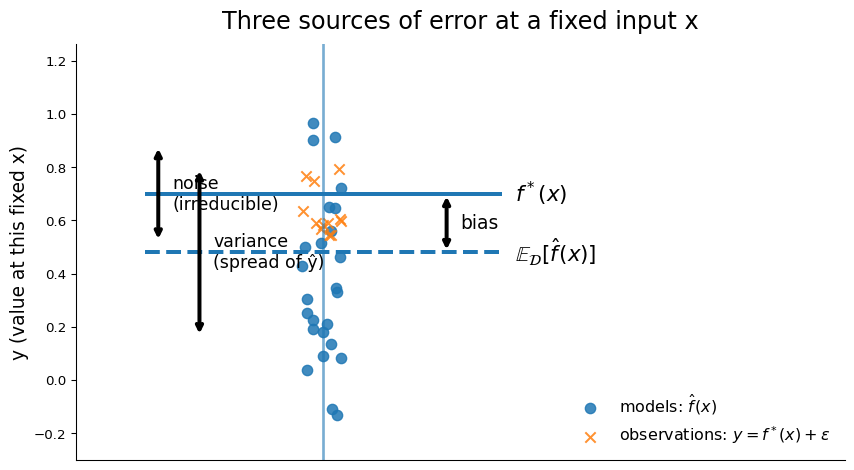
The three sources of error
\(f^*\) is “the ideal predictor for this problem,” often described informally as “the true relationship between \(X\) and \(Y\) or “the classifier you’d get if you knew reality and the loss exactly.”
Definitions
Assume \(y = f^*(x) + \varepsilon\), with \(\mathbb{E}[\varepsilon]=0\).
And irreducible noise: \(\mathrm{Var}(\varepsilon)=\sigma^2\).
Underfitting vs overfitting
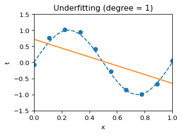
Underfitting (polynomial order = 1)
Model is too simple to capture the curve.
Both training and validation error are relatively high.
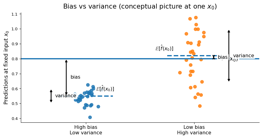
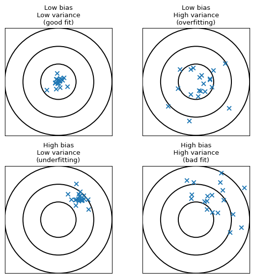
high bias, low variance → predictions are consistently wrong in the same way.
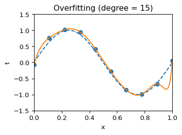
Overfitting (polynomial order = 15)
Model is too flexible for the amount of data.
Training error is almost zero; validation/test error is much larger.
low bias, high variance → predictions swing wildly with small changes in the data.
Overfitting vs underfitting
Each \(\times\) shows the prediction from a model trained on a different dataset. The bullseye is the true value. See Fortmann-Roe (2012) and Bishop (2006).
Expand the square and take expectations
The cross-terms with \(\varepsilon\) have expectation 0 (since \(\mathbb{E}[\varepsilon]=0\)), and \(\mathbb{E}_{\mathcal{D}}[\hat f(x) - \mu(x)] = 0\), so their cross-terms vanish too.
We are left with:
Across datasets, \(\hat f(x)\) has mean 1.6 and std 0.5
Noise std is 0.3
Then:
Bias² \(=(1.6-2.0)^2=0.16\)
Var \(=0.5^2=0.25\)
Noise \(=0.3^2=0.09\)
Expected squared error \(=0.16+0.25+0.09=0.50\).
❌ Anti-example: when the identity is not literally true
Bias–variance as an identity depends on:
squared loss (classification 0–1 loss breaks the algebra)
IID sampling (time series, clusters, or drift break it)
finite-variance noise (heavy tails can make variance blow up)
Modern framing: the decomposition still guides interventions (data vs capacity vs regularization), even when not exact.
Worked Example 1 (DGP): fitting polynomials to a noisy physical signal
We simulate:
\[
y = \sin(2\pi x) + \varepsilon, \quad \varepsilon\sim\mathcal{N}(0,0.1^2)
\]
Then fit polynomial degrees \(d\in\{1,3,5,9\}\).
Code
import plotly.graph_objects as goimport numpy as npimport matplotlib.pyplot as pltfrom numpy.polynomial import Polynomialdef generate_data(n, noise=0.1): x = rng.uniform(0, 1, size=n) y_true = np.sin(2*np.pi*x) y = y_true + rng.normal(0, noise, size=n)return x, y, y_truedef poly_fit_predict(x_train, y_train, x_grid, degree): p = Polynomial.fit(x_train, y_train, degree)return p(x_grid)# One dataset snapshot for visualsx, y, _ = generate_data(30, noise=0.1)xg = np.linspace(0, 1, 400)f_star = np.sin(2*np.pi*xg)fig = go.Figure()fig.add_trace(go.Scatter(x=x, y=y, mode="markers", name="samples"))fig.add_trace(go.Scatter(x=xg, y=f_star, mode="lines", name="f*(x)=sin(2πx)", line=dict(width=4)))for d in [1,3,5,9]: yhat = poly_fit_predict(x, y, xg, d) fig.add_trace(go.Scatter(x=xg, y=yhat, mode="lines", name=f"poly degree {d}"))fig.update_layout( title="Toggle model capacity (legend) + hover for values", xaxis_title="x", yaxis_title="y", legend_title="Traces", height=520)fig.show()
From “looks wiggly” to falsifiable diagnosis
Hypothesis: overfitting (high variance)
Test: Add more data or increase regularization.
Because if variance is the problem, less freedom to chase noise should lower validation error (even if training error rises).
Hypothesis: underfitting (high bias)
Test: Use a richer model or weaken regularization.
Because if bias dominates, more flexibility should lower both training and validation error.
Hypothesis: evaluation bug / leakage
Test: Shuffle labels and re-run the pipeline.
Because with shuffled labels, no model should beat chance, so any “good” result means the evaluation is wrong, not the model.
Estimating variance empirically
We sample many training datasets, refit, and look at prediction spread.
Code
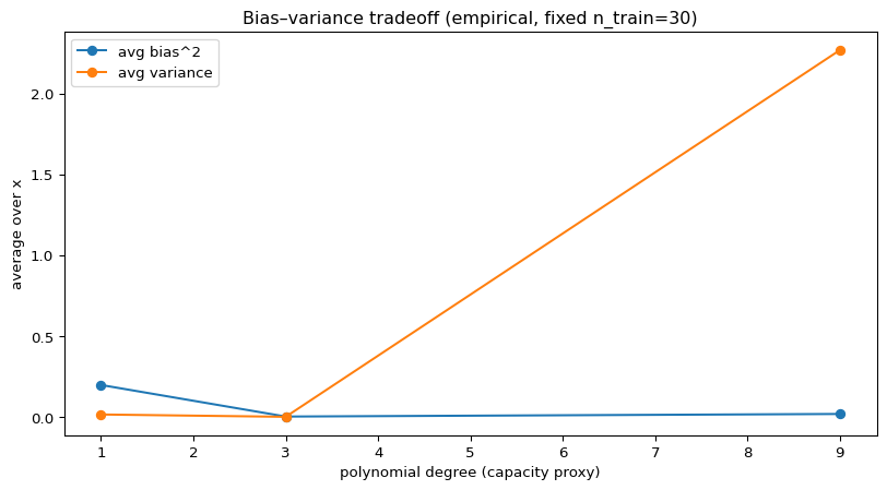
import pandas as pddef estimate_bias_variance(n_train=30, degree=9, n_reps=200, noise=0.1): xg = np.linspace(0, 1, 200) f_star = np.sin(2*np.pi*xg) preds = []for _ inrange(n_reps): x, y, _ = generate_data(n_train, noise=noise) preds.append(poly_fit_predict(x, y, xg, degree)) preds = np.vstack(preds) # (reps, grid) mean_pred = preds.mean(axis=0) bias2 = (mean_pred - f_star)**2 var = preds.var(axis=0)return xg, f_star, mean_pred, bias2, var, predsrows = []for d in [1,3,9]: xg, f_star, mean_pred, bias2, var, preds = estimate_bias_variance(n_train=30, degree=d, n_reps=200) rows.append({"degree": d,"avg_bias2_over_x": float(bias2.mean()),"avg_var_over_x": float(var.mean()) })bv = pd.DataFrame(rows).sort_values("degree")bv
degree
avg_bias2_over_x
avg_var_over_x
0
1
0.199789
0.017544
1
3
0.004801
0.003215
2
9
0.020778
2.267449
Code
# Visualization: average bias^2 and variance versus degreeplt.figure()plt.plot(bv["degree"], bv["avg_bias2_over_x"], marker="o", label="avg bias^2")plt.plot(bv["degree"], bv["avg_var_over_x"], marker="o", label="avg variance")plt.title("Bias–variance tradeoff (empirical, fixed n_train=30)")plt.xlabel("polynomial degree (capacity proxy)")plt.ylabel("average over x")plt.legend()plt.show()
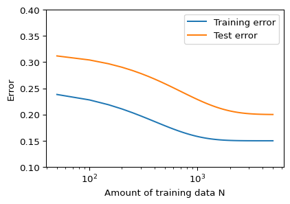
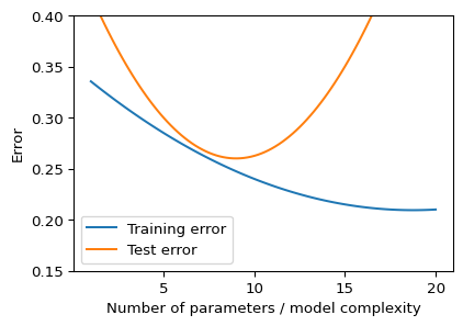
Error
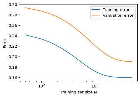
Left: as we add more data, both train and test error fall, and test error gradually approaches train error.
Right: as we increase model complexity, train error keeps dropping, but test error is U-shaped: underfitting → sweet spot → overfitting.
Together, these plots capture the core bias–variance story for supervised learning.
Curiosity: beyond the textbook U-shape
In very overparameterized models (e.g. large neural nets), test error can sometimes decrease again after the model perfectly fits the training data, a phenomenon called double descent(Belkin et al. 2019).
Learning curves: reading them in practice
Code
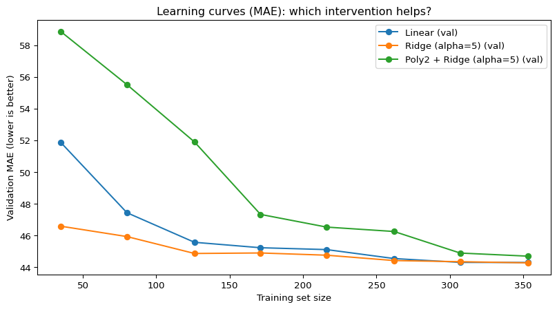
plot_learning_curves()
Operational reading (diagnosis):
small gap + both high → high bias (underfitting)
model too simple / too much regularization.
large gap (train ≪ val) → high variance (overfitting)
model too flexible / too little regularization.
validation keeps improving with more data → data-limited
error is still dropping; more data is worth it.
Pattern → typical next move:
Pattern
Diagnosis
Next move
Train & val high, small gap
Underfitting (bias)
Richer model / features, weaker regularization
Train low, val much higher
Overfitting (variance)
Stronger regularization / simpler model / more data
Both decreasing, val still high
Data-limited
Try to get more data if feasible
Both low and close
Happy zone
Stop tweaking; check fairness / robustness
Worked Example 2: learning curves
Decision context (plausible): triage planning for a diabetes clinic.
We predict a continuous progression score.
We care about MAE: large errors directly translate into misallocated follow-up intensity.
This code jumps ahead a little to future modules, but it also uses our \(k\) fold CV.
High-variance models can create unstable subgroup performance (some groups get erratic predictions).
“Collect more data” can worsen privacy risks and entrench systemic bias.
A single MAE can hide who the model fails on.
Quick check (4)
Your training and validation errors are both high and close together. What dominates?
A. variance B. bias C. noise D. leakage
Validation error keeps decreasing as you add data, but the train–val gap stays large. Best next move?
A. increase degree B. add more data C. stronger regularization D. reduce features
Which statement is most correct?
A. variance = randomness in labels
B. bias disappears with more data
C. regularization trades variance for bias
D. learning curves only matter for deep nets
An engineer standardizes features using mean/std computed on the full dataset before splitting. This is:
A. fine B. leakage C. confounding D. shift
References
Belkin, Mikhail, Daniel Hsu, Siyuan Ma, and Soumik Mandal. 2019. “Reconciling Modern Machine-Learning Practice and the Classical Bias–Variance Trade-Off.”Proceedings of the National Academy of Sciences 116 (32): 15849–54.
Bishop, Christopher M. 2006. Pattern Recognition and Machine Learning. Springer.
Hastie, Trevor, Robert Tibshirani, and Jerome Friedman. 2009. The Elements of Statistical Learning: Data Mining, Inference, and Prediction. 2nd ed. Springer Series in Statistics. New York, NY: Springer.