M12: Evaluation metrics for regression & classification

CSCI 3151 — Foundations of Machine Learning

Frank Rudzicz

Why this module?

  • We almost never deploy models based on loss alone.
  • Decisions are made using evaluation metrics on held-out data.
  • Choosing the wrong metric can make a bad model look good (and vice versa).
  • In high-stakes settings, metric choice is an ethical decision.
    • We’ll see a fraud detection with 99.5% accuracy that misses most fraud

Learning outcomes

By the end of this module, you should be able to:

  • Define and compute core metrics for regression (MSE, MAE, RMSE, \(R^2\)) and classification (accuracy, precision, recall, F1, ROC–AUC).
  • Choose metrics that align with a concrete decision problem and cost structure.
  • Diagnose failure modes such as class imbalance, threshold choice, and over-optimistic metrics.
  • Implement an evaluation loop in Python (NumPy / scikit-learn) that respects train/validation/test splits.
  • Justify trade-offs between metrics for different stakeholders (e.g., users vs. ops vs. regulators).

Loss vs evaluation metric

  • Training loss: what the optimizer sees.
    • Example: squared loss, logistic loss, cross-entropy.
  • Evaluation metric: what (🤓 nerdy) humans look at to decide if the model is useful.
    • Example: MSE, MAE, accuracy, precision, recall, AUC.
  • In an ideal world, the loss and metric are aligned.
    • But in practice we often train with one (e.g., log-loss) and report another (e.g., AUC).

🔑 Key definition

An evaluation metric is a function \(M(\hat{y}, y)\) that maps predicted outputs and true labels to a scalar score, used for comparing models on a held-out dataset.

❌ Anti-example: accuracy gone wrong

  • Task: detect fraudulent transactions.
  • 🛢️ Dataset: 1% of transactions are fraud.
  • 🧮 Model A: predicts “not fraud” for every transaction.

On a test set of 10,000 transactions:

  • True frauds: 100
  • Model predictions: all “not fraud”
  • Accuracy: \[\text{Accuracy} = \frac{9900}{10{,}000} = 0.99\]

But:

  • Recall for fraud: \[\text{Recall}_\text{fraud} = 0\]
  • Business impact: the model catches no fraud while looking great by accuracy.

Warning

Anti-example lesson: A metric is “wrong” if optimizing it leads to bad decisions for the stakeholders about whom we care.

Regression: Squared vs absolute error

Let \(y \in \mathbb{R}\) be the true value and \(\hat{y}\) the prediction.

  • Squared error: \((y - \hat{y})^2\)
    • Mean Squared Error (MSE): \[\text{MSE} = \frac{1}{n} \sum_{i=1}^n (y_i - \hat{y}_i)^2\]
  • Absolute error: \(|y - \hat{y}|\)
    • Mean Absolute Error (MAE): \[\text{MAE} = \frac{1}{n} \sum_{i=1}^n |y_i - \hat{y}_i|\]

Intuition:

  • MSE penalizes large errors more heavily (quadratic).
  • MAE treats all errors linearly; more robust to outliers.

Tiny numeric example:

  • True: \(y = [10, 10]\)
  • 🧐 Pred A: \(\hat{y} = [9, 11]\)
  • 🤪 Pred B: \(\hat{y} = [0, 20]\)

Compute:

  • For A: MSE = 1, MAE = 1.
  • For B: MSE = 100, MAE = 10.

Example 1: regression metrics in Python

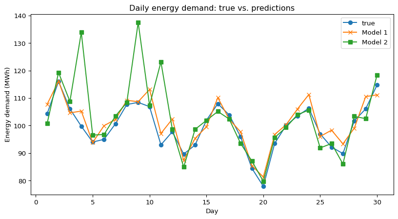
We compare two models predicting daily energy demand (MWh) over 30 days.

Code
import numpy as np
import pandas as pd
import matplotlib.pyplot as plt

rng = np.random.default_rng(3151)

days = np.arange(1, 31)
true_demand = 100 + 10 * np.sin(2 * np.pi * days / 7) + rng.normal(0, 5, size=days.shape)

# Model 1: slightly biased but smooth
pred_1 = true_demand + rng.normal(0, 3, size=days.shape) + 2

# Model 2: sometimes very wrong (outliers)
pred_2 = true_demand + rng.normal(0, 3, size=days.shape)
outlier_idx = rng.choice(len(days), size=3, replace=False)
pred_2[outlier_idx] += rng.normal(30, 5, size=outlier_idx.shape)

df = pd.DataFrame({
    "day": days,
    "true_demand": true_demand,
    "pred_1": pred_1,
    "pred_2": pred_2
})
df.head()
day true_demand pred_1 pred_2
0 1 104.310079 107.776495 100.804840
1 2 116.028137 116.148769 119.274859
2 3 106.073735 104.626473 108.771196
3 4 99.744096 105.247185 133.904268
4 5 93.988574 93.825993 96.537741

Regression metrics — table & DIY check

Code
from sklearn.metrics import mean_squared_error, mean_absolute_error, r2_score

metrics_table = pd.DataFrame({
    "model": ["Model 1", "Model 2"],
    "MSE": [
        mean_squared_error(df["true_demand"], df["pred_1"]),
        mean_squared_error(df["true_demand"], df["pred_2"])
    ],
    "MAE": [
        mean_absolute_error(df["true_demand"], df["pred_1"]),
        mean_absolute_error(df["true_demand"], df["pred_2"])
    ],
    "R2": [
        r2_score(df["true_demand"], df["pred_1"]),
        r2_score(df["true_demand"], df["pred_2"])
    ]
})
metrics_table
model MSE MAE R2
0 Model 1 10.799738 2.777448 0.846760
1 Model 2 104.345125 5.224704 -0.480575

Get metrics from sklearn AND DIY!

Code
# DIY: MSE and MAE for Model 1
errors = df["true_demand"] - df["pred_1"]
mse_manual = np.mean(errors ** 2)
mae_manual = np.mean(np.abs(errors))

print("MSE (sklearn): ", metrics_table.loc[0, "MSE"])
print("MSE (manual) : ", mse_manual)
print("MAE (sklearn): ", metrics_table.loc[0, "MAE"])
print("MAE (manual) : ", mae_manual)
MSE (sklearn):  10.799737650199566
MSE (manual) :  10.799737650199566
MAE (sklearn):  2.7774484676071842
MAE (manual) :  2.7774484676071842

Plot predictions over time.

Subtlety / failure mode

  • Model 2 might have similar average error but huge spikes on a few days.
  • If large spikes are operationally catastrophic, MAE (or even a max-error metric) may be more relevant than MSE.

Classification: Confusion matrix

For binary classification with positive class “fraud”:

Predicted: fraud Predicted: not fraud
Actual: fraud True Positive (TP) False Negative (FN)
Actual: not fraud False Positive (FP) True Negative (TN)

From these counts:

  • Accuracy: \[\text{Acc} = \frac{\color{green}{TP} + \color{green}{TN}}{\color{green}{TP} + \color{green}{TN} + \color{red}{FP} + \color{red}{FN}}\]
  • Precision (fraud): \[\text{Prec} = \frac{\color{green}{TP}}{\color{green}{TP} + \color{red}{FP}}\]
  • Recall (fraud): \[\text{Rec} = \frac{\color{green}{TP}}{\color{green}{TP} + \color{red}{FN}}\]
  • F1 score (harmonic mean): \[F_1 = 2 \cdot \frac{\text{Prec} \cdot \text{Rec}}{\text{Prec} + \text{Rec}}\]

Classification: Confusion matrix

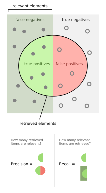
🧠 Intuition:

  • Precision: “If we flag something, how often are we right?”
  • Recall: “Of all the true frauds, how many did we catch?”

From 🔗 here

Example 2: Imbalanced fraud detection

We simulate 2,000 credit-card transactions with ~5% fraud.

Code
from sklearn.model_selection import train_test_split
from sklearn.linear_model import LogisticRegression
from sklearn.metrics import (
    accuracy_score, precision_score, recall_score, f1_score,
    confusion_matrix, ConfusionMatrixDisplay, roc_auc_score,
    roc_curve, precision_recall_curve
)

rng = np.random.default_rng(3151)
n = 2000

amount = rng.lognormal(mean=3, sigma=1, size=n)
is_international = rng.binomial(1, 0.15, n)
is_high_risk_country = is_international * rng.binomial(1, 0.3, n)
hour = rng.integers(0, 24, n)
device_trust = rng.uniform(0, 1, n)

logit_p = -5.0 + 0.7 * np.log1p(amount) + 1.2 * is_international + \
          1.5 * is_high_risk_country + 0.05 * (hour - 12) - 2.0 * device_trust
p = 1 / (1 + np.exp(-logit_p))
y = rng.binomial(1, p)

fraud_rate = y.mean()
fraud_rate
np.float64(0.0515)

Fraud example — train/test and baseline

We take a peek at the data…

Code
import pandas as pd

data = pd.DataFrame({
    "amount": amount,
    "is_international": is_international,
    "is_high_risk_country": is_high_risk_country,
    "hour": hour,
    "device_trust": device_trust,
    "is_fraud": y
})
data.head()
amount is_international is_high_risk_country hour device_trust is_fraud
0 9.957768 0 0 20 0.668216 0
1 70.511203 0 0 14 0.546161 0
2 28.416773 0 0 9 0.318283 0
3 45.448808 0 0 6 0.320275 0
4 42.417911 0 0 0 0.847995 0

… then split the data and always choose `not fraud’.

Baseline accuracy: 0.9483333333333334
Baseline recall (fraud): 0.0

Fraud example — logistic regression & metrics

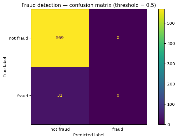
Now lets actually train and test a logistic regression model (with threshold=0.5).

Code
log_reg = LogisticRegression(max_iter=1000, class_weight=None)
log_reg.fit(X_train, y_train)

y_proba = log_reg.predict_proba(X_test)[:, 1]
y_pred = (y_proba >= 0.5).astype(int)

acc = accuracy_score(y_test, y_pred)
prec = precision_score(y_test, y_pred, zero_division=0)
rec = recall_score(y_test, y_pred, zero_division=0)
f1 = f1_score(y_test, y_pred, zero_division=0)
auc = roc_auc_score(y_test, y_proba)

print(f"Accuracy: {acc:.3f}")
print(f"Precision (fraud): {prec:.3f}")
print(f"Recall (fraud): {rec:.3f}")
print(f"F1 (fraud): {f1:.3f}")
print(f"ROC–AUC: {auc:.3f}")
Accuracy: 0.948
Precision (fraud): 0.000
Recall (fraud): 0.000
F1 (fraud): 0.000
ROC–AUC: 0.797

Let’s look at the confusion matrix (with threshold 0.5).

🧐 Subtlety / failure mode

  • Accuracy might still be very high (class imbalance), but recall might be too low for the fraud team.
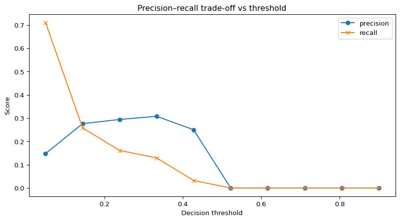
  • Can we measure precision-v-recall at different thresholds?

The ROC curve

If we treat the threshold as a ⏲️ continuous dial from 0 to 1, we can summarize the model’s behaviour over all possible “operating points”:

threshold precision recall
0 0.050000 0.147651 0.709677
1 0.144444 0.275862 0.258065
2 0.238889 0.294118 0.161290
3 0.333333 0.307692 0.129032
4 0.427778 0.250000 0.032258
5 0.522222 0.000000 0.000000
6 0.616667 0.000000 0.000000
7 0.711111 0.000000 0.000000
8 0.805556 0.000000 0.000000
9 0.900000 0.000000 0.000000
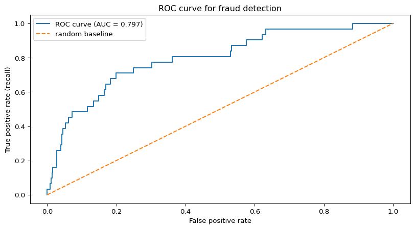
  • The Receiver-Operating Characteristic (ROC) curve plots
    True Positive Rate (TPR (i.e., recall)) vs False Positive Rate (FPR)
    as we sweep the threshold from very low (almost everything predicted fraud) to very high (almost nothing predicted fraud).
Code
# ROC curve for the fraud classifier

fpr, tpr, roc_thresholds = roc_curve(y_test, y_proba)
roc_auc = roc_auc_score(y_test, y_proba)

fig, ax = plt.subplots()
ax.plot(fpr, tpr, label=f"ROC curve (AUC = {roc_auc:.3f})")
ax.plot([0, 1], [0, 1], linestyle="--", label="random baseline")
ax.set_xlabel("False positive rate")
ax.set_ylabel("True positive rate (recall)")
ax.set_title("ROC curve for fraud detection")
ax.legend()
plt.show()

  • The ROC–AUC (Area Under the ROC Curve), in this example, approximates the probability that a randomly chosen fraud gets a higher score than a randomly chosen non-fraud.
    • AUC = 0.5 ≈ random ranking.
    • AUC closer to 1.0 = the model tends to rank frauds above non-frauds.

The precision-recall curve

For highly imbalanced problems like fraud, a precision–recall (PR) curve is often more informative (Saito and Rehmsmeier 2015): it shows how much precision we lose as we push recall higher.

Code
fig, ax = plt.subplots()
ax.plot(thr_df["threshold"], thr_df["precision"], marker="o", label="precision")
ax.plot(thr_df["threshold"], thr_df["recall"], marker="x", label="recall")
ax.set_xlabel("Decision threshold")
ax.set_ylabel("Score")
ax.set_title("Precision–recall trade-off vs threshold")
ax.legend()
plt.show()

Decision perspective

  • Fraud operations may say:
    • “We can only investigate 50 alerts per day.”
    • “Missing fraud costs $X; annoying users costs $Y.”
  • Metric choice:
    • Maybe optimize recall at fixed precision, or precision@k (top-k alerts).

❌ Shortcuts: the “tanks in the trees” legend

  • Widely retold story (probably apocryphal, see 🔗 Fraser (1998) and 🔗 Gwern (2011):
    • US military trained a neural net to detect camouflaged tanks in forest photos.
    • Training set:
      • Photos with tanks: taken on cloudy days.
      • Photos without tanks: taken on sunny days.
    • On held-out images from the same distribution, performance looks great.
    • On new photos, performance collapses to random.

  • Post-mortem:
    • The network would effectively learn “cloudy vs sunny”, not “tank vs no tank”.
    • The evaluation metric on a biased test set would look impressive.
  • Takeaways:
    • Metrics can be high even when the model is using totally wrong features.
    • Confounders (here: weather correlated with tanks) make offline evaluation lie.
    • This would be an instance of shortcut learning: models latch onto easiest predictive signals, not the “true” concept.

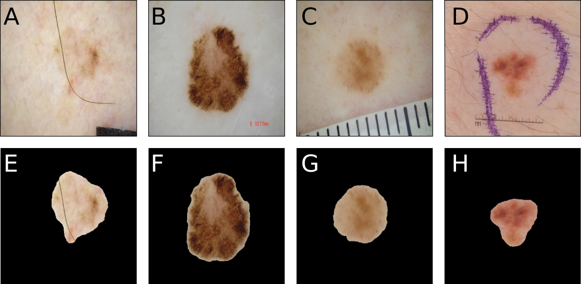
❌ Shortcuts in medical imaging: rulers ≠ melanoma

  • In dermoscopy datasets (🔗ISIC, 🔗HAM10000, etc.), malignant lesions may:
    • Have marker ink or skin markings.
    • Include ruler markings, colour charts, or other clinic artefacts.
  • These can act as confounding factors for classifiers. (Maron et al. 2021)
  • When researchers inpaint or segment out these artefacts, predicted melanoma probability often drops, suggesting the network was focusing on the artefact rather than the lesion. (Nauta et al. 2022)
  • Common challenge images explicitly show “ruler marker artefact” as an example of problematic bias in skin-lesion classification. (Mahbod et al. 2019)

Warning

  • A high ROC–AUC on a held-out set doesn’t guarantee the model has learned a medically meaningful signal.
  • Confounders == features that:
    • Are correlated with the label in your dataset.
    • Are not part of the causal mechanism you care about.
  • Evaluation must ask: “What is my model actually using?”, not just “What is my AUC?”.

Common threats to evaluation

  • Train/test contamination:
    • Data leakage via feature engineering using full dataset.
    • Using test set to tune hyperparameters.
  • Distribution shift:
    • Evaluate on one time period, deploy in another.
    • New user population, devices, or behaviour patterns.
  • Confounders / shortcuts:
    • Metric looks good because the model exploits a shortcut (e.g., hospital ID instead of patient state).

… and their mitigations

  • Keep a strict hold-out test set (think “final exam” set).
  • Log experiments and metrics with versioning (e.g., 🔗 MLflow).
  • Regularly reevaluate on fresh data.

Aside: A wide ecosystem of metrics

  • ‘Keep an eye open’ for bespoke metrics based on task

  • For example, in search / recommender systems, we often care about ranked lists, not just “correct / incorrect”

  • Each result at rank \(i\) has a relevance score \(\mathrm{rel}_i \in \{0,1,2,3,\dots\}\).

What does a good ranking look like?

  • Highly relevant items appear early:
    • The very top ranks (1–3, say) should be mostly results with high relevance.
  • Less relevant items are pushed down:
    • Medium/low relevance results should show up later in the list.
  • Users who only scan the top few results still win:
    • Even if a user stops after 3–5 items, they should already have seen most of the good stuff.
  • Ranking quality is about order, not just “what’s in the list”:
    • The same set of documents can be “great” or “terrible” depending on how they are ordered.
  • We assign a gain to the result at rank \(i\), often \[ \text{gain}_i = 2^{\mathrm{rel}_i} - 1. \]

  • We then discount lower-ranked items using a logarithmic factor: \[ \text{discount}_i = \log_2(i + 1). \]

  • The discounted gain at rank (i) is \[ \text{disc_gain}_i = \frac{\text{gain}_i}{\text{discount}_i}. \]

  • Discounted Cumulative Gain (DCG):

    • As we walk down the ranked list, we accumulte all the discounted gains so far. At rank \(k\): \[ \text{DCG@}k = \sum_{i=1}^{k} \frac{2^{\mathrm{rel}_i} - 1}{\log_2(i+1)}. \]
  • Normalized DCG (NDCG):

    • Given an ideal ranking for the top-\(k\) results, IDCG@k (Järvelin and Kekäläinen 2002), we can measure how close our ranking is with: \[\text{NDCG@}k = \frac{\text{DCG@}k}{\text{IDCG@}k} \in [0,1]\]

Aside: DCG and NDCG@5

Suppose we have 5 search results with graded relevance (0–3):

Rank Result Rel (0–3) Disc. gain Cum. DCG
1 A 3 7.00 7.00
2 B 0 0.00 7.00
3 C 2 1.50 8.50
4 D 1 0.43 8.93
5 E 2 1.16 10.09

DCG@5 (actual) ≈ 10.09

Rank Result Rel (0–3) Disc. gain Cum. DCG
1 A 3 7.00 7.00
2 C 2 1.89 8.89
3 E 2 1.50 10.39
4 D 1 0.43 10.82
5 B 0 0.00 10.82

DCG@5 (ideal) ≈ 10.82

So

\[ \text{NDCG@5} = \frac{10.09}{10.82} \approx 0.93. \]

How small metric gains matter at scale

Real-world systems:

  • Recommender systems (streaming, e-commerce).
  • Web search.
  • Large-scale fraud / abuse detection.

Example 1 — ranking (NDCG):

  • Your search engine handles 100M queries/day.
  • Baseline model: NDCG@10 = 0.80.
  • New model: NDCG@10 = 0.81 (+0.01 absolute).
  • Suppose a +0.01 NDCG@10 corresponds to +0.2 percentage points in click-through rate on top results (empirically common in information retrieval). (Järvelin and Kekäläinen 2002)
  • At 100M queries/day, that is ~200k extra “good” clicks per day, which might translate to:
    • more revenue (ads, purchases), or
    • more relevant content consumed (learning, health info, etc.).

Example 2 — classification (AUC):

  • A fraud model with AUC = 0.95 vs a stronger one with AUC = 0.955.
  • At your chosen operating point (fixed investigation budget), that might mean:
    • catching hundreds more fraud cases per day, or
    • reducing false alarms by thousands per day.

Warning

  • At scale, “boring” +0.5% gains in AUC / NDCG can be massive in business and social impact.
  • This is why metric choice, and understanding what it really measures, is a big deal.

Warning

  • Is a difference of 0.005 ‘real’ or is it an accident of evaluation?
  • We won’t talk too much about statistical significance in this course but avoiding empirical traps is an upcoming topic.

Metric selection recipes (suggestion)

  • Balanced classification (roughly equal positives/negatives):
    • Start with accuracy, precision/recall, F1.
  • Rare positives (fraud, disease):
    • Use precision, recall, PR curves, and maybe ROC–AUC;
    • Downplay accuracy.
  • Ranking / recommendation:
    • Use NDCG@k, MAP, or business-specific top-k metrics.
  • Regression with occasional huge errors:
    • Prefer MAE (robust), maybe also max-error quantiles.
  • High-stakes domains:
    • Focus on metrics that align with real costs and risks (cost-weighted loss, recall at fixed precision, etc.).

Metrics, confounds, and ethics

So far, we’ve seen that:

  • A model can get great metrics by exploiting confounders (i.e., artefacts that correlate with labels but aren’t causal, e.g., hospital ID, rulers / ink, weather).
  • Offline evaluation can hide this:
    • ROC–AUC, PR–AUC, or NDCG can all look excellent on a biased test set.

Ethical implications:

  • If a model uses shortcuts:
    • It may fail catastrophically on new populations or hospitals.
    • It can amplify existing biases (who gets flagged, who gets missed).
    • It can give stakeholders a false sense of safety (“AUC is 0.97, we’re fine.”).

Our responsibility as ML practitioners:

  • Treat metric choice as an ethical design decision, not just a technical one.
  • Always ask:
    • “What patterns could the model be using to achieve this score?”
    • “Who is helped or harmed if this shortcut fails?”
  • Connect evaluation to broader topics in responsible ML:
    • dataset shift & confounding,
    • fairness and subgroup performance,
    • transparency and model auditing.

Quick checks

Q1 You have two regression models on the same test set:

  • Model A: MAE = 2.0, MSE = 5.0
  • Model B: MAE = 2.0, MSE = 8.0

Which statement is most likely true?

A. A has more large errors than B.
B. B has more large errors than A.
C. They have identical error distributions.
D. You cannot say anything from these numbers.

QC2 — classification

On a binary classification test set:

  • TP = 40, FP = 10, FN = 60, TN = 890.

What is the recall for the positive class?

A. 0.4
B. 0.5
C. 0.25
D. 0.06

QC3 — metric choice

For fraud detection with 1% fraud rate, which metric is least informative on its own?

A. Accuracy
B. Precision (fraud)
C. Recall (fraud)
D. ROC–AUC

QC4 — assumption check

A team evaluates a model on the same data they used for training and reports a very high AUC. Which assumption is most violated?

A. Loss function is convex.
B. Data points are IID.
C. Evaluation uses a held-out test set.
D. Labels are noise-free.

References

Järvelin, Kalervo, and Jaana Kekäläinen. 2002. “Cumulated Gain-Based Evaluation of IR Techniques.” ACM Trans. Inf. Syst. 20 (4): 422–46. https://doi.org/10.1145/582415.582418.
Mahbod, Amirreza, Gerald Schaefer, Chunliang Wang, Rupert Ecker, and Isabella Ellinger. 2019. “Skin Lesion Classification Using Hybrid Deep Neural Networks.” In ICASSP 2019 – 2019 IEEE International Conference on Acoustics, Speech and Signal Processing (ICASSP), 1229–33. Brighton, United Kingdom: IEEE. https://doi.org/10.1109/ICASSP.2019.8683352.
Maron, Roman C., Achim Hekler, Eva Krieghoff-Henning, Max Schmitt, Justin G. Schlager, Jochen S. Utikal, and Titus J. Brinker. 2021. “Reducing the Impact of Confounding Factors on Skin Cancer Classification via Image Segmentation: Technical Model Study.” Journal of Medical Internet Research 23 (3): e21695. https://doi.org/10.2196/21695.
Nauta, Meike, Ricky Walsh, Adam Dubowski, and Christin Seifert. 2022. “Uncovering and Correcting Shortcut Learning in Machine Learning Models for Skin Cancer Diagnosis.” Diagnostics 12 (1): 40. https://doi.org/10.3390/diagnostics12010040.
Saito, Takaya, and Marc Rehmsmeier. 2015. “The Precision-Recall Plot Is More Informative Than the ROC Plot When Evaluating Binary Classifiers on Imbalanced Datasets.” PLOS ONE 10 (3): e0118432. https://doi.org/10.1371/journal.pone.0118432.