We then (try to) choose \[
\hat{f} = \mathop{\mathrm{arg\,min}}_{f \in \mathcal{F}} \hat{L}_n(f),
\] where \(\mathcal{F}\) is our model class (e.g., linear functions).
Tiny numeric example (regression):
Suppose \(y = 10,12,9\) and our model always predicts \(\hat{y} = 11\).
from sklearn.linear_model import LinearRegressionimport plotly.express as pximport numpy as np# Fit a simple line so we can overlay it on the scatterX = df_exam[["hours_studied"]].valuest = df_exam["exam_score"].valueslinreg = LinearRegression()linreg.fit(X, t)x_grid = np.linspace(df_exam["hours_studied"].min(), df_exam["hours_studied"].max(), 200)y_grid = linreg.predict(x_grid.reshape(-1, 1))fig = px.scatter(df_exam,x="hours_studied",y="exam_score",opacity=0.7,labels={"hours_studied": "hours_studied", "exam_score": "exam_score"},title="Exam score vs hours studied (interactive)",)fig.add_scatter(x=x_grid, y=y_grid, mode="lines", name="linear fit")fig
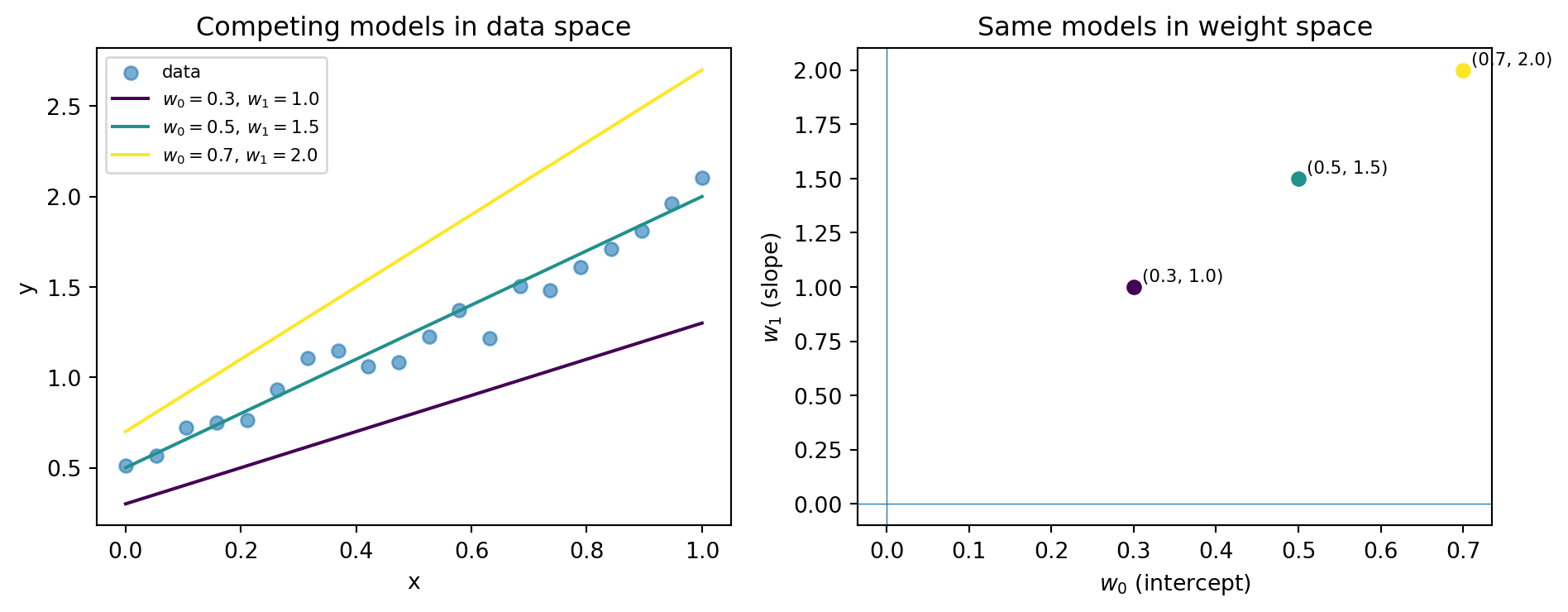
Data space: scatter and fitted line
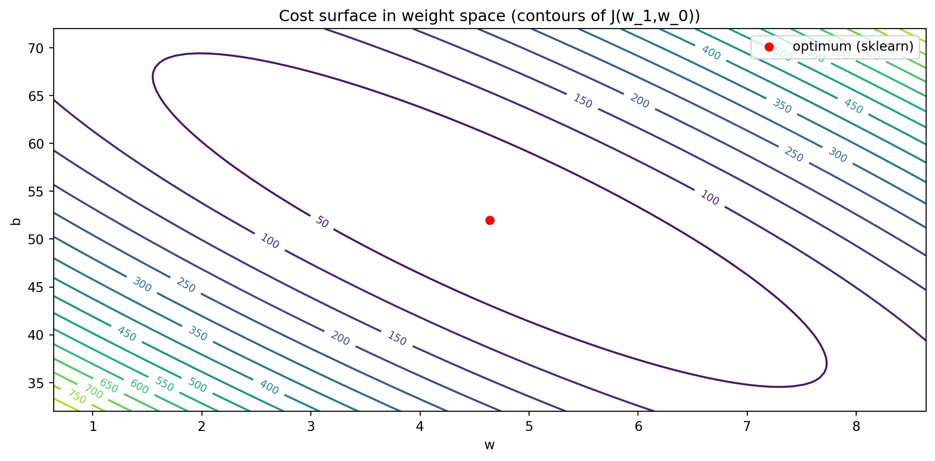
In weight space, for 1D regression, the cost \[
J(w_1,w_0) = \frac{1}{2n}\sum_{i=1}^n (w_qx^{(i)} + w_0 - t^{(i)})^2
\] is a quadratic and convex function of \((w_1,w_0)\).
We can visualize \(J(w_1,w_0)\) over a grid of \((w_0,w_1)\) values:
Code
# Build a grid over w and bw_vals = np.linspace(linreg.coef_[0] -4, linreg.coef_[0] +4, 80)b_vals = np.linspace(linreg.intercept_ -20, linreg.intercept_ +20, 80)W, B = np.meshgrid(w_vals, b_vals)J_grid = np.zeros_like(W)for i inrange(W.shape[0]):for j inrange(W.shape[1]): w_ij = W[i, j] b_ij = B[i, j] y_ij = w_ij * hours + b_ij J_grid[i, j] =0.5* np.mean((y_ij - score) **2)fig, ax = plt.subplots()cs = ax.contour(W, B, J_grid, levels=20)ax.clabel(cs, inline=True, fontsize=8)ax.scatter([linreg.coef_[0]], [linreg.intercept_], color="red", label="optimum (sklearn)")ax.set_xlabel("w")ax.set_ylabel("b")ax.set_title("Cost surface in weight space (contours of J(w_1,w_0))")ax.legend()plt.tight_layout()plt.show()
Why is \(J(w_1,w_0)\) quadratic and convex?
Why is \(J(w_1,w_0)\) quadratic?
Each term \[
\big(w_1x^{(i)} + w_0 - t^{(i)}\big)^2
\] is a square of a linear function in \((w_1,w_0)\).
If you expand it, you only get terms like \(w_1^2\), \(w_1\cdot w_0\), \(w_0^2\), \(w_1\), \(w_0\), and a constant.
Averaging over \(i\) keeps it a polynomial of degree at most 2 in \((w_1,w_0)\) → quadratic.
Why is \(J(w_1,w_0)\) convex?
Function \(z \mapsto \tfrac{1}{2} z^2\) is 🔗 convex on \(\mathbb{R}\).
Each term \(w_1x^{(i)} + w_0 - t^{(i)}\) is an affine (linear + constant) function of \((w_1,w_0)\).
A convex function composed with an affine map is convex, and an average of convex functions is convex.
Therefore the average \[
J(w,b) = \frac{1}{n}\sum_{i=1}^n \tfrac{1}{2}\big(w_1x^{(i)} + w_0 - t^{(i)}\big)^2
\] is convex in \((w_1,w_0)\).
This “single-bowl” shape is why gradient descent works so reliably for linear regression: any local minimum is a global minimum.
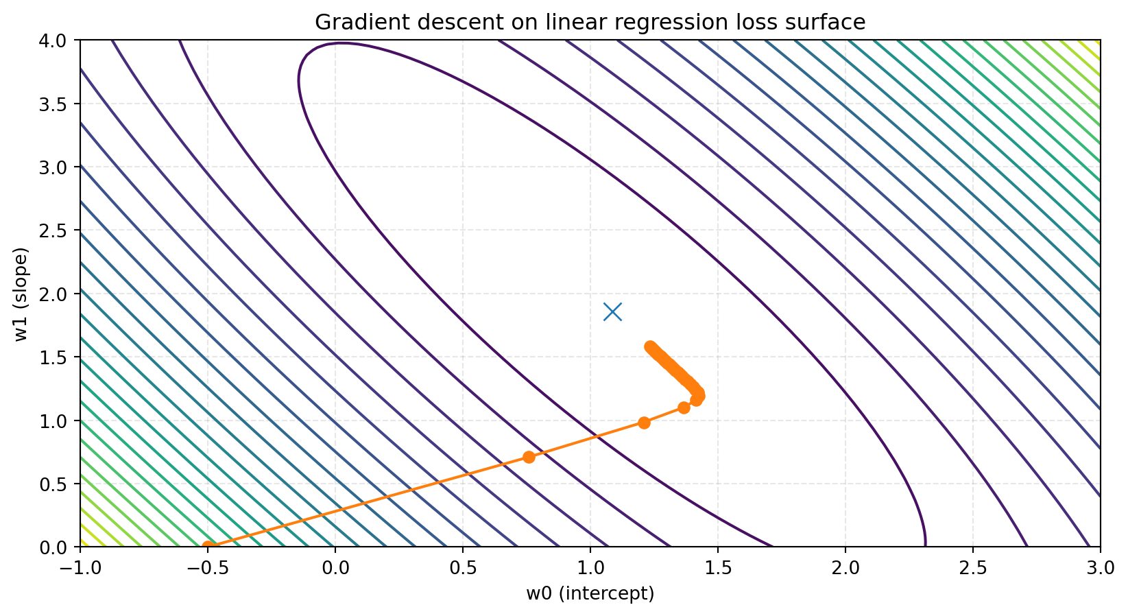
Gradient descent visualized
👉 The path moves roughly orthogonal to level sets, towards the optimum.
Gradient descent mathemetized
We can minimize \(J(w_1,w_0)\) via gradient descent:
def cost_and_grads(w, b, x, t): y = w * x + b r = y - t J =0.5* np.mean(r**2) dJ_dw = np.mean(r * x) dJ_db = np.mean(r)return J, dJ_dw, dJ_dbw, b =-2.0, 20.0# deliberately bad starting pointeta =1e-3history = []for step inrange(120): J, dJ_dw, dJ_db = cost_and_grads(w, b, hours, score) history.append((w, b, J)) w = w - eta * dJ_dw b = b - eta * dJ_dbprint("w_1, w_0, J")history[-5:]
Predictions on all \(n\) examples: \[
y = Xw_1 + w_0,
\] or with the bias trick (augment \(x\) with a 1): \[
\tilde{x} = \begin{bmatrix} x \\\\ 1 \end{bmatrix}, \quad
\tilde{w} = \begin{bmatrix} w_1 \\\\ w_0 \end{bmatrix}, \quad
y = X_{\text{aug}}\tilde{w}.
\]
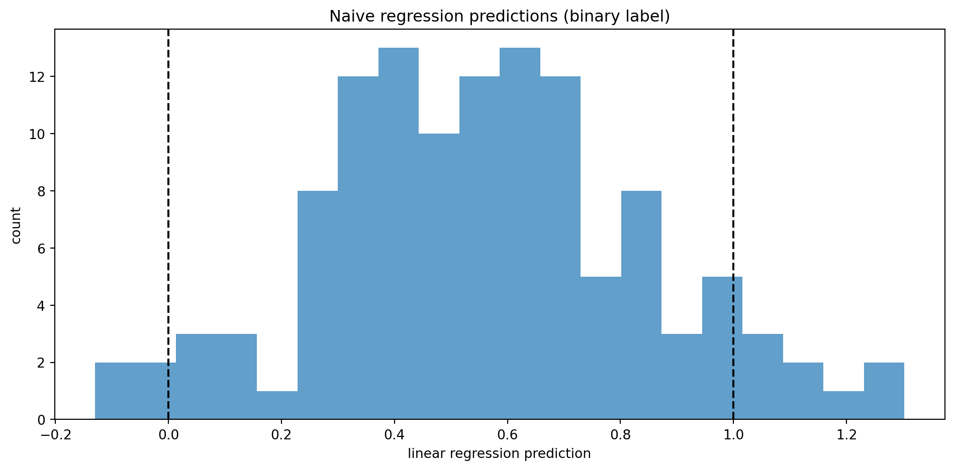
Threshold at 0.5 is arbitrary and not tied to any probability semantics.
Regression predictions on binary labels
Code
import numpy as npimport pandas as pdimport plotly.graph_objects as gofrom sklearn.linear_model import LinearRegressionnp.random.seed(123)# Simulate xn =200x = np.linspace(0, 10, n)# Probability of y = 1 increases with x (logistic-ish)p =1/ (1+ np.exp(-(x -5)))y = np.random.binomial(1, p)df = pd.DataFrame({"x": x, "y": y})# Fit linear regression y ~ x (deliberately wrong)model = LinearRegression()model.fit(df[["x"]], df["y"])x_grid = np.linspace(df["x"].min(), df["x"].max(), 200)y_hat = model.predict(x_grid.reshape(-1, 1))# Jitter y so the points aren’t perfectly on 0 and 1rng = np.random.default_rng(123)df["y_jitter"] = df["y"] + rng.uniform(-0.05, 0.05, size=len(df))# Build interactive figurefig = go.Figure()# Scatter of observed datafig.add_trace( go.Scatter( x=df["x"], y=df["y_jitter"], mode="markers", marker=dict(size=6), name="Observed 0/1 outcomes", text=[f"x = {xi:.2f}<br>y = {yi}"for xi, yi inzip(df["x"], df["y"])], hoverinfo="text" ))# Linear regression linefig.add_trace( go.Scatter( x=x_grid, y=y_hat, mode="lines", name="Linear regression fit (y ~ x)" ))fig.update_layout( title="Why linear regression is a bad model for binary data", xaxis_title="Predictor x", yaxis=dict( title="Outcome (0/1)",range=[-0.3, 1.3], tickmode="array", tickvals=[0, 1], ticktext=["0", "1"] ))fig
🧐: regression & loss at scale
The ideas in this module scale up:
Large language models (LLMs) are trained with token-level cross-entropy loss (a big logistic-like loss over huge vocabularies).
Image classifiers optimize cross-entropy over thousands of classes.
Deep nets are compositions of linear maps + nonlinearities, trained by gradient-based optimization on an average loss over a dataset.
If you understand:
Data → model → loss → empirical risk.
Linear regression & logistic regression.
Gradient descent as “follow negative gradient in weight space”.
…you’ve understood a core template behind much of modern ML.
Quick checks
For 1D linear regression, the cost \[
J(w,b) = \frac{1}{2n}\sum_{i=1}^n (wx^{(i)} + b - t^{(i)})^2
\] is, as a function of \((w,b)\):
A. Linear.
B. Convex quadratic.
C. Non-convex.
D. Discontinuous.
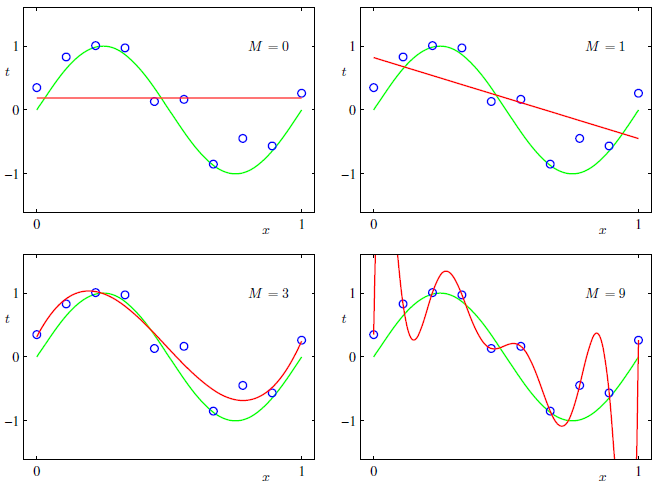
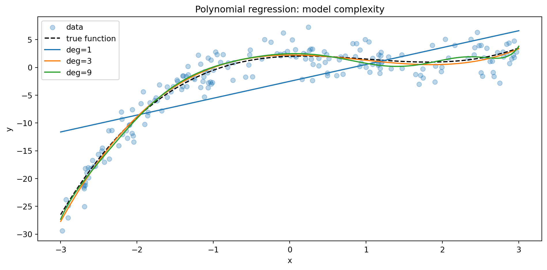
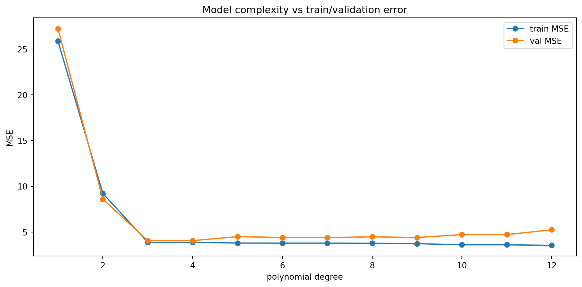
In the polynomial regression example, increasing the degree tends to:
A. Always improve validation error.
B. Always worsen validation error.
C. Decrease train error, but validation error may eventually increase.
D. Have no effect on either train or validation error.
In the early-warning system, which metric is most aligned with the decision to catch at-risk students?
A. Overall accuracy.
B. Recall for \(y=1\) (at-risk).
C. Train MSE.
D. Number of parameters.
Using test data to choose hyperparameters is best described as:
A. Regularization.
B. Cross-validation.
C. Data leakage / test-set overfitting.
D. Semi-supervised learning.
Looking ahead
Next steps in the course:
M05 will continue the supervised story and set us up for:
Deeper probabilistic views (MLE, likelihood).
More sophisticated classification setups.
M06 will introduce unsupervised objectives (clustering, density).
Later clusters ought revisit today’s ideas in more sophisticated forms:
C03 MLE & probabilistic modelling: formalize LR as a likelihood model.
C04 Evaluation & bias–variance: build on the polynomial regression curves.
C05 Regularization & optimization: revisit linear/logistic regression with penalties and more advanced optimizers.
For now: you’ve seen how regression, loss, risk, and optimization fit together in a scientifically grounded ML pipeline.
References
Bishop, Christopher M. 2006. Pattern Recognition and Machine Learning. Springer.