M02: Supervised, unsupervised, self- & semi-supervised

CSCI 3151: Foundations of Machine Learning

Frank Rudzicz

2026-01-01

Assumptions

In M02, we assume:

  • Dataset
    • A small, synthetic student trial accounts dataset (2D features) for concrete examples.
  • Decision context
    • We’re deciding who to flag / nudge in an online learning platform (e.g., send a subscription email).
  • Math depth
    • Light: definitions, simple formulas, toy numeric examples; no heavy proofs.
  • Prereqs beyond the course
    • You’re comfortable with Python / Jupyter, NumPy, pandas, and basics of supervised learning.

Learning outcomes

  • By the end of this module:
    • Define supervised, unsupervised, self-supervised, and semi-supervised learning in terms of the data they assume.
    • Write down a basic objective for supervised risk minimization.
    • Classify real-world problems into appropriate paradigms and justify the choice.
    • Diagnose when a paradigm’s assumptions are violated and what failure modes to expect.
    • Connect modern systems (e.g., GPT-style models) back to these paradigms.

In and out: \(\color{blue}{X}\) and \(\color{red}{y}\)

We’ll use this notation a lot:

  • \(\color{blue}{X}\) (capital): all your input data — a matrix of shape \((n, d)\)
    • \(n\) = number of examples (rows: students, patients, transactions, …)
    • \(d\) = number of features per example
  • \(\color{red}{y}\) (lowercase vector): the target(s) we care about — shape \((n,)\)

Think of one row of \(\color{blue}{X}\) as one data point.

Code
import pandas as pd

df = pd.DataFrame({
    "time_on_platform_hours": [1.2, 3.4, 5.1],
    "avg_quiz_score": [55, 78, 88],
    "will_subscribe": [0, 1, 1],
})

def color_xy_cols(col):
    if col.name in ["time_on_platform_hours", "avg_quiz_score"]:
        # X columns → light blue
        return ['background-color: #e6f2ff'] * len(col)
    elif col.name == "will_subscribe":
        # y column → light red
        return ['background-color: #ffe6e6'] * len(col)
    else:
        return [''] * len(col)

df.style.apply(color_xy_cols)
  time_on_platform_hours avg_quiz_score will_subscribe
0 1.200000 55 0
1 3.400000 78 1
2 5.100000 88 1
Code
X = df[["time_on_platform_hours", "avg_quiz_score"]].values
y = df["will_subscribe"].values

print("X shape:", X.shape)  # (n, d)
print("y shape:", y.shape)  # (n,)
X shape: (3, 2)
y shape: (3,)

Supervised vs unsupervised — what data points look like

Code
import numpy as np
import matplotlib.pyplot as plt

rng = np.random.default_rng(3151)

n_per = 80
X1 = rng.normal([2, 2], 0.6, size=(n_per, 2))
X0 = rng.normal([-2, -2], 0.6, size=(n_per, 2))

X = np.vstack([X1, X0])
y = np.concatenate([np.ones(n_per), np.zeros(n_per)])

fig, axes = plt.subplots(1, 2, figsize=(7, 3))

axes[0].scatter(X[:, 0], X[:, 1], c=y, alpha=0.8)
axes[0].set_title("Supervised:\nwe see (x, y)")
axes[0].set_xticks([]); axes[0].set_yticks([])

axes[1].scatter(X[:, 0], X[:, 1], alpha=0.8)
axes[1].set_title("Unsupervised:\nwe see x only")
axes[1].set_xticks([]); axes[1].set_yticks([])

fig.suptitle("Same world, different information at training time", fontsize=11)
fig.tight_layout()
plt.show()

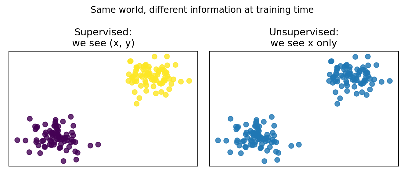
  • Supervised: the learner is told which points are, e.g., “positive” vs “negative”.
  • Unsupervised: the learner only sees the cloud of \(x\)’s and must discover structure without labels.

Unifying idea: learning from data

We’ll use a simple notation:

  • Input features: \(\color{blue}{x \in \mathcal{X}}\) (e.g., images, tabular records, text).
  • Targets / labels: \(\color{red}{y \in \mathcal{Y}}\) (e.g., classes, real numbers, next token).
  • Data come from an unknown distribution \((\color{blue}{X},\color{red}{Y}) \sim p(\color{blue}{x},\color{red}{y})\).

🚨 Machine learning (for this course):

Learn a function \(f_\theta : \mathcal{X} \to \mathcal{Y}\) that performs well on new samples from the same (or similar) distribution.

A probability surface over \(\color{blue}{(x_1, x_2)}\)

Code
import numpy as np
import pandas as pd
from sklearn.linear_model import LogisticRegression
import plotly.graph_objects as go

# Synthetic 2D data, similar to our earlier example
rng = np.random.default_rng(3151)
n_pos, n_neg = 80, 80

time_pos = rng.normal(5.0, 1.0, size=n_pos)
quiz_pos = rng.normal(80.0, 5.0, size=n_pos)

time_neg = rng.normal(1.5, 0.7, size=n_neg)
quiz_neg = rng.normal(55.0, 7.0, size=n_neg)

X = np.vstack([
    np.column_stack([time_pos, quiz_pos]),
    np.column_stack([time_neg, quiz_neg]),
])
y = np.concatenate([
    np.ones(n_pos, dtype=int),
    np.zeros(n_neg, dtype=int),
])

df = pd.DataFrame({
    "time_on_platform_hours": X[:, 0],
    "avg_quiz_score": X[:, 1],
    "will_subscribe": y,
})

# Fit logistic regression
log_reg = LogisticRegression()
log_reg.fit(X, y)

# Grid over feature space
x1_grid = np.linspace(df["time_on_platform_hours"].min()-1,
                      df["time_on_platform_hours"].max()+1, 60)
x2_grid = np.linspace(df["avg_quiz_score"].min()-5,
                      df["avg_quiz_score"].max()+5, 60)
xx, yy = np.meshgrid(x1_grid, x2_grid)
grid = np.c_[xx.ravel(), yy.ravel()]

probs = log_reg.predict_proba(grid)[:, 1].reshape(xx.shape)

# Build interactive 3D surface + points
surface = go.Surface(
    x=xx,
    y=yy,
    z=probs,
    colorscale="Viridis",
    showscale=False,
    opacity=0.8,
)

points = go.Scatter3d(
    x=df["time_on_platform_hours"],
    y=df["avg_quiz_score"],
    z=df["will_subscribe"],
    mode="markers",
    marker=dict(
        size=4,
        color=df["will_subscribe"],
        colorscale="Viridis",
        opacity=0.9,
    ),
    name="data",
)

fig = go.Figure(data=[surface, points])
fig.update_layout(
    scene=dict(
        xaxis_title="time_on_platform_hours",
        yaxis_title="avg_quiz_score",
        zaxis_title="P(will_subscribe=1)",
    ),
    margin=dict(l=0, r=0, b=0, t=30),
    title="Probability surface over $(x_1, x_2)$",
)

fig
  • The horizontal axes are features (here, two dimensions of \(\color{blue}{x}\)).
  • The height is the model’s estimate of \(P(\color{red}{y=1} \mid \color{blue}{x})\).
  • Supervised learning in this course is mostly about learning functions like this that generalize to new \(\color{blue}{(x_1, x_2)}\).

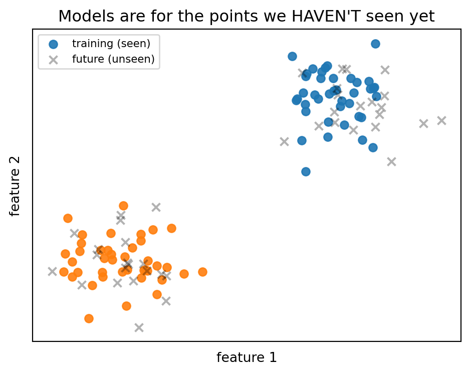
Why we care about models

In every learning setting, the game is:

Use data we do have (training) to build a model that performs well on data we haven’t seen yet (future samples from the same process).

Code
import numpy as np
import matplotlib.pyplot as plt

rng = np.random.default_rng(3151)

# Training data (what we see)
n_train = 80
X_train_pos = rng.normal([2, 2], 0.6, size=(n_train // 2, 2))
X_train_neg = rng.normal([-2, -2], 0.6, size=(n_train // 2, 2))

# "Future" data (what the model will actually face)
n_future = 40
X_future = np.vstack([
    rng.normal([2, 2], 0.6, size=(n_future // 2, 2)),
    rng.normal([-2, -2], 0.6, size=(n_future // 2, 2)),
])

fig, ax = plt.subplots(figsize=(5, 4))

# Training points
ax.scatter(X_train_pos[:, 0], X_train_pos[:, 1],
           label="training (seen)", alpha=0.9)
ax.scatter(X_train_neg[:, 0], X_train_neg[:, 1],
           alpha=0.9)

# Future points
ax.scatter(X_future[:, 0], X_future[:, 1],
           label="future (unseen)", alpha=0.3,
           marker="x", linewidths=1.5, color="black")

ax.set_xticks([]); ax.set_yticks([])
ax.set_xlabel("feature 1")
ax.set_ylabel("feature 2")
ax.set_title("Models are for the points we HAVEN'T seen yet")
ax.legend(loc="upper left", fontsize=8)

plt.tight_layout()
plt.show()

Tip

Every metric we compute on a test set is trying to estimate:

“How will this model behave on future data from this process?”

If we’re only winning on the points we’ve already seen, we’re not doing machine learning — we’re doing memorization.

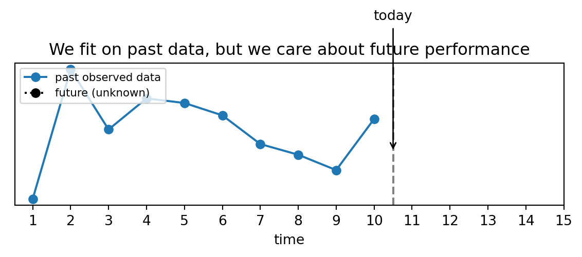
Today’s data, tomorrow’s decisions

Think of every ML project as a small time-travel experiment:

  • Today: we have a dataset \(\{(\color{blue}{x_i}, \color{red}{y_i})\}_{i=1}^n\) from the past.
  • Tomorrow: we’ll see new \(\color{blue}{X^*}\) and have to make decisions before we know \(\color{red}{Y^*}\).

We often (not always) want a model \(f_\theta\) to help with tomorrow’s decisions, not just to explain yesterday.

🔬 Definitions (1/2)

Supervised learning

  • 🛢️ Data: \(\mathcal{D}_\text{sup} = \{(\color{blue}{x_i}, \color{red}{y_i})\}_{i=1}^n\) with labels.
  • 🥅 Objective: choose parameters \(\theta\) to minimize expected loss \[R(\theta) = \mathbb{E}_{(\color{blue}{X},\color{red}{Y})\sim p}[\ell(f_\theta(\color{blue}{X}), \color{red}{Y})].\]
  • We often minimize the empirical risk \[\hat R(\theta) = \frac{1}{n} \sum_{i=1}^n \ell(f_\theta(\color{blue}{x_i}), \color{red}{y_i}).\]

Unsupervised learning

  • 🛢️ Data: \(\mathcal{D}_\text{unsup} = \{\color{blue}{x_i}\}_{i=1}^n\) only.
  • 🥅 Objective: discover structure in \(\color{blue}{x}\) alone, e.g.:
    • Clustering: partition indices \(\{1, \ldots, n\}\) into groups \(S_1, \dots, S_k\) so that points in the same group are more “similar” than points from different groups.
    • Density models \(p_\theta(\color{blue}{x})\): how likely are different regions of feature space?

Tip

Think of supervised as “predict a label” and unsupervised as “explain or compress the data, or find patterns”.

🔬 Definitions (2/2)

Self-supervised learning

  • 🛢️ Data: still only \(\{\color{blue}{x_i}\}\).
  • But we create pseudo-labels from the data itself:
    • Next token prediction in text.
    • Masked-word prediction (BERT-style).
    • Did we rotate this image (Y/N)?
  • We then run supervised learning on this synthetic task.

Semi-supervised learning

  • 🛢️ Data:
    • A small labeled set \(\mathcal{D}_L = \{(\color{blue}{x_i}, \color{red}{y_i})\}_{i=1}^{n_L}\) and
    • A larger unlabeled set \(\mathcal{D}_U = \{\color{blue}{x_j}\}_{j=1}^{n_U}\)
  • Objective: use both \(\mathcal{D}_L\) and \(\mathcal{D}_U\) to learn a predictor for \(\color{red}{Y}\).
  • Typical assumptions:
    • Cluster assumption: points in the same cluster tend to share labels.
    • Smoothness assumption: nearby points in a high-density region should have similar labels.

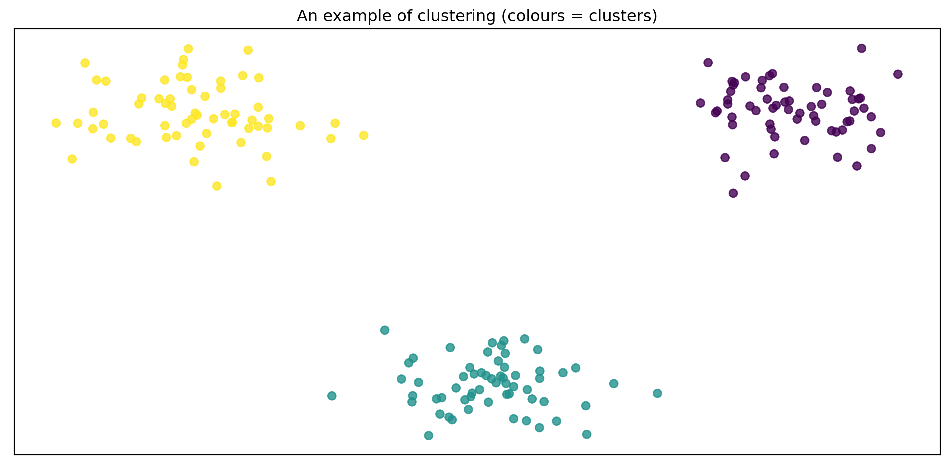
Clustering visually

Code
import numpy as np
import matplotlib.pyplot as plt
from sklearn.cluster import KMeans

rng = np.random.default_rng(3151)

X_clusters = np.vstack([
    rng.normal([2.0, 2.0], 0.4, size=(60, 2)),
    rng.normal([-2.0, 2.0], 0.4, size=(60, 2)),
    rng.normal([0.0, -2.0], 0.4, size=(60, 2)),
])

kmeans = KMeans(n_clusters=3, random_state=3151, n_init=10)
labels = kmeans.fit_predict(X_clusters)

fig, ax = plt.subplots()
ax.scatter(X_clusters[:, 0], X_clusters[:, 1], c=labels, alpha=0.8)
ax.set_xticks([])
ax.set_yticks([])
ax.set_title("An example of clustering (colours = clusters)")
plt.tight_layout()
plt.show()

  • Each colour is one cluster: a group of points the algorithm judged similar.
  • 🧐 we never told it any \(\color{red}{y}\) labels — clustering is based only on the geometry of \(\color{blue}{X}\).
  • A popular algorithm that behaves like this is k-means — we’ll define and analyze it carefully in a later module.

❌ Anti-example: unused labels

You collect:

  • \(n=100k\) customer records with features.
  • For 500 of them, you also have future revenue (a \(\mathbb{R}\)-valued target).
  • You cluster all 100k records and call it “semi-supervised regression”.

Warning

What’s wrong?

  • You never used the labels in your objective → your training is unsupervised.
  • You might evaluate clusters using revenue, but that’s post hoc.
  • Calling this “semi-supervised regression” hides the fact that you made no effort to align the clusters with revenue.

Boundary lesson:
What makes something supervised/semi-supervised is how labels enter the objective, not whether labels exist somewhere in your database.

🔬 Supervised risk

Suppose:

  • Binary classification, \(y \in \{0,1\}\).
  • Loss: 0–1 loss \(\ell(\hat y, y) = \mathbb{1}[\hat y \neq y]\).
  • Toy dataset of size 4:
\(x\) \(y\) \(f_\theta(x)\)
0.2 0 0
0.3 0 1
0.8 1 1
0.9 1 1

Empirical risk:

\[ \begin{align} \hat R(\theta) &= \frac{1}{4} \sum_{i=1}^4 \mathbb{1}[f_\theta(\color{blue}{x_i}) \neq \color{red}{y_i}]\\ &= \frac{1}{4}(0 + 1 + 0 + 0) = 0.25. \end{align} \]

Key idea:

Supervised learning turns “make few mistakes on future data” into “minimize empirical risk on a sample” (+ other controls we’ll learn later)

loss is a measure of error for a single data point or the average error across the training data,

risk is the expected value of that loss over the entire, unknown data distribution

Example 1 — supervised: subscription prediction

We’ll use a synthetic student trial accounts dataset.

  • Features:
    • time_on_platform_hours (continuous, hours/week).
    • avg_quiz_score (0–100).
  • Label:
    • will_subscribe (0/1).

Decision

  • We want to flag students for a nudge email if they seem likely to subscribe.
  • False negatives: missed opportunity to increase engagement.
  • False positives: mild annoyance; we want to cap them.

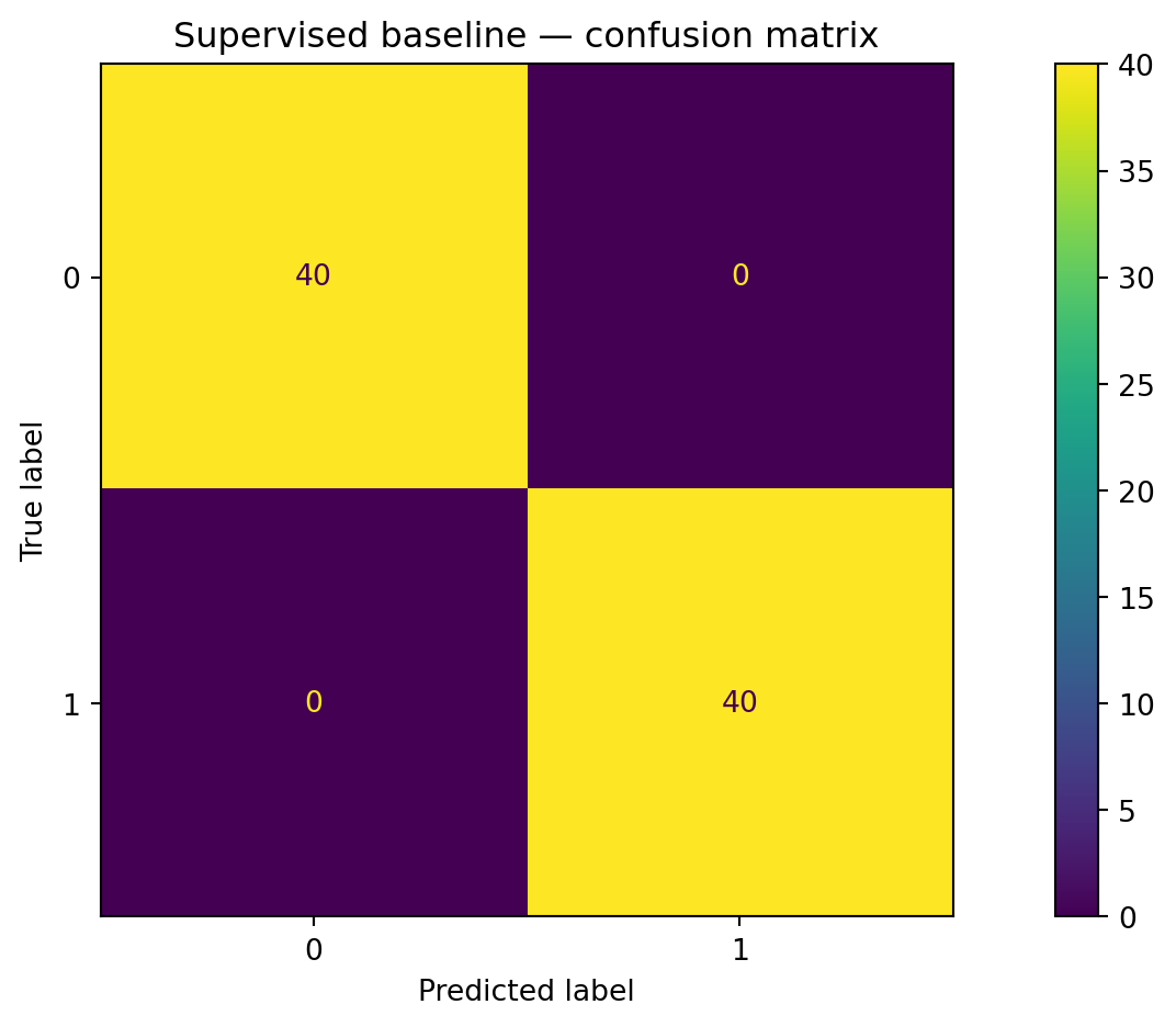
Code: supervised baseline in scikit-learn

Code
import numpy as np
import pandas as pd
import matplotlib.pyplot as plt
from sklearn.model_selection import train_test_split
from sklearn.linear_model import LogisticRegression
from sklearn.metrics import accuracy_score, ConfusionMatrixDisplay

rng = np.random.default_rng(3151)
n_pos, n_neg = 160, 160

time_pos = rng.normal(5.0, 1.0, size=n_pos)
quiz_pos = rng.normal(80.0, 5.0, size=n_pos)

time_neg = rng.normal(1.5, 0.7, size=n_neg)
quiz_neg = rng.normal(55.0, 7.0, size=n_neg)

X = np.vstack([
    np.column_stack([time_pos, quiz_pos]),
    np.column_stack([time_neg, quiz_neg]),
])
y = np.concatenate([
    np.ones(n_pos, dtype=int),
    np.zeros(n_neg, dtype=int)
])

df = pd.DataFrame({
    "time_on_platform_hours": X[:, 0],
    "avg_quiz_score": X[:, 1],
    "will_subscribe": y,
})

X_train, X_test, y_train, y_test = train_test_split(
    df[["time_on_platform_hours", "avg_quiz_score"]],
    df["will_subscribe"],
    test_size=0.25,
    random_state=3151,
    stratify=df["will_subscribe"],
)

log_reg = LogisticRegression()
log_reg.fit(X_train, y_train)

y_pred = log_reg.predict(X_test)
acc = accuracy_score(y_test, y_pred)
print(f"Accuracy: {acc:.3f}")

ConfusionMatrixDisplay.from_predictions(y_test, y_pred)
plt.title("Supervised baseline — confusion matrix")
plt.tight_layout()
plt.show()
Accuracy: 1.000

Warning

  • Subtlety: because this synthetic dataset is “nice”, logistic regression can get very high accuracy, but in real life:
    • Labels can be noisy / delayed.
    • The train/test split can introduce shifts.
    • One metric (accuracy) can hide important tradeoffs.

What is the model really learning?

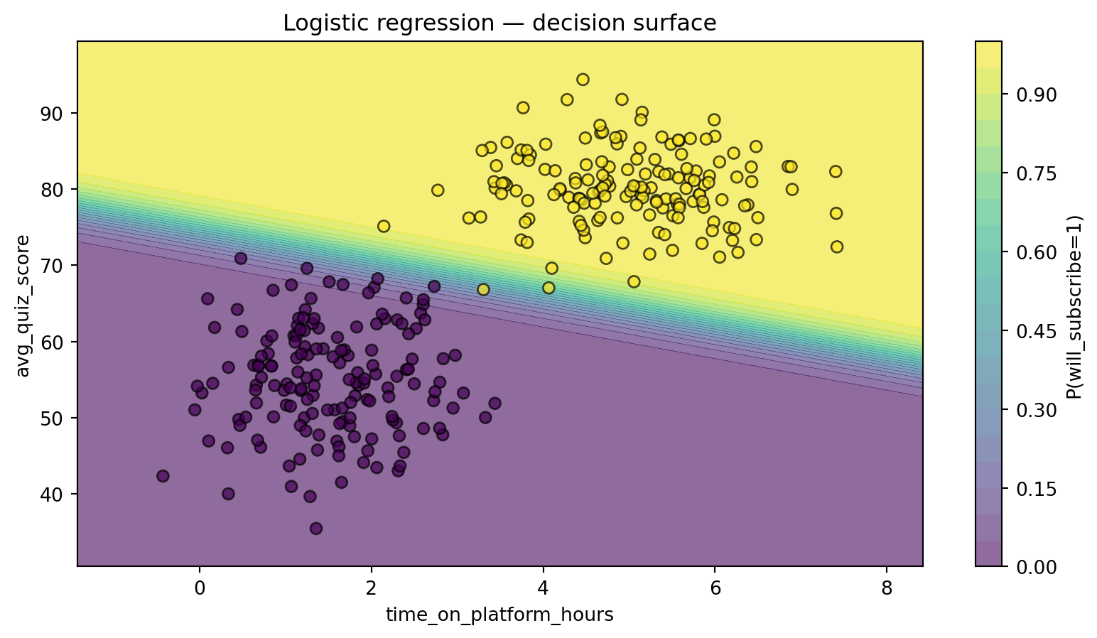
We can visualize the decision boundary in feature space:

Code
xx, yy = np.meshgrid(
    np.linspace(df["time_on_platform_hours"].min()-1,
                df["time_on_platform_hours"].max()+1, 200),
    np.linspace(df["avg_quiz_score"].min()-5,
                df["avg_quiz_score"].max()+5, 200),
)
grid = np.c_[xx.ravel(), yy.ravel()]
probs = log_reg.predict_proba(grid)[:, 1].reshape(xx.shape)

fig, ax = plt.subplots()
cs = ax.contourf(xx, yy, probs, levels=20, alpha=0.6)
scatter = ax.scatter(
    df["time_on_platform_hours"],
    df["avg_quiz_score"],
    c=df["will_subscribe"],
    edgecolor="k",
    alpha=0.7,
)
ax.set_xlabel("time_on_platform_hours")
ax.set_ylabel("avg_quiz_score")
ax.set_title("Logistic regression — decision surface")
plt.colorbar(cs, ax=ax, label="P(will_subscribe=1)")
plt.show()

Tip

Reading this plot:

  • The colour field is \(f_\theta(x)\) — the model’s estimate of \(\mathbb{P}(Y=1 \mid X=x)\).
  • The contour where probability ≈ 0.5 is the default decision boundary.

Example 2 — unsupervised clustering on the same data

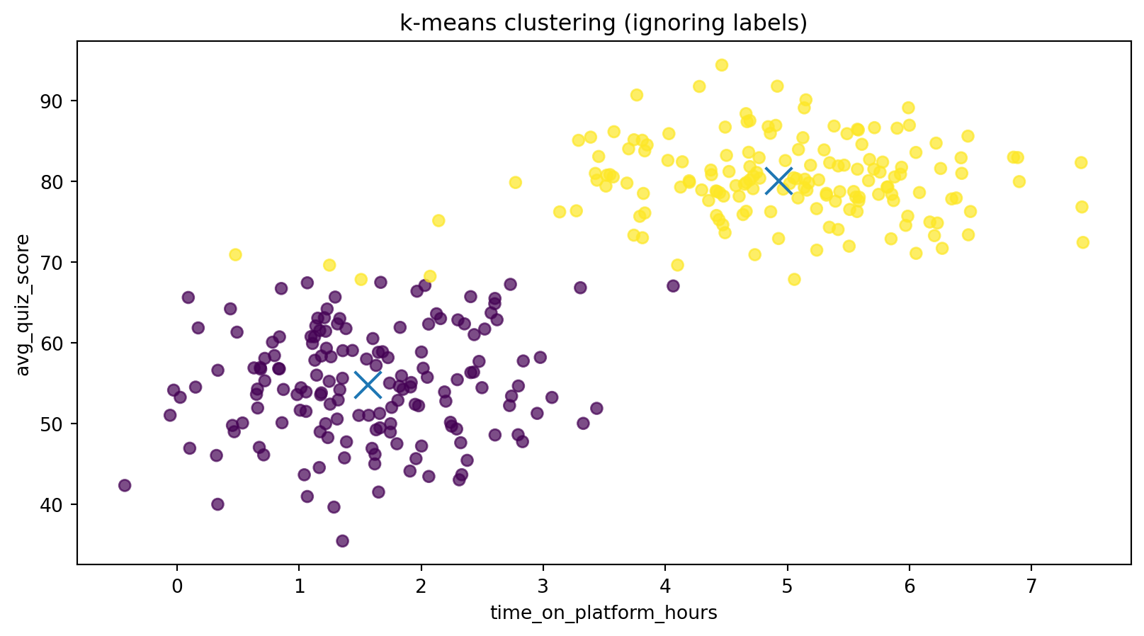
Now we pretend we never saw the subscription labels and run k-means:

Note

  • Sometimes clusters align nicely with labels — here they mostly do.
  • But the algorithm has no idea what “subscribe” means; it only sees geometry.
  • Using clusters as if they were ground-truth labels can be very misleading.
Code
from sklearn.cluster import KMeans

X_all = df[["time_on_platform_hours", "avg_quiz_score"]].values

kmeans = KMeans(n_clusters=2, random_state=3151, n_init=10)
cluster_labels = kmeans.fit_predict(X_all)

fig, ax = plt.subplots()
scatter = ax.scatter(
    df["time_on_platform_hours"],
    df["avg_quiz_score"],
    c=cluster_labels,
    alpha=0.7,
)
ax.scatter(
    kmeans.cluster_centers_[:, 0],
    kmeans.cluster_centers_[:, 1],
    marker="x",
    s=200,
)
ax.set_xlabel("time_on_platform_hours")
ax.set_ylabel("avg_quiz_score")
ax.set_title("k-means clustering (ignoring labels)")
plt.show()

import pandas as pd
contingency = pd.crosstab(cluster_labels, df["will_subscribe"],
                          rownames=["cluster"], colnames=["label"])
contingency

label 0 1
cluster
0 156 2
1 4 158

Fine.

Evaluation must match the decision

For our subscription decision:

  • Stakeholders care about:
    • How many future subscribers we catch (recall).
    • How many people we annoy unnecessarily (precision / false positive rate).
  • Accuracy treats all mistakes the same.

🤔 Always ask:

“If a model makes this type of mistake, who gets hurt and how badly?”

Possible evaluation choices:

  • For supervised subscription prediction:
    • Precision, recall, F1.
    • ROC / PR curves.
    • Calibration curves (are probabilities honest?).
  • For unsupervised clustering:
    • If no labels: cohesion/separation metrics, stability across runs.
    • If we do have labels (for teaching): adjusted Rand index, mutual information.

Ethics, fairness, and robustness

  • Fairness:
    • If labels (e.g., “will subscribe”) encode historical bias, supervised/semi-supervised models inherit that bias.
    • Clusters can indirectly encode protected attributes (e.g., geography, prior access).
  • Privacy:
    • Self-supervised objectives on logs or text can memorize sensitive information if not regularized / anonymized.
  • Robustness & shift:
    • Semi-supervised learning assumes unlabeled data come from the same distribution as labeled data.
    • If that’s false (e.g., new user demographic), pseudo-labeling can amplify mistakes.

Note

Evidence you should demand:

  • Performance + error analysis by subgroup (e.g., different student populations).
  • Tests of robustness under distribution shift (different time periods, campuses).
  • Documentation of what data was used for self-/semi-supervised pretraining.

🤔 Curiosity hook — how is GPT “self-supervised”?

Modern large language models are mostly trained with self-supervision:

  • Data: massive corpora of text (no human labels).
  • Task: predict the next token given previous tokens.
  • Objective: minimize cross-entropy (a supervised loss!) on this synthetic task.

Why it matters for us:

  • The paradigm is self-supervised, but under the hood it’s just supervised learning on an automatically-generated target.
  • Semi-supervised and fine-tuning steps later add small labeled datasets on top.
  • We’ll come back to this.

Question to keep in mind

“If my pretext task is weird, what representations will my model learn, and which downstream tasks will that help or hurt?”

Quick check (pause and think)

Try these before looking at the answers.

  1. You have millions of unlabeled images and 10k image–label pairs for cats vs. dogs.
    You pretrain a model to colourize grayscale images and then fine-tune it on the 10k labels.
    Q1: Which paradigms are used at the pretraining and fine-tuning stages?

  2. You cluster patient trajectories and then give doctors a dashboard showing cluster summaries, without ever using outcomes.
    Q2: What learning setting is this? Is there any hidden “supervision”?

  3. You have labeled spam/not-spam emails but accidentally include test-set emails in your training set.
    Q3: Which assumption is being violated?

  4. You run k-means with \(k=10\) on the student dataset and treat cluster ID as the “true” label.
    Q4: Name one serious risk of this practice.
References