M29: From EDA to Narrative: Annotation & Layout

CSCI 1109 — Practical Data Science

Frank Rudzicz

Outcomes

By the end of this module, you should be able to:

  1. Explain the difference between EDA plots and narrative/explanatory plots.
  2. Design a short visual story from a set of EDA findings for a specific audience.
  3. Use titles, subtitles, annotations, and layout to guide a reader’s attention.
  4. Critique a multi-plot layout for clarity, honesty, and support of the main message.

From EDA scratchpad to story

🙇 Exploratory Data Analysis (EDA)

  • You are the audience.
  • Goal: learn the data, chase questions, discover patterns.
  • Often many small, messy plots in notebooks:
    • Change scales, colours, filters frequently.
    • Re-run cells, duplicate code, etc.

🗣️ Narrative / Explanatory visualization

  • Someone else is the audience (manager, teammate, public).
  • Goal: communicate a small number of key findings.
  • Fewer, more polished figures:
    • Stable encodings, clear hierarchy, minimal clutter (Munzner 2014).

Key idea:

EDA is like a lab notebook; narrative viz is like a short article.

EDA vs narrative: quick comparison

Aspect EDA scratchpad Narrative figure
Audience You (analyst) Others (non-expert or expert)
Number of plots Many Few (often 1–3)
Titles “tmp”, “check this”, or missing Clear, descriptive, question/answer
Axes & scales Change often, experimental Consistent, justified
Colour & style Default / ad hoc Intentional, consistent legend
Annotations Rare Strategic: callouts, highlights
Story structure None Beginning → middle → end

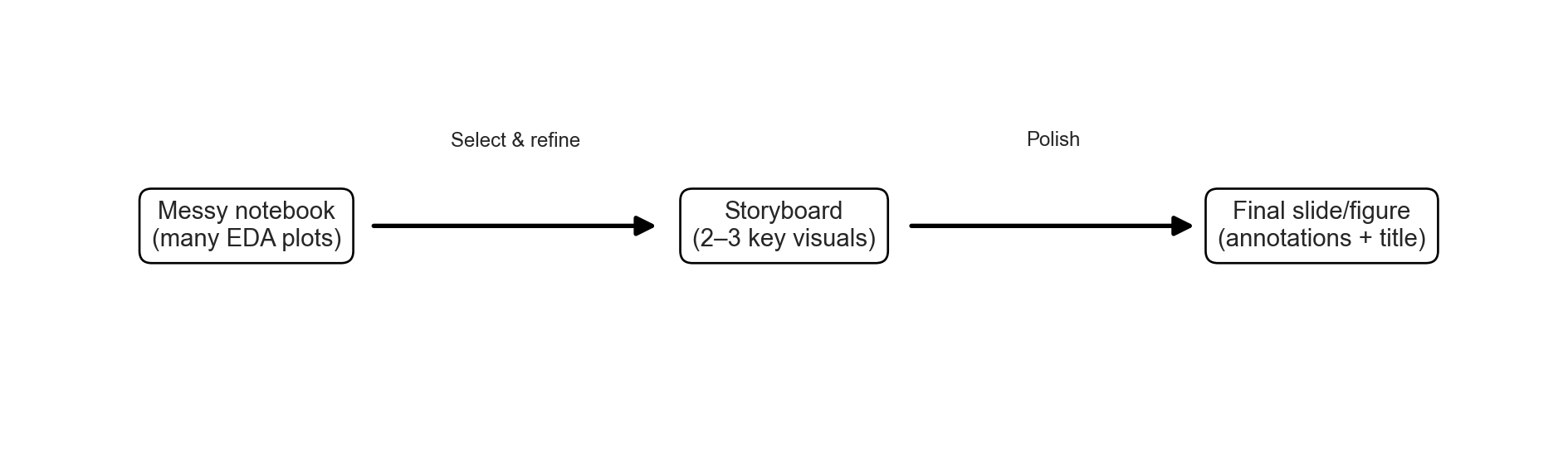
Conceptual scaffold: from EDA to storyboard

Think of building a mini storyboard (see also Healy (2019)):

  1. Question (or claim) you care about.
  2. Evidence you discovered during EDA (plots, tables, checks).
  3. Minimal set of visuals that support that evidence.
  4. Layout & annotation to make the logic obvious.

A simple process for reading any plot (SEE)

When you see a plot in this course (or anywhere else), run this quick SEE checklist:

  • Scan: What is this plot claiming?
    • What are the axes and units?
    • What pattern is your eye drawn to first?
  • Examine: How is that claim supported (or distorted)?
    • Are there truncated axes, odd aspect ratios, missing labels, …?
    • Are there outliers or small groups that are easy to miss?
  • Explain: What could also explain this pattern?
    • Is there a possible confounder (e.g., time, group, selection bias)?
    • What extra plot or summary would you ask for before believing a strong conclusion?

You don’t have to write these down every time, but the goal is that this three-beat rhythm (“Scan → Examine → Explain”) becomes automatic.

❌ Anti-example: when the story breaks

Imagine a dashboard slide:

  • Big title: “Our new menu dramatically increased tips”.
  • Only figure: bar chart of average tip % before vs after.
  • Axes start at 15%, making a small 1% increase look enormous.
  • No info on:
    • Number of tables in each period.
    • Weekday vs weekend mix.
    • Lunch vs dinner.
Code
import pandas as pd
import matplotlib.pyplot as plt

# Tiny real difference, but we'll exaggerate it visually
data = pd.DataFrame({
    "period": ["Before new menu", "After new menu"],
    "avg_tip_pct": [18.2, 19.1]  # less than 1 percentage point difference
})

fig, ax = plt.subplots(figsize=(6, 4))

# Bar chart
bars = ax.bar(data["period"], data["avg_tip_pct"])

# Misleading y-axis: start high so the difference looks huge
ax.set_ylim(17, 20)  # <- truncation that exaggerates the difference

# Over-confident title
ax.set_title("Our new menu dramatically increased tips", fontsize=14)

ax.set_ylabel("Average tip (%)")

# No mention of sample size, no error bars, no context
# (We could add those in a 'fixed' version, but we deliberately don't.)

# Add value labels on top of bars (helps sell the story)
for bar, val in zip(bars, data["avg_tip_pct"]):
    ax.text(
        bar.get_x() + bar.get_width() / 2,
        val + 0.05,
        f"{val:.1f}%",
        ha="center",
        va="bottom",
        fontsize=10
    )

# Remove grid to keep the focus on the bars
ax.grid(False)

plt.tight_layout()
plt.show()
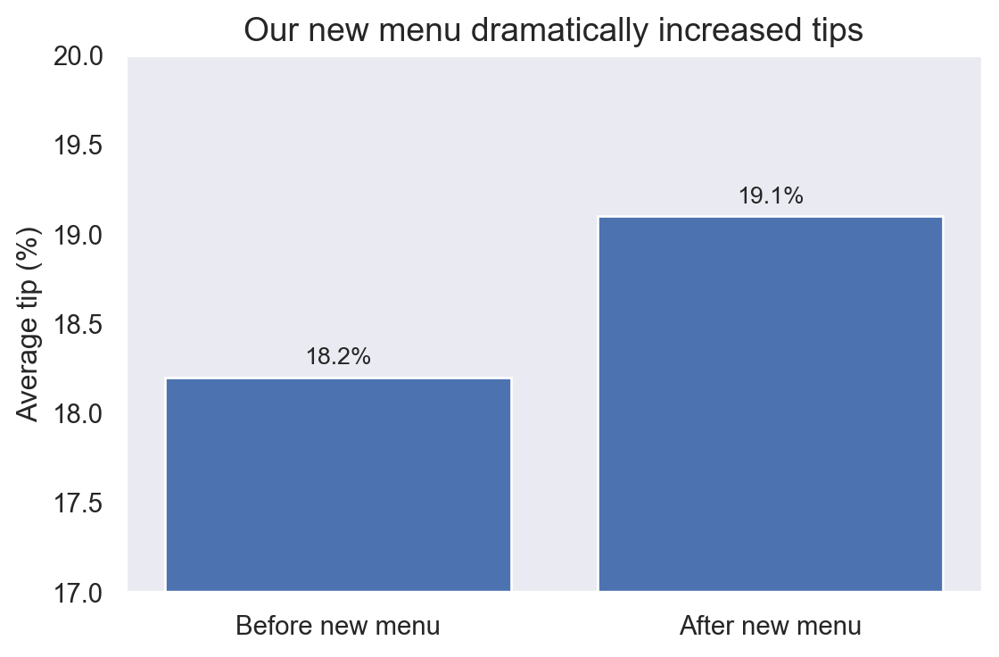
Problems:

  • Cherry-picking: only the most flattering cut of the data.
  • Perception tricks: truncated axis exaggerates differences.
  • Missing context: viewer can’t judge reliability.

Anti-example lesson

A clean-looking chart is not automatically honest or informative (Tufte 2001).

Setup: imports & data

Code
import pandas as pd
import seaborn as sns
import matplotlib.pyplot as plt

sns.set_theme()

# Built-in restaurant tipping dataset
tips = sns.load_dataset("tips").copy()
tips["tip_pct"] = tips["tip"] / tips["total_bill"] * 100

tips[["total_bill", "tip", "tip_pct", "day", "time", "size"]].head()
total_bill tip tip_pct day time size
0 16.99 1.01 5.944673 Sun Dinner 2
1 10.34 1.66 16.054159 Sun Dinner 3
2 21.01 3.50 16.658734 Sun Dinner 3
3 23.68 3.31 13.978041 Sun Dinner 2
4 24.59 3.61 14.680765 Sun Dinner 4
  • Context: Tips at a (Halifax?) restaurant, with day, time (lunch/dinner), and party size.
  • We’ll use this as a running example for narrative visualization.

Example 1 – EDA scratchpad

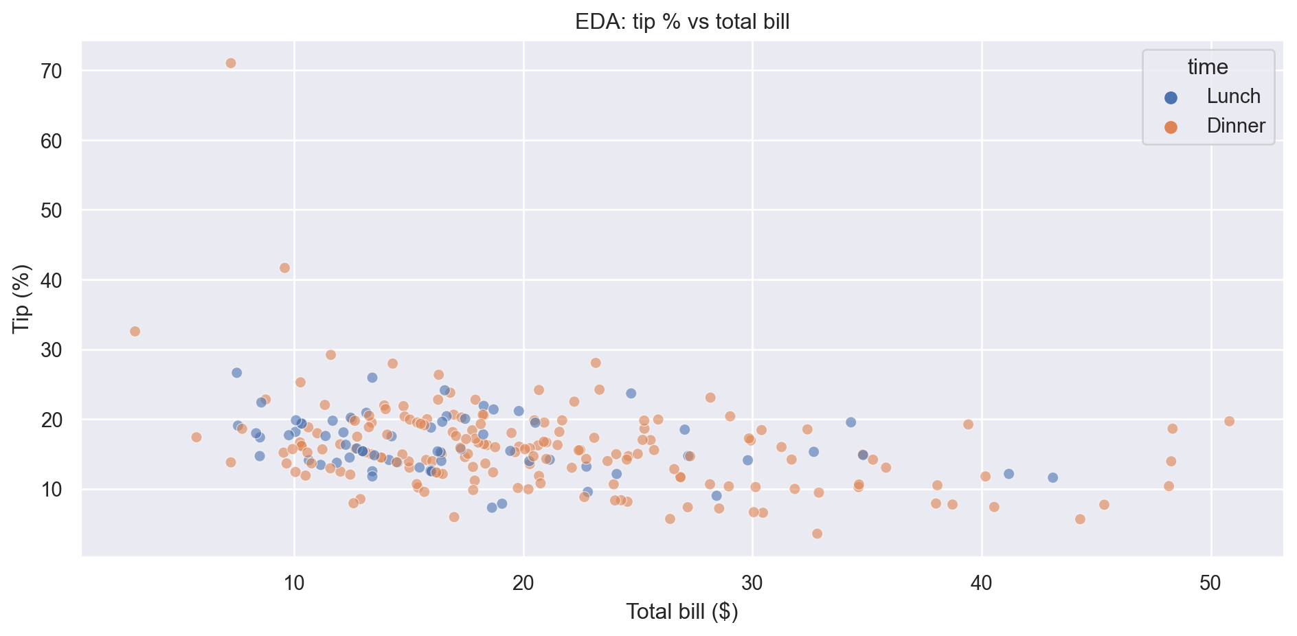
Question (vague):

“How does tip % behave as bills get larger?”

Initial EDA pass:

Code
fig, ax = plt.subplots()
sns.scatterplot(
    data=tips,
    x="total_bill",
    y="tip_pct",
    hue="time",
    alpha=0.6,
    ax=ax,
)

ax.set_title("EDA: tip % vs total bill")
ax.set_ylabel("Tip (%)")
ax.set_xlabel("Total bill ($)")
plt.tight_layout()
Figure 1: EDA scatterplot of tip % vs total bill, coloured by time of day.

EDA observations

  • Tip % is quite spread out, especially for smaller bills.
  • Dinner seems to include more large bills than lunch.
  • Above some amount (e.g. $40), there are few points.

Example 1 – Summaries behind the story

Before going narrative, check some simple summaries:

Code
summary_by_time = (
    tips
    .groupby("time")["tip_pct"]
    .agg(["count", "mean", "median"])
    .round(1)
    .reset_index()
)
summary_by_time
Average tip % by time of day.
time count mean median
0 Lunch 68 16.4 15.4
1 Dinner 176 16.0 15.5

✏️

  • Are differences large enough to matter?
  • How many observations do we have at lunch vs dinner?
  • This table can support or weaken any claim like
    “Dinner customers tip more generously than lunch customers”.

Example 1 – Turning it into a story figure

Now create a single narrative plot for the restaurant stakeholders.

Design choices

  • Audience is now non-technical staff at the restaurant.
  • Title states the main message in plain language.
  • Shaded band marks a “normal” tipping range (15–20%).
  • Axes are trimmed to the region with most data, but y still starts at 0 to avoid exaggeration.
  • A single annotation calls out unusually generous tips on mid-sized dinner bills.
  • Many EDA variants → one clear, annotated figure.
Code
fig, ax = plt.subplots(figsize=(7, 4))

sns.scatterplot(
    data=tips,
    x="total_bill",
    y="tip_pct",
    hue="time",
    alpha=0.5,
    ax=ax,
    legend=True,
)

# Focus on the main range where most customers live
ax.set_xlim(0, 60)
ax.set_ylim(0, 40)

ax.set_title("Most customers tip around 15–20% on typical dinner bills")
ax.set_xlabel("Total bill ($)")
ax.set_ylabel("Tip (% of bill)")

# Add a horizontal band for 15–20% as a “normal tipping” region
ax.axhspan(15, 20, color="grey", alpha=0.1)
ax.text(
    5, 21.5,
    "Common tipping range\n(15–20%)",
    fontsize=9,
    va="bottom"
)

# Optional annotation: call out high tips on mid-sized dinner bills
ax.annotate(
    "Some dinner parties tip 25%+ on $30–$50 bills",
    xy=(40, 26),
    xytext=(48, 32),
    arrowprops=dict(arrowstyle="->"),
    fontsize=9,
)

ax.legend(title="Time of day", loc="lower right")
plt.tight_layout()
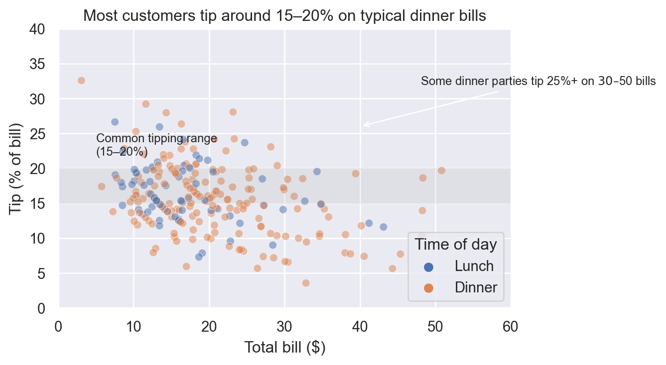
Figure 2: Narrative version: focus on typical tip %, highlight moderate bills.

Example 2 – Layout & small multiples

New question:

“When do we see the highest average tip %: weekday vs weekend, lunch vs dinner?”

First, build a small summary table:

Code
summary_day_time = (
    tips
    .groupby(["day", "time"])["tip_pct"]
    .agg(count="count", mean_pct="mean")
    .reset_index()
)

summary_day_time["mean_pct"] = summary_day_time["mean_pct"].round(1)
summary_day_time
Average tip % and number of tables by day and time.
day time count mean_pct
0 Thur Lunch 61 16.1
1 Thur Dinner 1 16.0
2 Fri Lunch 7 18.9
3 Fri Dinner 12 15.9
4 Sat Lunch 0 NaN
5 Sat Dinner 87 15.3
6 Sun Lunch 0 NaN
7 Sun Dinner 76 16.7

Example 2 – Narrative bar chart with labels

Code
fig, ax = plt.subplots(figsize=(7, 4))

sns.barplot(
    data=summary_day_time,
    x="day",
    y="mean_pct",
    hue="time",
    ax=ax,
)

ax.set_ylabel("Average tip (%)")
ax.set_xlabel("Day of week")
ax.set_title("Weekend dinners bring the highest tip percentages")

# Add labels on bars for quick reading
for container in ax.containers:
    ax.bar_label(container, fmt="%.1f", padding=2, fontsize=8)

ax.legend(title="Time of day", loc="lower right")
plt.tight_layout()
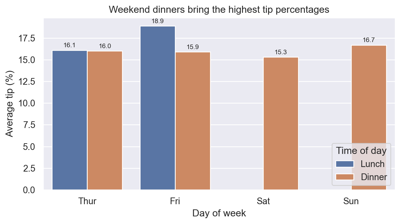
Figure 3: Average tip % by day and time of day, with bar labels.

Design choices

  • Single, centered figure instead of conflicting mini-charts.
  • Ordering of days (Thur → Sun) makes weekend pattern easier to see.
  • Bar labels let viewers get values without guessing from the y-axis.
  • Title states the main takeaway; legend reinforces colour coding.

Evaluation & checks

Before trusting your visual story, ask:

  • Sample size:
    • Are some bars based on only a handful of bills?
    • If so, mention that (or add error bars).
  • Stability:
    • Would your main message change if you:
      • Dropped extreme outliers?
      • Looked at a slightly different time window?
  • Alternative explanations:
    • Are high weekend dinner tips driven by larger party sizes?
    • Should you stratify by size, or at least mention this?

Ethics & risks

Narrative visualizations can be powerful — and misleading:

  • Cherry-picked cuts of the data can hide important groups (e.g. ignoring lunch entirely).
  • Styling tricks (truncated axes, deceptive colours, 3D effects) can exaggerate effects (Tufte 2001).
  • Omitted uncertainty can overstate confidence (e.g. tiny sample on one day).
  • Audience trust:
    • People may not see your notebook; they only see the polished chart.

Simple mitigations:

  • Show at least one supporting table or count behind your headline chart.
  • Avoid perception pitfalls from earlier modules (M26).
  • Use titles and annotations that are accurate, not hype (“higher in our sample” vs “proves that…”).

Curiosity & connections

Where does this show up in real life?

  • News articles and explainers (e.g. election maps, COVID dashboards).
  • Internal reports and slide decks for stakeholders.

Connection to later work:

  • When you start presenting ML results (accuracy, precision/recall, etc.),
    these same principles of story, annotation, layout, and honesty apply.

Quick checks

  1. MCQ: Which statement best describes a narrative visualization?

    • A. Any chart with pretty colours.
    • B. A plot designed primarily for you while exploring data.
    • C. A plot designed for others, with a clear message and supporting evidence.
    • D. A plot with the most subplots per slide.
  2. Short answer: Name two differences between EDA plots and narrative plots.

  3. MCQ: You create a bar chart of average tip % by day, but one day has only 3 observations.
    What’s the best next step?

    • A. Remove that day with no comment.
    • B. Keep it and add a note or error bar to show the low sample size.
    • C. Truncate the y-axis to exaggerate the difference.
    • D. Change to a pie chart.
  4. Short answer: Suppose your scatterplot suggests a weak trend, but your title says
    Massive increase in tips after new menu”.
    What’s one change you could make to make this more honest?

References

Healy, Kieran. 2019. Data Visualization: A Practical Introduction. Princeton, NJ: Princeton University Press.
Munzner, Tamara. 2014. Visualization Analysis and Design. AK Peters Visualization Series. Boca Raton, FL: A K Peters/CRC Press.
Tufte, Edward R. 2001. The Visual Display of Quantitative Information. 2nd ed. Cheshire, CT: Graphics Press.