M25 - Visualization Grammar & Taxonomy

CSCI 1109 — Practical Data Science

Frank Rudzicz

Learning outcomes

By the end of this module, you should be able to:

  1. Name and use the core visual variables (Bertin) and explain how they relate to a viz grammar.
  2. Classify charts by task (comparison, trend, distribution, relationship, part-to-whole, flow) and pick a reasonable type for each.
  3. Read and critique interactive examples (from nivo.rocks) using the language of marks, channels, and scales.
  4. Implement two basic but honest visualizations in Python that respect data types and units.
  5. Explain to a non-expert why a visualization is (or is not) appropriate for a given decision.

Eliciting knowledge from data

Is there a relationship between a country’s median age and its birthrate?

The full table has 18,410 rows

As a graph

Table vs chart – reflection

Thought experiment
Imagine this table extended back to 1960 for 10+ countries. How easy would it be to see which country gained the most? How easy is it on the chart above?

✏️ Questions to consider:

  • When did the chart feel clearly better than the table?
  • When is the table still necessary?
    • e.g., exact values, documentation, debugging your charts
  • Which visual variables are doing the heavy lifting in the chart?
    • e.g., position, slope, colour

Visualization elicits structure quickly, does not replace the underlying data.

Anscombe’s quartet

From Anscombe (1973), these four \((x, y)\) datasets have identical:

  • means
  • standard deviations
  • correlations
  • simple linear regressions

Do they all describe similar phenomena?

I II III IV
x y x y x y x y
0 10.0 8.04 10.0 9.14 10.0 7.46 8.0 6.58
1 8.0 6.95 8.0 8.14 8.0 6.77 8.0 5.76
2 13.0 7.58 13.0 8.74 13.0 12.74 8.0 7.71
3 9.0 8.81 9.0 8.77 9.0 7.11 8.0 8.84
4 11.0 8.33 11.0 9.26 11.0 7.81 8.0 8.47
5 14.0 9.96 14.0 8.10 14.0 8.84 8.0 7.04
6 6.0 7.24 6.0 6.13 6.0 6.08 8.0 5.25
7 4.0 4.26 4.0 3.10 4.0 5.39 19.0 12.50
8 12.0 10.84 12.0 9.13 12.0 8.15 8.0 5.56
9 7.0 4.82 7.0 7.26 7.0 6.42 8.0 7.91
10 5.0 5.68 5.0 4.74 5.0 5.73 8.0 6.89

Anscombe’s quartet

Datasaurus Dozen

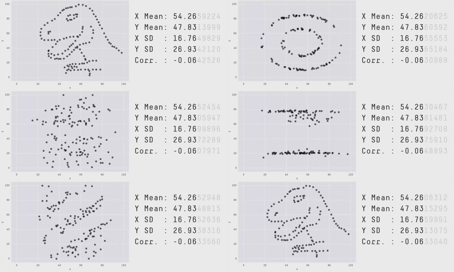
The Datasaurus example (Matejka and Fitzmaurice 2017) pushes this further:

  • Every frame in this animation has (approximately) the same: means of \(x\) and \(y\), standard deviations, and correlations
  • But the shape of the data changes dramatically:
    • dinosaur → star → circle → slanted line → …
Warning

We must look at the data, not just its summary statistics.

History: Disease

  • Cholera is an infection of the small intestine
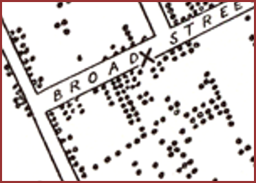
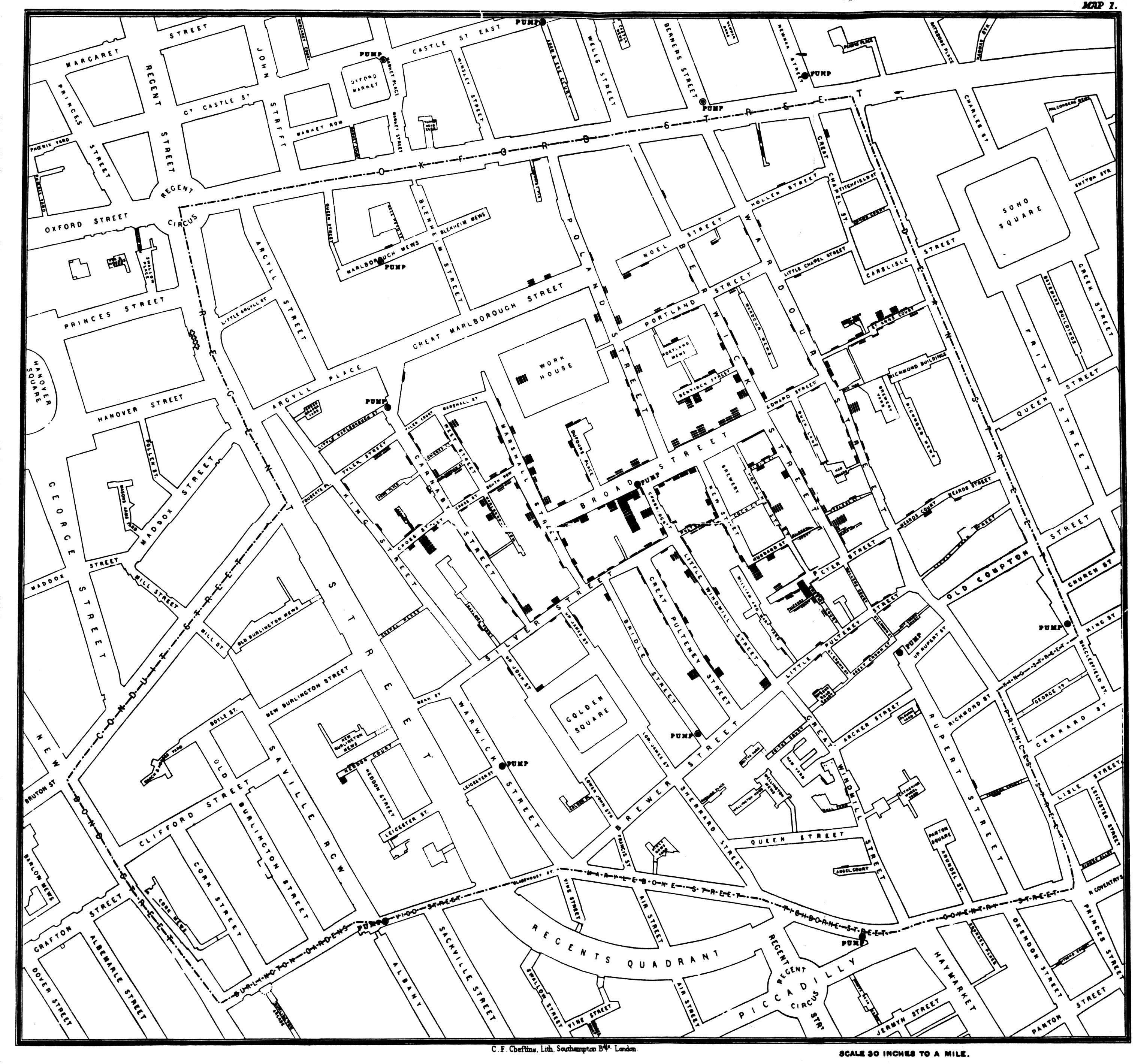
  • ~1854, a cholera outbreak shook London (England)
  • At the time, it was thought to have spread by ‘miasma’.
  • John Snow, establishing the field of epidemiology, plotted the homes of infected patients.
    • A water pump was identified at the centre of the outbreak
    • Removing the pump handle ended the outbreak
History: War
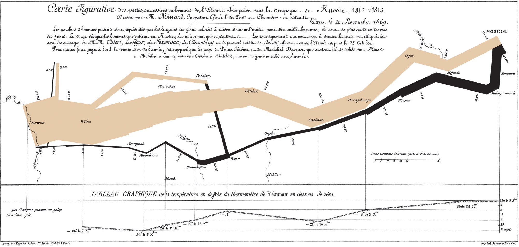
  • Minard’s (Sankey) map of Napoleon’s 1812 Russian campaign combines:
    • troop size,
    • location,
    • direction,
    • temperature,
    • time.

History: Disease & War

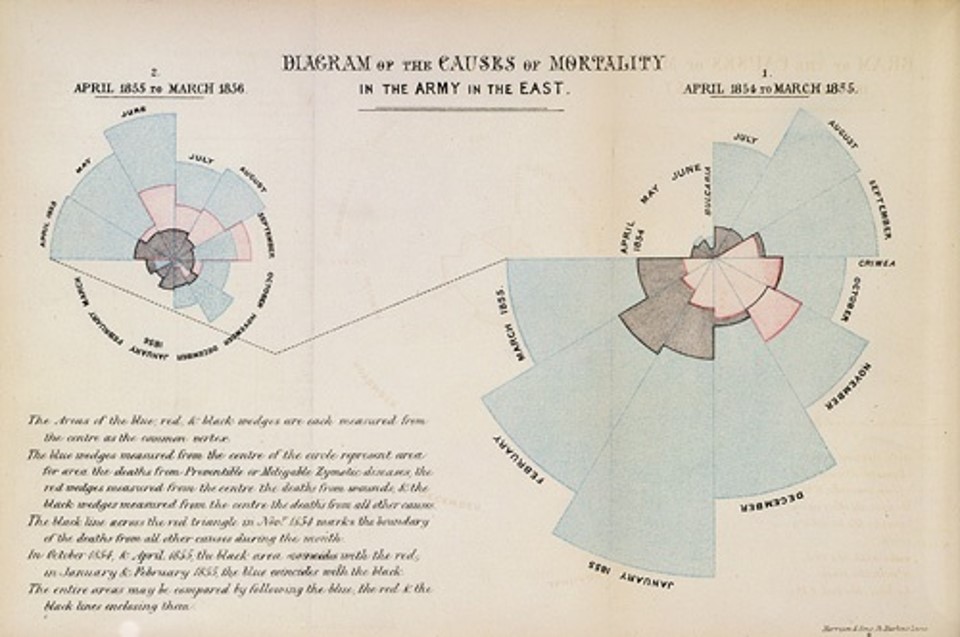
  • Florence Nightingale was an accomplished nurse and statistician.
    • (and an early innovator in infoviz)
  • She plotted casualties in the Crimean War (no, not that one; in 1854-1856).
    • Red: wounds
    • Blue: disease
  • This led to an inquiry into sanitation and, thereafter, significant improvements in barracks and hospitals.

Conceptual scaffold

Visualization grammar

  • Goal: give you a single mental model for thinking about visualization design.
  • We treat a visualization a bit like a sentence:
    • there is a purpose,
    • some content,
    • and a grammar for how it is drawn.
  • We will organize that grammar around three questions (after Munzner):

Why?
Task, audience,
decision

What?
Data, attributes,
abstraction

How?
Marks, channels,
layout

Why: Tasks and effectiveness

  • A widely used definition in visualization research (Munzner 2014, 2009):

    Computer-based visualization systems provide visual representations of datasets designed to help people carry out tasks more effectively.

  • The task is the reason someone is looking at the graphic at all:

    • e.g., to compare groups, spot outliers, understand a trend, check whether a model is reasonable, or communicate a key result to a non-technical audience.
  • Evaluation-focused writing on visualization emphasizes that we cannot judge a graphic with a single magic metric; instead we ask:

    • does this visualization help its audience perform their task accurately, quickly, and confidently? (Tayo 2020)

Why (visual): example task in a scatterplot
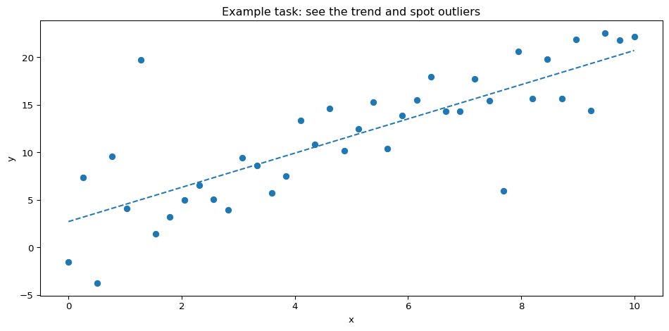
  • Possible tasks for this figure:
    • Characterize the trend (is it increasing? roughly linear?).
    • Find anomalies / outliers (which points clearly don’t fit?).

What: dataset types (big picture)

  • Next layer in the scaffold: the structure of the data we are visualizing.

  • Following Munzner, we distinguish dataset types (overall structure) from attributes (columns) (Munzner 2014).

  • Common dataset types in this course:

    • Tables: rows = items (students, loans, patients), columns = attributes.
    • Networks: nodes and links (social networks, citation graphs).
    • Spatial / fields: values defined over space (e.g., temperature over a map, pixel intensities in an image).
  • Dataset type strongly constrains what kinds of plots make sense:

    • tables → scatterplots, bar charts, line charts, heatmaps,
    • networks → node–link diagrams, adjacency matrices,
    • spatial / fields → choropleths, contour plots, raster images.

What (visual): tiny table example

student_id major gpa year
0 101 CS 3.2 2nd
1 102 Stats 3.8 4th
2 103 CS 2.9 1st
3 104 Math 3.6 3rd
4 105 CS 3.1 2nd
  • This is a table dataset:
    • rows = students,
    • columns = attributes (major, gpa, year, …).

What (visual): network vs spatial / field
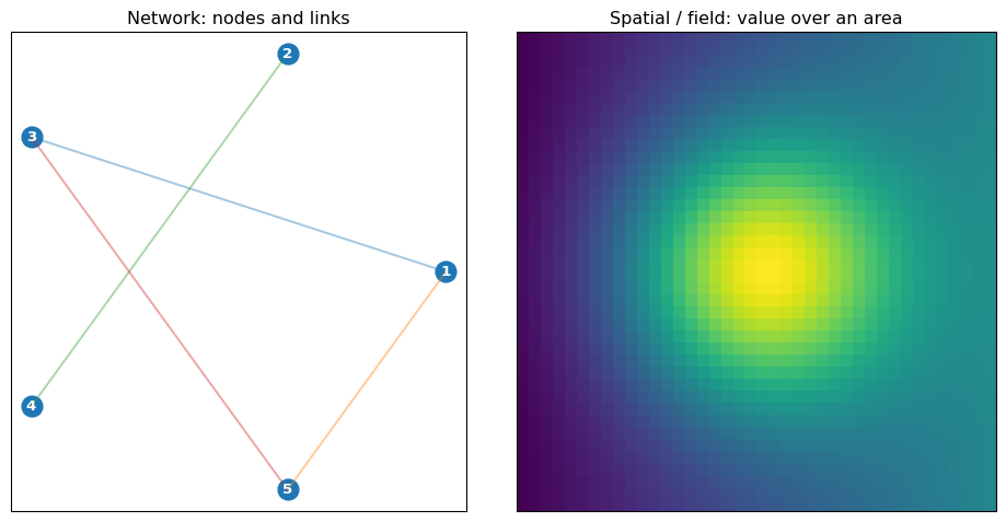
  • Left: a network of 5 nodes.
  • Right: a field where every location has a value (heatmap-like).

What: attribute types (data types)

  • Within a table, different attribute types support different visual encodings (Munzner 2014; Mackinlay 1986):

    • Categorical (nominal): unordered labels (species, major, country).
    • Ordered (ordinal): categories with a meaningful order but not equal spacing (Likert scales, grade bands).
    • Quantitative: numeric values with meaningful differences and often ratios (age, height, income, probability).
  • Other useful distinctions:

    • Key vs value attributes (IDs vs measurements).
    • Derived attributes (i.e., computed from others)
      • e.g., residuals, percentages, z-scores).

What (visual): three attribute types
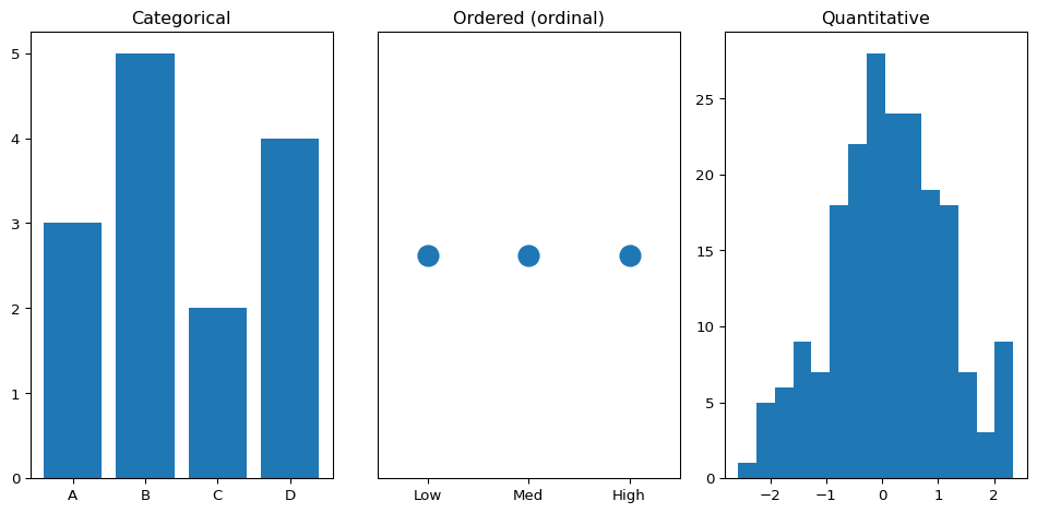
  • Same underlying concept (some notion of “level”), but different attribute types → different appropriate plots.

How: marks and channels

  • Now the How layer: how do we turn data into pixels?

  • Following Bertin’s Semiology of Graphics and later work (Bertin 1983; Roth 2017; Munzner 2014):

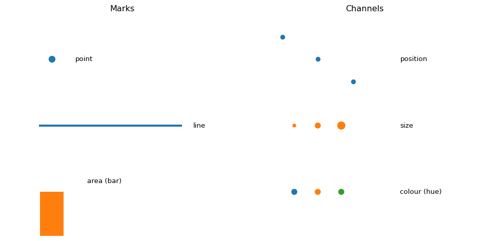
    • Marks are the basic geometric objects that appear in the plot:
      • points, lines, areas (bars, polygons), text, sometimes volumes.
    • Channels (also called visual variables) are properties of marks that we can vary to encode data:
      • position \((x, y)\),
      • size,
      • shape,
      • colour (hue, value, saturation),
      • orientation,
      • texture,
      • et cetera (motion, blur, transparency, etc.).
  • The grammar question is:

    Which attributes map to which channels on which marks?

How (visual): marks and channels palette
How (visual): same data, different channels
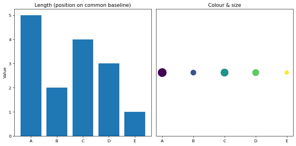
  • Left: position and length make it easy to compare values.
  • Right: colour and size look ‘fancier’, but precise comparison is harder.

How: expressiveness and effectiveness

  • Mackinlay’s classic paper on automated chart design introduced two key criteria (Mackinlay 1986):

    • Expressiveness: the visualization shows all the information in the data, and only that information.
      • e.g., do not imply an order for purely categorical data (e.g., by using a light–dark gradient).
    • Effectiveness: the chosen encodings exploit human perception so that the most important information is easiest to see.
  • A simple (but powerful) consequence:

    • For quantitative attributes, prefer channels like position on a common scale, length, sometimes angle 📐.
    • For ordered attributes, channels like position, value (lightness), or size work well.
    • For categorical attributes, channels like colour hue, shape, and distinct regions are more appropriate.

Comparison & trend

  • Mark: rectangle.
  • Channels: \(x\)-position = category, height = value, sometimes hue = group.
  • Best for: comparison across categories.
  • Mark: line segments.
  • Channels: \(x\)-position = time, \(y\)-position = value.
  • Best for: trend over time, continuity.

Relationship & distribution

  • Mark: points.
  • Channels: \(x\)-position, \(y\)-position, colour for groups, size optionally.
  • Best for: relationships, clusters, outliers.
  • Mark: tiles.
  • Channels: row/column position, colour value for magnitude.
  • Best for: matrix-like relationships, e.g., correlation matrices, confusion matrices.

Flow – Sankey

  • Marks: nodes + bands.
  • Channels: band width = flow magnitude, colour = group, position = stage.
  • Best for: “where did it go?” questions (budgets, energy, traffic).

Grammar of Graphics

  • Wilkinson’s Grammar of Graphics proposes that every chart can be described in terms of a small set of components (Wilkinson 2005).

  • Many modern libraries (e.g., 🔗 ggplot2, 🔗 plotnine, 🔗 Altair) build (directly or indirectly) on this grammar.

  • Key components:

    • Data: one or more datasets.
    • Aesthetics / mappings: which attribute maps to which channel (x, y, colour, size, etc.).
    • Geometric objects: mark types (points, bars, lines, polygons, text).
    • Statistical transformations: aggregations, binning, smoothing.
    • Scales and guides: axes, legends, colourbars that relate data units to visual units.
    • Coordinate system: Cartesian, polar, map projection.
    • Faceting: splitting data into small multiples / panels.
Data
Transform
Map to channels
Marks & layout
Axes & legends
  • Thinking in this “grammar of graphics” way lets us reason systematically about alternative designs instead of memorizing chart recipes.

Tasks: from questions to low-level actions

  • Returning to the Why layer, we can be more precise about tasks.
  • Amar, Eagan & Stasko (2005) propose a widely used set of low-level analysis tasks for information visualization (Amar, Eagan, and Stasko 2005):
  • Retrieve a value
  • Filter items that match a condition
  • Find extrema (min / max)
  • Sort or rank items
  • Determine range
  • Characterize distribution
  • Find clusters
  • Find anomalies or outliers
  • Correlate attributes
  • Compute derived values
  • When you design or critique a visualization, ask:
    • Which of these low-level tasks should be easy?
    • Do my encoding choices actually make them easy?

Evaluating a visualization with the scaffold

Use the scaffold as a structured way to critique or improve any plot:

  1. Why? (Task and audience)
    • Whom is this for?
    • What question or decision are they working on?
    • Which low-level tasks from the previous slide are primary?
  2. What? (Data and abstraction)
    • Are we showing the right dataset(s)?
    • Are we using appropriate abstractions (e.g., aggregations, derived attributes)?
    • Are attribute types (categorical / ordered / quantitative) respected?
  3. How? (Visual encoding and idiom)
    • Are marks and channels expressive and effective for these attributes and tasks?
    • Are scales, axes, legends, and labels clear and readable?
    • Is important structure visible without excessive clutter?
  • Tayo (2020) (and others) show visualization evaluation is multidimensional, not a single score

Math lens

Intuition

Think of a visualization as a function \(g\) that takes a row of data and returns a mark:

  • Input: row = (country="Canada", income=46000, life_exp=82)
  • Output: a circle at some (x, y) with a certain size and colour.

Plain language:

Viz is a pipeline that turns units and labels into positions, lengths, and colours.

Light notation

Let a data row be a vector \(\mathbf{x} = (x_1, x_2, \dots, x_d)\). Then

\[ g(\mathbf{x}) = (\text{mark type}, x_{\text{pos}}, y_{\text{pos}}, \text{colour}, \text{size}, \dots) \]

For a penguin scatterplot:

\[ g(\mathbf{x}) = (\text{point},\; \text{flipper_length}(\mathbf{x}),\; \text{body_mass}(\mathbf{x}),\; \text{colour(species)},\; \text{size} = 5) \]

You won’t manipulate these equations directly, but they give a precise way to think about encoding.

Example 1 – Penguins 🐧

Question and stakes

You are a field biologist planning penguin weighing sessions.

From flipper length, can we guess body mass to within ~300 g?

  • Over-estimate mass → unsafe sedative dose.
  • Under-estimate mass → safer but wasteful.

We use a tiny sample inspired by the Palmer penguins dataset (Horst, Hill, and Gorman 2020).

Load data

Code
import pandas as pd
import numpy as np
import matplotlib.pyplot as plt
from palmerpenguins import load_penguins

# Load full Palmer penguins table
penguins = load_penguins()

# (Optional) drop rows with missing values for cleaner plotting later
penguins = penguins.dropna()

penguins.head()
species island bill_length_mm bill_depth_mm flipper_length_mm body_mass_g sex year
0 Adelie Torgersen 39.1 18.7 181.0 3750.0 male 2007
1 Adelie Torgersen 39.5 17.4 186.0 3800.0 female 2007
2 Adelie Torgersen 40.3 18.0 195.0 3250.0 female 2007
4 Adelie Torgersen 36.7 19.3 193.0 3450.0 female 2007
5 Adelie Torgersen 39.3 20.6 190.0 3650.0 male 2007

Scatterplot by species

Code
fig, ax = plt.subplots(figsize=(6, 4))

for species, sub in penguins.groupby("species"):
    ax.scatter(
        sub["flipper_length_mm"],
        sub["body_mass_g"],
        label=species,
        alpha=0.8
    )

ax.set_xlabel("Flipper length (mm)")
ax.set_ylabel("Body mass (g)")
ax.set_title("Penguins: flipper length vs body mass")
ax.legend(title="Species")
plt.tight_layout()
plt.show()
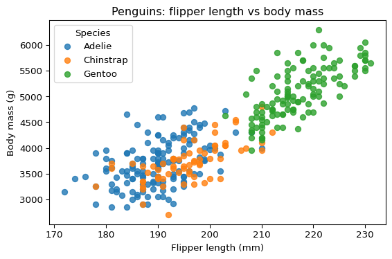
  • Mark: point.
  • Channels:
    • \(x\)-position = flipper_length_mm (quantitative).
    • \(y\)-position = body_mass_g (quantitative).
    • colour = species (nominal).
  • Scales: linear for \(x\) and \(y\); categorical for colour.

Reading the chart:

  • Heavier penguins have longer flippers on average.
  • Within a species, vertical spread ≈ uncertainty in predicted body mass at a given flipper length.

Worked Example 2 – Tiny Gapminder

Question and stakes

A global health NGO wants to prioritise where to invest vaccination funding.

Which countries combine low income, low life expectancy, and large population?

We build a mini version of the Gapminder “health vs income” chart.

Data

Code
import io
gapminder_csv = """country,region,income_per_capita_usd,life_expectancy_years,pop_millions
Norway,Europe,82000,82.3,5.3
Canada,North America,46000,81.9,38.0
Brazil,Latin America,15000,75.0,212.0
India,Asia,6500,69.4,1380.0
Nigeria,Africa,5500,55.2,206.0
Bangladesh,Asia,4800,72.6,163.0
Ethiopia,Africa,2800,66.2,115.0
Vietnam,Asia,7000,75.4,97.3
"""

gap = pd.read_csv(io.StringIO(gapminder_csv))
gap
country region income_per_capita_usd life_expectancy_years pop_millions
0 Norway Europe 82000 82.3 5.3
1 Canada North America 46000 81.9 38.0
2 Brazil Latin America 15000 75.0 212.0
3 India Asia 6500 69.4 1380.0
4 Nigeria Africa 5500 55.2 206.0
5 Bangladesh Asia 4800 72.6 163.0
6 Ethiopia Africa 2800 66.2 115.0
7 Vietnam Asia 7000 75.4 97.3

Bubble chart

Code
fig, ax = plt.subplots(figsize=(6.5, 4.5))

region_colors = {
    "Europe": "tab:blue",
    "North America": "tab:orange",
    "Latin America": "tab:green",
    "Asia": "tab:red",
    "Africa": "tab:purple",
}

sizes = gap["pop_millions"] / 5  # scale for visibility

for idx, row in gap.iterrows():
    ax.scatter(
        row["income_per_capita_usd"],
        row["life_expectancy_years"],
        s=sizes.loc[idx],
        color=region_colors[row["region"]],
        alpha=0.7,
        edgecolor="k",
        linewidth=0.5,
    )

ax.set_xscale("log")
ax.set_xlabel("Income per capita (USD, log scale)")
ax.set_ylabel("Life expectancy at birth (years)")
ax.set_title("Toy health vs income (Gapminder-style)")

for region, color in region_colors.items():
    ax.scatter([], [], color=color, label=region)
ax.legend(title="Region", bbox_to_anchor=(1.05, 1), loc="upper left")

plt.tight_layout()
plt.show()
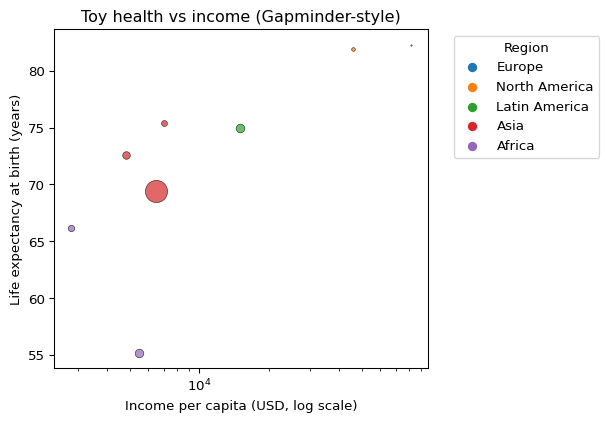
  • Marks: points (bubbles).
  • Channels:
    • \(x\)-position: income (quantitative, log).
    • \(y\)-position: life expectancy (quantitative).
    • size (area): population (quantitative).
    • colour: region (nominal).
  • Task: spot low-income, low-life-expectancy, high-population countries.

How this supports decisions:

  • Helps screen for where to look more closely.
  • Does not by itself prove which interventions are best; that needs more data (costs, infrastructure, uncertainty).

Evaluation & ethics

Chart as hypothesis

Treat each chart as a claim:

“Shown this way, people will correctly answer this question.”

Simple evaluation:

  • Ask a few people to answer a specific question from the chart.
  • Measure:
    • Were they correct?
    • How long did it take?
  • If they struggle, experiment with:
    • different chart types,
    • simpler encodings,
    • clearer guides (labels, legends, titles).

Ethics

  • Aggregation can hide important differences (e.g., overall income vs neighbourhoods).
  • Location-heavy charts (maps, detailed scatters) can accidentally reveal individuals.
  • Design choices (what you highlight, axis limits, colour scales) affect who is heard.

Ask yourself:

If someone took this chart seriously and acted on it, who could be helped or harmed?

Case Study: Strava Heat Map

  • Background: Strava (🏃) released a global activity heatmap (2018), visualizing 3 trillion GPS data points from runners & cyclists, intended as feature.
  • The Problem ⚠️: Heatmap unintentionally exposed sensitive military locations (🔗BBC, 🔗Guardian).
  • Lesson 📚: Aggregate ≠ anonymous when context-sensitive data is involved.
    • Even when individual identities are hidden, patterns can endanger groups (e.g., soldiers, aid workers).


Summary & quick check

Key takeaways

  • Visualizations are built from visual variables organised into a small grammar.
  • Start from the task (comparison, trend, distribution, relationship, part-to-whole, flow), then choose chart type.
  • For precise comparisons, prefer position and length.
  • Use marks + channels + scales vocabulary to design and critique charts.
  • Treat each viz as a testable hypothesis about how people will read your data.

Quick-check

Try these before moving on (answers below in comments).

  1. You need to compare average commute times for 6 cities. Best default?
      1. 3D pie chart
      1. Vertical bar chart, shared baseline
      1. Bubble cloud with random x-position
  2. You want to show the distribution of bill length in penguins. Name a reasonable chart type and its main channel(s).
  3. For showing flows in and out of a budget, which mark is most natural?
  4. True/False: A pie chart can be acceptable for part-to-whole if there are at most 3–4 slices and labels are clear.

References

Amar, Robert, James Eagan, and John T. Stasko. 2005. “Low-Level Components of Analytic Activity in Information Visualization.” In Proceedings of the IEEE Symposium on Information Visualization (InfoVis 2005), 111–17. IEEE. https://doi.org/10.1109/INFOVIS.2005.24.
Anscombe, F. J. 1973. “Graphs in Statistical Analysis.” The American Statistician 27 (1): 17–21.
Bertin, Jacques. 1983. Semiology of Graphics: Diagrams, Networks, Maps. Madison, WI: University of Wisconsin Press.
Horst, Allison Marie, Alison Presmanes Hill, and Kristen B. Gorman. 2020. Palmerpenguins: Palmer Archipelago (Antarctica) Penguin Data. https://doi.org/10.5281/zenodo.3960218.
Mackinlay, Jock D. 1986. “Automating the Design of Graphical Presentations of Relational Information.” ACM Transactions on Graphics 5 (2): 110–41. https://doi.org/10.1145/22949.22950.
Matejka, Justin, and George Fitzmaurice. 2017. “Same Stats, Different Graphs: Generating Datasets with Varied Appearance and Identical Statistics Through Simulated Annealing.” In Proceedings of the 2017 CHI Conference on Human Factors in Computing Systems, 1290–94. CHI ’17. New York, NY, USA: Association for Computing Machinery. https://doi.org/10.1145/3025453.3025912.
Munzner, Tamara. 2009. “A Nested Model for Visualization Design and Validation.” IEEE Transactions on Visualization and Computer Graphics 15 (6): 921–28. https://doi.org/10.1109/TVCG.2009.111.
———. 2014. Visualization Analysis and Design. AK Peters Visualization Series. Boca Raton, FL: CRC Press.
Roth, Robert E. 2017. “Visual Variables.” Edited by Douglas Richardson et al. International Encyclopedia of Geography: People, the Earth, Environment and Technology. https://doi.org/10.1002/9781118786352.wbieg0761.
Tayo, Benjamin Obi. 2020. “How to Evaluate a Data Visualization.” Towards AI (Medium article). https://pub.towardsai.net/how-to-evaluate-a-data-visualization-e04f75e5ae78.
Wilkinson, Leland. 2005. The Grammar of Graphics. 2nd ed. New York, NY: Springer.