M22 - Descriptive statistics & distributions

CSCI 1109 — Practical Data Science

Frank Rudzicz

Assumptions

  • You are:
    • Comfortable with basic Python, pandas, and simple plotting (Matplotlib via earlier modules).
    • Comfortable with high-school algebra, basic functions, and with averages and percentages.

Learning outcomes

By the end of this module, you will be able to:

  • Explain in plain language what a distribution is and why it matters.
  • Compute and interpret mean, median, variance, standard deviation, and IQR in Python.
  • Read and critique histograms and boxplots for shape, spread, and tail risk.
  • Explain simple conditional probabilities, including in Bayes’ rule.
  • Choose a summary / metric that matches a real decision and its costs of error.

A motivating question

Two instructors each report an “average” exam score of 70%.
Are their classes equally doing “about 70%”?

  • Class A scores (out of 100):
    69, 70, 71, 68, 72, 70, 69, 71
  • Class B scores:
    20, 30, 40, 100, 100, 100, 100, 100

Both have mean ≈ 70, but clearly the situations are very different.

Key message:
> A single number almost never tells the whole story.
> We need tools to describe distributions.

Key definitions

  • Distribution (n.)
    A description of how likely (or how often) different values or ranges of values occur.

  • Statistic (n.)
    A quantity computed from sample data (usually a single number) that summarizes some feature of that sample.
    Examples: mean, median, variance, IQR, 90th percentile.

  • Location (centre) (n.)
    A statistic that describes where the bulk of the distribution sits on the number line
    (e.g., mean, median).

  • Spread (variability) (n.)
    How dispersed the values are around their centre
    (e.g., variance, standard deviation, interquartile range).

  • Outlier (n.)
    An observation that is unusually far from most of the data.

  • Shape (n.)
    The overall form of the distribution: symmetry vs skewness, how many peaks it has, and how heavy its tails are
    (e.g., symmetric / skewed / long-tailed / multimodal).

We’ll build each with a tiny example, and with 🐍 Python.

Lemme just import some modules for the rest of this deck right quick.

Code
import numpy as np
import pandas as pd
import matplotlib.pyplot as plt

import plotly.graph_objects as go
import plotly.express as px

plt.rcParams["figure.figsize"] = (6, 4)
np.random.seed(22)

🔎 Math lens: mean (average)

Intuition: if we shared the total equally, how much does each person get?

\[ \bar{x} = \frac{1}{n} \sum_{i=1}^n x_i \]

Tiny example:

Code
xs = np.array([20, 22, 26])
xs.mean()
np.float64(22.666666666666668)
  • Total = 68
  • Shared across \(n=3\) → 22.67

🔎 Math lens: median (robust centre)

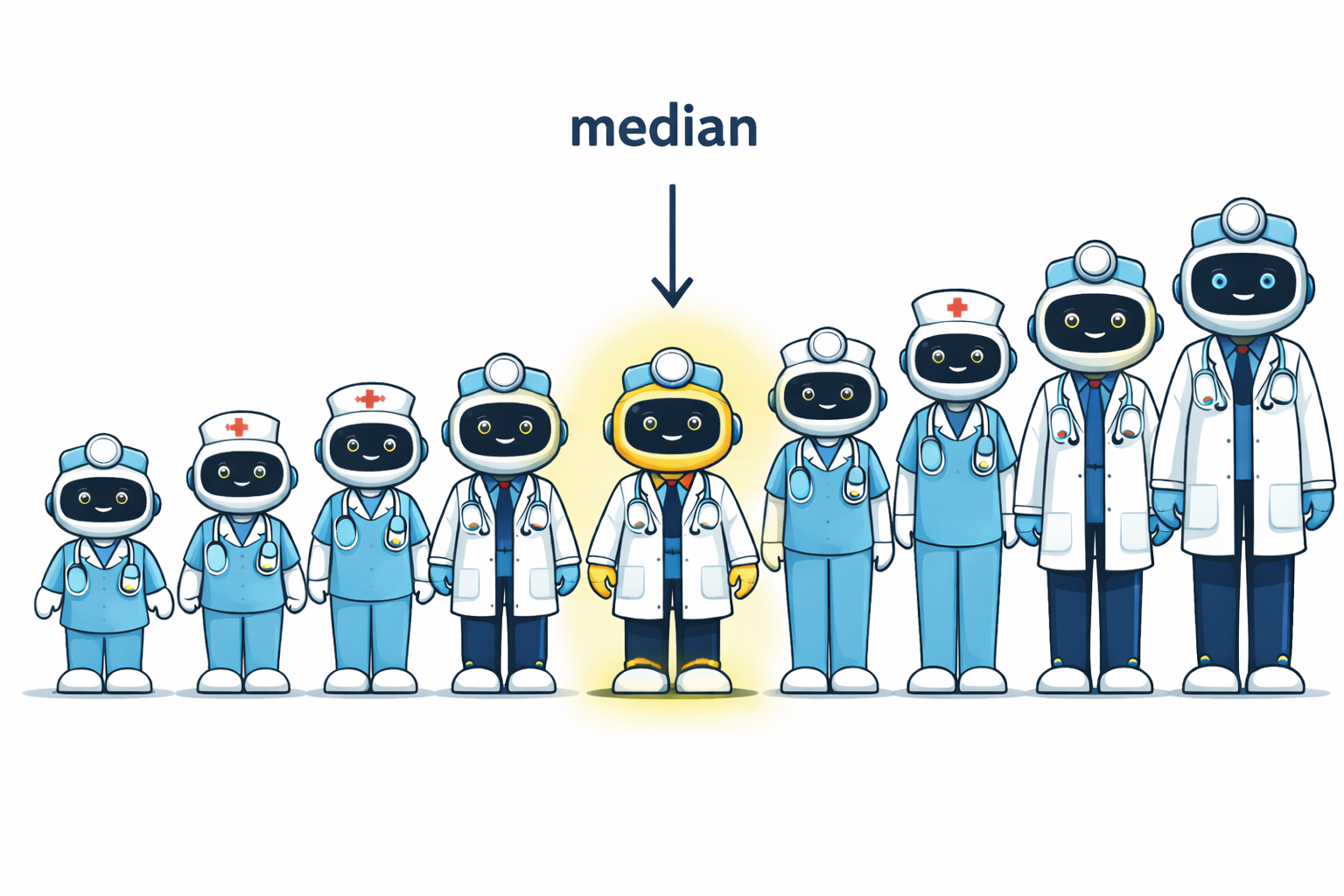
Intuition: line everyone up from smallest to largest; the middle person is the median.

  • Median cares about order, not extreme distances.
  • So it is robust to outliers.

Code
xs = np.array([20, 22, 26])
ys = np.array([20, 22, 100])

print("xs mean:", xs.mean(), ". median: ", np.median(xs))
print("ys mean:", ys.mean(), ". median: ", np.median(ys))
xs mean: 22.666666666666668 . median:  22.0
ys mean: 47.333333333333336 . median:  22.0

Mean jumps when 26→100.
Median stays at 22.

🔎 Math lens: variance & standard deviation

Intuition: typical squared distance from the mean.

\[ \mathrm{Var}(X) = \sigma^2(X) = \frac{1}{n}\sum_{i=1}^n (x_i - \bar{x})^2 \]

\[ \mathrm{sd}(X) = \sigma(X) = \sqrt{\mathrm{Var}(X)} \]

Same mean, different spread.

Code
a = np.array([15, 20, 25])
b = np.array([5, 20, 35])

print("a mean:", a.mean(), "s.d.: ", a.std())
print("b mean:", b.mean(), "s.d.: ", b.std())
a mean: 20.0 s.d.:  4.08248290463863
b mean: 20.0 s.d.:  12.24744871391589

Both means = 20, but b is more spread out.

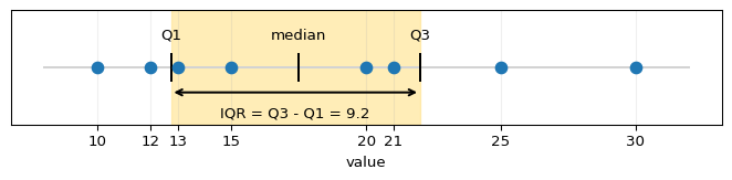
🔎 Math lens: quantiles & IQR

Quantiles: split sorted data into parts containing specified proportions of the data. E.g.,

  • the 25th percentile (quartile 1 = Q1) is the value at or below which about 25% of the observations fall;
  • the 50th percentile is the median;
  • the 75th percentile (quartile 3 = Q3) has about 75% of observations at or below it.

The inter-quartile range (IQR) is: \[ \mathrm{IQR} = Q_3 - Q_1 \]

Intuition: the width of the middle 50% of data.

Code
xs = np.array([10, 12, 13, 15, 20, 21, 25, 30])
q1 = np.quantile(xs, 0.25)
q3 = np.quantile(xs, 0.75)
iqr = q3 - q1
q1, q3, iqr
(np.float64(12.75), np.float64(22.0), np.float64(9.25))

IQR ignores the extreme tails → good for a robust spread.

Code
import numpy as np
import matplotlib.pyplot as plt

# Toy data: sorted so students can see positions
xs = np.array([10, 12, 13, 15, 20, 21, 25, 30], dtype=float)
q1 = np.quantile(xs, 0.25)
q2 = np.quantile(xs, 0.50)
q3 = np.quantile(xs, 0.75)
iqr = q3 - q1

fig, ax = plt.subplots(figsize=(7, 1.8))

# Number line
ax.hlines(0, xs.min()-2, xs.max()+2, colors="lightgray")

# All data points
ax.scatter(xs, np.zeros_like(xs), s=60, zorder=3)

# Shade middle 50%
ax.axvspan(q1, q3, color="#ffe699", alpha=0.7, zorder=1)

# Vertical lines at Q1, median, Q3
for x, label in [(q1, "Q1"), (q2, "median"), (q3, "Q3")]:
    ax.vlines(x, -0.2, 0.2, colors="black", linestyles="solid")
    ax.text(x, 0.35, label, ha="center", va="bottom", fontsize=10)

# IQR bracket and label
ax.annotate(
    "",
    xy=(q1, -0.35),
    xytext=(q3, -0.35),
    arrowprops=dict(arrowstyle="<->", linewidth=1.5),
)
ax.text((q1+q3)/2, -0.55, f"IQR = Q3 - Q1 = {iqr:.1f}", ha="center", va="top", fontsize=10)

ax.set_ylim(-0.8, 0.8)
ax.set_yticks([])
ax.set_xlabel("value")
ax.set_xticks(xs)
ax.grid(axis="x", alpha=0.2)

plt.tight_layout()
plt.show()
🏥 “Average wait is 30 minutes…”

“Our average emergency wait time is 30 minutes. We’re doing great.”

Two hospitals have the same reported average wait.
Would you rather go to Hospital A or Hospital B?

We’ll simulate both and see how the same mean can hide very different risks.

Code
def make_hospital_waits(n=500):
    # Hospital A: roughly normal around 30 minutes
    a = np.random.normal(loc=30, scale=7, size=n)
    a = np.clip(a, 5, None)  # no negative waits
    
    # Hospital B: mixture — many quick, some very long waits
    fast = np.random.exponential(scale=10, size=int(0.7 * n)) + 5
    slow = np.random.exponential(scale=40, size=int(0.3 * n)) + 30
    b = np.concatenate([fast, slow])
    
    return pd.DataFrame({
        "wait_min": np.concatenate([a, b]),
        "hospital": ["A"] * len(a) + ["B"] * len(b)
    })

waits = make_hospital_waits()
waits.groupby("hospital")["wait_min"].agg(["mean", "median", "std"]).round(1)
mean median std
hospital
A 30.6 30.4 7.4
B 30.1 17.7 30.0

Same mean, different distributions

Code
fig, axes = plt.subplots(1, 2, figsize=(10, 4), sharey=True)

for ax, name in zip(axes, ["A", "B"]):
    subset = waits[waits["hospital"] == name]["wait_min"]
    ax.hist(subset, bins=25)
    ax.axvline(subset.mean(), linestyle="--", label="mean")
    ax.axvline(subset.median(), linestyle=":", label="median")
    ax.set_title(f"Hospital {name}")
    ax.set_xlabel("wait (min)")
    ax.grid(alpha=0.2)

axes[0].set_ylabel("count")
axes[0].legend()
plt.tight_layout()
plt.show()
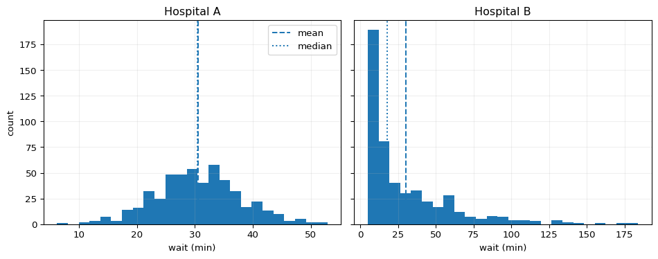
  • 🏥 Hospital A: most patients near 30 minutes.
  • 🏥 Hospital B: many quick visits, but a long tail of patients waiting far longer.

The same average encodes very different patient experiences.

How outliers drag the mean

Use the slider + Play to move one outlier and watch how mean vs median react.

Code
import numpy as np
import plotly.graph_objects as go

# 8 "normal" patients with typical waits
base = np.array([20, 22, 21, 19, 20, 23, 22, 21], dtype=float)

# Outlier values we’ll move through (more steps = smoother animation)
outliers = np.linspace(25, 140, 10)  # 10 smooth steps

frames = []
for i, o in enumerate(outliers):
    x = np.append(base, o)
    mean_val = x.mean()
    median_val = np.median(x)

    frames.append(
        go.Frame(
            name=f"step{i}",
            data=[
                # base patients (blue-ish)
                go.Scatter(
                    x=base,
                    y=[0] * len(base),
                    mode="markers",
                    marker=dict(size=12),
                    name="base patients",
                    hovertemplate="wait=%{x:.1f} min<extra></extra>"
                ),
                # outlier patient (different color)
                go.Scatter(
                    x=[o],
                    y=[0],
                    mode="markers",
                    marker=dict(size=14, symbol="x"),
                    name="outlier",
                    hovertemplate="outlier=%{x:.1f} min<extra></extra>"
                )
            ],
            layout=go.Layout(
                title_text=f"Outlier ❌ at {o:.1f} — mean={mean_val:.1f}, median={median_val:.1f}",
                shapes=[
                    # Mean (dashed line)
                    dict(
                        type="line",
                        x0=mean_val, x1=mean_val,
                        y0=-0.4, y1=0.4,
                        line=dict(dash="dash", width=3)
                    ),
                    # Median (dotted line)
                    dict(
                        type="line",
                        x0=median_val, x1=median_val,
                        y0=-0.4, y1=0.4,
                        line=dict(dash="dot", width=3)
                    )
                ],
                annotations=[
                    dict(
                        x=mean_val, y=0.45,
                        text=f"mean={mean_val:.1f}",
                        showarrow=False,
                        yanchor="bottom"
                    ),
                    dict(
                        x=median_val, y=0.75,
                        text=f"median={median_val:.1f}",
                        showarrow=False,
                        yanchor="bottom"
                    )
                ]
            )
        )
    )

# Initial frame
o0 = outliers[0]
x0 = np.append(base, o0)
mean0 = x0.mean()
med0 = np.median(x0)

fig = go.Figure(
    data=[
        go.Scatter(
            x=base,
            y=[0] * len(base),
            mode="markers",
            marker=dict(size=12),
            name="base patients",
            hovertemplate="wait=%{x:.1f} min<extra></extra>"
        ),
        go.Scatter(
            x=[o0],
            y=[0],
            mode="markers",
            marker=dict(size=14, symbol="x"),
            name="outlier",
            hovertemplate="outlier=%{x:.1f} min<extra></extra>"
        )
    ],
    frames=frames
)

fig.update_layout(
    title_text=f"Outlier ❌ at {o0:.1f} — mean={mean0:.1f}, median={med0:.1f}",
    xaxis_title="wait time (minutes)",
    yaxis_title="",
    yaxis=dict(showticklabels=False, range=[-1, 1]),
    xaxis=dict(range=[15, 150]),
    showlegend=False,
    shapes=[
        dict(
            type="line",
            x0=mean0, x1=mean0,
            y0=-0.4, y1=0.4,
            line=dict(dash="dash", width=3)
        ),
        dict(
            type="line",
            x0=med0, x1=med0,
            y0=-0.4, y1=0.4,
            line=dict(dash="dot", width=3)
        )
    ],
    annotations=[
        dict(
            x=mean0, y=0.45,
            text=f"mean={mean0:.1f}",
            showarrow=False,
            yanchor="bottom"
        ),
        dict(
            x=med0, y=0.75,
            text=f"median={med0:.1f}",
            showarrow=False,
            yanchor="bottom"
        )
    ],
    updatemenus=[{
        "type": "buttons",
        "x": 1.08,
        "y": 0.55,
        "buttons": [
            {
                "label": "Play",
                "method": "animate",
                "args": [
                    None,
                    {
                        "frame": {"duration": 400, "redraw": True},
                        "fromcurrent": True,
                        "transition": {"duration": 200, "easing": "cubic-in-out"}
                    }
                ]
            },
            {
                "label": "Pause",
                "method": "animate",
                "args": [
                    [None],
                    {
                        "frame": {"duration": 0, "redraw": False},
                        "mode": "immediate"
                    }
                ]
            }
        ]
    }],
    sliders=[{
        "pad": {"t": 50},
        "currentvalue": {"prefix": "Outlier value: "},
        "steps": [
            {
                "label": f"{o:.0f}",
                "method": "animate",
                "args": [
                    [f"step{i}"],
                    {
                        "frame": {"duration": 0, "redraw": True},
                        "mode": "immediate",
                        "transition": {"duration": 200}
                    }
                ]
            }
            for i, o in enumerate(outliers)
        ]
    }]
)

fig.show()

Watch: the mean jumps as the outlier moves; the median barely changes.

Conceptual scaffold: from data to decisions

flowchart LR
  A["Phenomenon<br/>Health system"] --> B["DGP<br/>(unknown)"]
  B --> C["Sample<br/>wait times"]
  C --> D["Empirical distribution"]
  D --> E["Summaries<br/>mean / median / IQR / tails"]
  E --> F["Decision<br/>thresholds & resources"]

  • DGP — some messy real-world process makes wait times.
  • We only see a sample, with a distribution.
  • We compress the distribution into statistics.
  • Good decisions match those statistics to real costs of error.

Math lens

Probability vs frequency

  • Empirical frequency:
    • “In my waiting room of 1000 patients, 230 left without being seen.”
    • ( = 230/1000 = 0.23).
  • Probability model:
    • “If a new patient entered the waiting room, there is a 23% chance that they might leave without being seen.”

Idea:

  • Data give us sample distributions.
    • Probability gives us a language for what we’d expect if we repeated the process many times.

We’ll use simple rules of probability to reason about events defined on these distributions.

Events and basic rules

An experiment: something with uncertain outcome (e.g., selecting a random student and checking if they passed).

  • Sample space \(S\): all possible outcomes.
  • Event \(A\): a subset of outcomes (e.g., “student earns ≥ 80%”).

Probability rules (for event (A)):

  1. \(0 \le P(A) \le 1\).
  2. \(P(S) = 1\).
  3. If \(A\) and \(B\) are disjoint (mutually exclusive):
    \[ P(A \cup B) = P(A) + P(B). \]

Complement rule: \[ P(A^c) = 1 - P(A). \]

Conditional probability

Idea: We often want the probability of an event A, given that another event B has occurred.

  • Notation: \(P(A \mid B)\) 👉 “probability of A given B”.

  • Definition (when \(P(B) > 0\)):

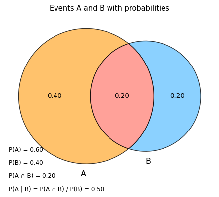
    \[ P(A \mid B) = \frac{P(A \cap B)}{P(B)} \]

  • Read this as: Among the outcomes where B happens, what fraction also have A?

Example

  • \(A\): “student passes the exam”
  • \(B\): “student attended at least 80% of classes”

Then \(P(A \mid B)\) is “the probability a student passes given they attended regularly”.
Unions, intersections, independence
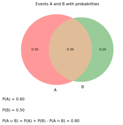
For any events \(\color{red}{A}\) and \(\color{blue}{B}\):

  • Union: \(\color{red}{A} \cup \color{blue}{B}\): “ or (or both)”.
  • Intersection: \(\color{red}{A} \cap \color{blue}{B}\): “ and ”.

General addition rule: \[ \boxed{P(\color{red}{A} \cup \color{blue}{B}) = P(\color{red}{A}) + P(\color{blue}{B}) - P(\color{red}{A} \cap \color{blue}{B}).} \]

Multiplication rule:

  • For any events: \[ P(\color{red}{A} \cap \color{blue}{B}) = P(\color{red}{A}) P(\color{blue}{B} \mid \color{red}{A}) = P(\color{blue}{B}) P(\color{red}{A} \mid \color{blue}{B}) \]

  • If () and () are independent: \[ P(\color{red}{A} \cap \color{blue}{B}) = P(\color{red}{A}) P(\color{blue}{B}). \]

  • This generalizes to more than 2 events, e.g.: \[ P(\color{red}{A} \cap \color{blue}{B} \cap \color{green}{C} \cap \color{purple}{D}) = P(\color{red}{A},\color{blue}{B},\color{green}{C},\color{purple}{D}) = P(\color{red}{A}) P(\color{blue}{B} \mid \color{red}{A}) P(\color{green}{C} \mid \color{red}{A},\color{blue}{B}) P(\color{purple}{D} \mid \color{red}{A},\color{blue}{B},\color{green}{C}) \]

Unions, intersections, independence

❌ Anti-example: confusing conditional probabilities

Common mistake:

  • \(P( \text{has disease} \mid \text{test positive})\) vs
  • \(P( \text{tests positive} \mid \text{has disease})\).

These are usually not the same.

In data:

  • We might know “90% of people with the disease test positive” (sensitivity).
  • But if the disease is rare, the probability someone has the disease given a positive test can still be low.

Warning

Be careful about the direction of conditioning:
\(P(A\mid B) \neq P(B\mid A)\) in general.

Same mean, different distributions

We construct three distributions that all have similar means:

  • Nearly normal
  • Right-skewed (many small counts, few big counts)
  • Bimodal (two peaks)
Code
n = 500

normal = np.random.normal(30, 6, n)
skewed = np.random.exponential(scale=15, size=n) + 20
bimodal = np.concatenate([
    np.random.normal(20, 3, n // 2),
    np.random.normal(40, 3, n // 2)
])

dist_df = pd.DataFrame({
    "value": np.concatenate([normal, skewed, bimodal]),
    "type": (["normal"] * n +
             ["skewed"] * n +
             ["bimodal"] * n)
})

dist_df.groupby("type")["value"].agg(["mean", "median"]).round(1)
mean median
type
bimodal 29.9 30.4
normal 29.8 29.6
skewed 32.8 28.6
Code
fig = px.histogram(
    dist_df,
    x="value",
    facet_col="type",
    nbins=40,
    opacity=0.8
)
fig.update_layout(title="Same-ish mean, very different shapes")
fig.for_each_xaxis(lambda a: a.update(title="value"))
fig.for_each_yaxis(lambda a: a.update(title="count"))
fig.show()

Warning

If all I told you was the mean, you’d have no idea whether you’re in a calm or a horror-movie distribution, or something else entirely.

Boxplots: compact comparison

Let’s summarize the data visually.

Code
fig = px.box(
    dist_df,
    x="type",
    y="value",
    points="all",
    title="Boxplots for our three distributions"
)
fig.update_layout(yaxis_title="value")
fig.show()
  • Boxes: Q1–Q3.
  • Line: median.
  • Whiskers & dots: extremes.

Great for comparing groups, but they hide detailed shape.

Bayes’ rule & conditional thinking (stretch)

Bayes’ rule: algebra and picture

  • We often know:
    • prior beliefs like \(P(X)\),
    • how likely data are under a hypothesis, like \(P(Y \mid X)\).
  • Bayes’ rule lets us flip the conditioning:

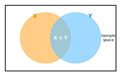
\[ P(X \mid Y) = \frac{P(X, Y)}{P(Y)} = \frac{P(X)\,P(Y \mid X)}{P(Y)}. \]

  • This is the core tool for going from model → data to data → updated belief.
Bayes’ rule: a campus story

You meet a shy, nerdy student on campus. You’re trying to guess their program:

  • \(C\): “they are a CS PhD student
  • \(M\): “they are an MBA student
  • Evidence \(S\): “they seem shy and nerdy

Suppose:

  • Among CS PhD students, about 80% are shy:
    • \(P(S \mid C) = 0.8\)
  • Among MBA students, about 20% are shy:
    • \(P(S \mid M) = 0.2\)
  • On campus, MBA students outnumber CS PhDs by 9:1:
    • \(P(C) = 0.1, \quad P(M) = 0.9\)

✏️ Are they in CS?

Think of a recent warning, in these slides

Bayes’ rule: doing the numbers

We have \(P(\color{red}{S} \mid \cdot)\). We actually want \(P(\color{orange}{C} \mid \color{red}{S})\) and \(P(\color{blue}{M} \mid \color{red}{S})\).

Using Bayes:

\[ P(\color{orange}{C} \mid \color{red}{S}) = \frac{P(\color{orange}{C})\,P(\color{red}{S} \mid \color{orange}{C})}{P(\color{red}{S})}, \qquad P(\color{blue}{M} \mid \color{red}{S}) = \frac{P(\color{blue}{M})\,P(\color{red}{S} \mid \color{blue}{M})}{P(\color{red}{S})}. \]

We can work with proportionality:

\[ P(\color{orange}{C} \mid \color{red}{S}) \propto P(\color{orange}{C}) P(\color{red}{S} \mid \color{orange}{C}) = 0.1 \times 0.8 = 0.08, \] \[ P(\color{blue}{M} \mid \color{red}{S}) \propto P(\color{blue}{M}) P(\color{red}{S} \mid \color{blue}{M}) = 0.9 \times 0.2 = 0.18. \]

Normalizing:

\[ P(\color{orange}{C} \mid \color{red}{S}) = \frac{0.08}{0.08 + 0.18} \approx 0.31, \quad P(\color{blue}{M} \mid \color{red}{S}) = \frac{0.18}{0.08 + 0.18} \approx 0.69. \]
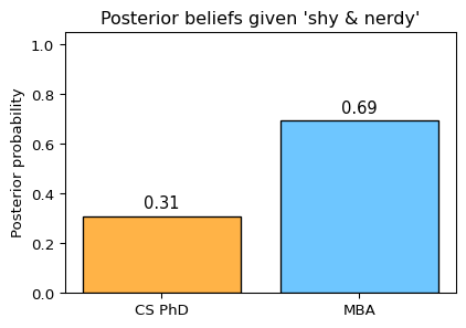
Even though shyness is more common among CS PhDs than MBAs,
the person you met is still more likely to be an MBA — because there are so many more MBAs overall.

Bayes’ rule intuition 1:
Remember your priors

Key lesson from the campus story:

  1. Base rates matter.
    • If you ignore \(P(C)\) and \(P(M)\), you’ll over-trust how “typical” the person looks.
  2. Likelihood vs prior.
    • \(P(S \mid C)\) and \(P(S \mid M)\) describe how the evidence behaves under each hypothesis.
    • \(P(C)\) and \(P(M)\) describe how common each hypothesis is before we look at the evidence.
  3. Bayes’ rule combines them:
    • Posterior ∝ Prior × Likelihood

Bayes’ rule intuition 2:
Updating beliefs

🔄 Bayesian thinking encourages a loop:

  1. Start with a prior belief (e.g., “CS PhDs are usually shy”).
  2. Collect real data (e.g., how shy students actually are in your classes).
  3. Use Bayes’ rule (or its spirit) to update your beliefs.
  4. Repeat over time.

🙅🏽 Pitfalls to avoid:

  • Confirmation bias:
    • Only noticing data that fit your existing story.
    • Dismissing data that contradict it as “noise” or “exceptions”.
  • Frozen priors:
    • Treating your prior as “the truth” instead of a starting point.

🤔 Good Bayesian-style habits for data science:

  • Write down what you expect before looking at the data.
  • Actually consider surprising data – don’t ignore it because it’s “weird”

Bayesians vs frequentists (very brief)

Two complementary views of probability:

Frequentist view

  • Probability = long-run frequency in repeated trials.
  • A parameter (like a true mean or true \(p\)) is fixed but unknown.
  • Statements like “95% confidence interval” are about the procedure:
    • “If we repeated this many times, 95% of such intervals would contain the true value.”

👍🪙

“If I flipped this coin many times, what fraction of flips would be heads?”

Bayesian view

  • Probability = degree of belief (given what you know).
  • Parameters themselves can be treated as random variables.
  • You start with a prior, see data, and get a posterior.

👍🪙

“Given what I’ve seen so far, how strongly should I believe this coin is fair?”

Note

For practical data science, it’s useful to:

  • Understand both interpretations,
  • Recognize when a Bayesian-style “update your belief” story aligns better with how people and systems actually behave.

Worked examples

Worked example 1 — Daily step counts (health app)

Imagine a ⌚️ health app choosing who gets a “low-activity nudge”.

Code
def make_steps_data(n=600):
    active = np.random.normal(loc=9500, scale=1200, size=int(0.7*n))
    low = np.random.normal(loc=4000, scale=900, size=int(0.3*n))
    steps = np.concatenate([active, low])
    ages = np.random.randint(18, 75, size=len(steps))
    device = np.random.choice(["phone", "watch"], size=len(steps), p=[0.6, 0.4])
    return pd.DataFrame({"steps": steps, "age": ages, "device": device})

steps_df = make_steps_data()
steps_df.head()
steps age device
0 11293.309589 45 phone
1 9708.973118 51 watch
2 11291.090549 63 watch
3 10431.845714 44 phone
4 7768.140309 22 phone

Steps: summary table

Code
summary_steps = steps_df["steps"].describe(
    percentiles=[0.1, 0.2, 0.5, 0.8, 0.9]
).round(0)
summary_steps.to_frame().T
count mean std min 10% 20% 50% 80% 90% max
steps 600.0 7843.0 2779.0 1255.0 3637.0 4431.0 8695.0 10288.0 10870.0 12801.0
  • Mean near the “10k steps” target.
  • 10th–20th percentiles show a non-trivial low-activity group.

Steps distribution

Code
fig = px.histogram(
    steps_df,
    x="steps",
    nbins=40,
    marginal="box",
    title="Daily steps — are we really all this active?"
)
fig.update_layout(xaxis_title="steps per day", yaxis_title="count")
fig.show()
  • The left tail = people who might never hit 6k steps.
  • Boxplot shows asymmetry clearly. ✏️ Are there outliers?

Decision & metric for steps

Decision: “Flag users who might benefit from a nudge.”

  • Metric: bottom-20% threshold on steps.
  • Rationale: missing a truly low-activity user (false negative) is worse than nudging a moderately active one (false positive).
Code
threshold = steps_df["steps"].quantile(0.2)
prop_flagged = (steps_df["steps"] <= threshold).mean()
threshold.round(0), round(prop_flagged, 2)
(np.float64(4431.0), np.float64(0.2))

✏️ Consider

Does this percentage feel too big? Too small? What would you tune?

Worked example 2 — ER wait times & fairness

Now back to our hospitals. Suppose a regulator asks:

“Are long waits distributed fairly, or do some groups consistently wait longer?”

We add a simple neighbourhood label indicating where each patient lives.

Code
def add_neighbourhood(df):
    neighbourhoods = np.random.choice(["A", "B", "C"], size=len(df))
    out = df.copy()
    out["neighbourhood"] = neighbourhoods

    # Mild structural unfairness: in Hospital B, neighbourhood C
    # gets extra long-wait noise (but only for a fraction of visits).
    mask = (out["hospital"] == "B") & (out["neighbourhood"] == "C")
    extra = np.random.exponential(scale=20, size=mask.sum())
    # maybe only add to, say, half the rows under that mask
    half = mask.sum() // 2
    idx = out[mask].sample(half, random_state=22).index
    out.loc[idx, "wait_min"] += extra[:half]

    return out

er_df = add_neighbourhood(waits)
er_df.head()
wait_min hospital neighbourhood
0 29.356351 A A
1 19.756545 A A
2 37.572542 A C
3 28.324724 A B
4 26.562096 A A

Grouped summaries

Code
group_summary = (
    er_df
    .groupby(["hospital", "neighbourhood"])["wait_min"]
    .agg(["count", "mean", "median", "std"])
    .round(1)
)
group_summary
count mean median std
hospital neighbourhood
A A 188 30.0 30.1 7.2
B 142 30.9 30.6 6.9
C 170 31.0 30.4 7.9
B A 170 27.3 17.6 26.5
B 177 33.5 19.2 32.8
C 153 37.4 25.0 32.4

👉 Even with similar means, some neighbourhoods show higher medians or variability.

Interactive widget #4 —
Tails by neighbourhood

Code
fig = px.box(
    er_df,
    x="neighbourhood",
    y="wait_min",
    color="hospital",
    points="all",
    title="ER wait times by neighbourhood & hospital"
)
fig.update_layout(yaxis_title="wait (minutes)")
fig.show()

✏️ Consider

  • Which hospital looks more variable overall?
  • Which neighbourhood appears worst off?

Tail-focused metrics for ER waits

For ER waits, harm often lives in the longest waits.

Let’s focus on a measure that is sensitive to longer wait times at, say, the \(90^{th}\) quantile.

Code
p90 = (
    er_df
    .groupby(["hospital", "neighbourhood"])["wait_min"]
    .quantile(0.9)
    .round(1)
    .unstack("hospital")
)
p90
hospital A B
neighbourhood
A 39.5 58.5
B 38.8 80.9
C 41.9 84.9

Example narration:

Important

Even though hospitals A and B report similar average waits, in Hospital B, neighbourhoods B and C has a 90th percentile wait that is much longer. That’s a group living in the tail.

Evaluation aligned to decisions

  • Steps app:
    • 📏 Metric: bottom-20% steps.
    • 😓 Cost rationale: better to send a few extra nudges than miss low-activity people.
  • ER fairness:
    • 📏 Metric: 90th or 95th percentile wait by group.
    • 😓 Cost rationale: long waits are where health harms and complaints are likely.

These metrics are testable: next month’s data can confirm or refute improvement. 🔬 Science! 👩🏻‍🔬

🧐 Ethics & limits

Consider that averages can look healthy even when most people are struggling and a small group is extremely “well off”.

  • A single overall mean can hide:
    • Disadvantaged groups (neighbourhood, age, disability).
    • Dangerous tail risks (“average wait is fine” while some wait hours).
  • Mitigations:
    • Always look at distributions (histograms, boxplots).
    • Stratify when equity matters.
    • Document which metrics you used and why (match real stakes).

Summary

  • A distribution tells the full story; statistics are compressed descriptions.
  • Mean vs median: sensitive vs robust to outliers.
  • Bayes helps us think about how knowledge and uncertainty.
  • Variance, SD, IQR: different ways to talk about spread.
  • Histograms & boxplots: complementary tools for understanding shape & tails.
  • Good practice: choose metrics that match decisions and costs of error, not convenience.

Quick check (distributions & probability)

  1. Mean vs median on skewed data

    You record 5 ER wait times (in hours):

    \[ 0.5,\; 0.7,\; 0.8,\; 0.9,\; 5.0 \]

    1. Compute the mean and median wait.
    2. Which better describes a “typical” wait? Why?
  2. Empirical probability from data

    Last week, 200 ER patients arrived. 26 of them waited more than 4 hours.

    1. Estimate \(P(\text{wait} > 4 \text{ h})\).
    2. If 3 new patients arrive independently, what is the probability none of them waits more than 4 hours?
  3. Using the Venn diagram numbers

    In our Venn example, suppose: \[ P(A) = 0.6,\quad P(B) = 0.4,\quad P(A \cap B) = 0.2. \]

    1. Compute \(P(A \cup B)\).
    2. Compute the conditional probability \(P(A \mid B)\).
  4. Tail risk & equity

    Two hospitals both have mean ER waits of 2.5 h.

    • Hospital 1: 90th percentile wait = 4 h.
    • Hospital 2: 90th percentile wait = 7 h.
    1. Which hospital is doing worse for the worst-off patients?
    2. Which metric (mean vs 90th percentile) tells you that, and why might that matter for equity?