CSCI 1109 — Practical Data Science
pandas (DataFrame, Series, indexing) and simple cleaning (missing values, duplicates).scikit-learn; all scaling/encoding is done with pandas + NumPy.By the end of this module you should be able to:
Data science models do not see the world directly.
They see numbers arranged in space.
These choices are called feature representations.
In practice, feature choices can matter more than the choice of model itself.
You’re helping a small credit union decide which loan applications to flag for manual review.
age (years)monthly_income (CAD)debt_to_income (ratio 0–1)employment_status (categorical: student / part-time / full-time / unemployed)city (Halifax / Truro / Sydney)defaulted (1 if they defaulted on a past loan, else 0)Now: we don’t build the classifier; we shape the data so future models can learn robustly and fairly.
We will focus on four ideas:
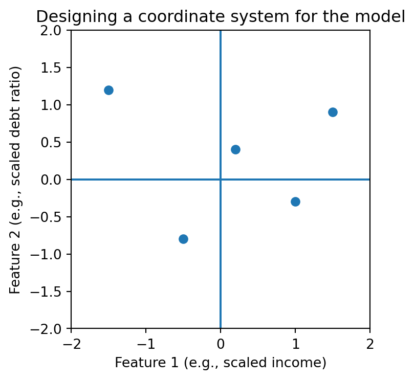
You can think of this as designing a coordinate system in which the model will later make decisions.

flowchart LR
A["Raw data<br/>CSV / JSON"] --> B["Cleaning<br/>(missingness, duplicates)"]
B --> C["Preprocessing<br/>(scaling, encoding, binning)"]
C --> D["Model training<br/>& evaluation"]
D --> E["Decision<br/>(ship, hold out, escalate)"]
Imagine you encode employment_status as:
What’s wrong?
🙂 Better: one-hot encoding (separate 0/1 indicator per category). We’ll implement this later.
Intuition:
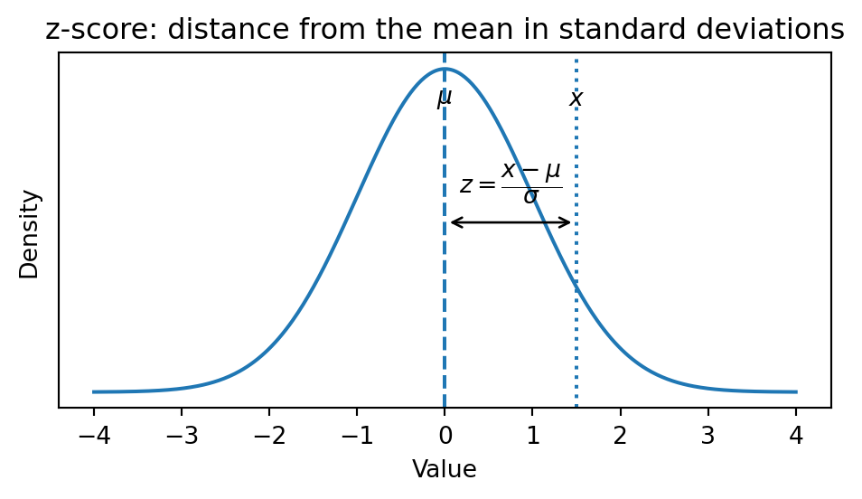
Measure “how many standard deviations away from typical” a value is.
Formal definition for a feature \(x\):
Tiny numeric example (monthly income in $1,000s):
| person | raw income | standardized \(z\) (approx) |
|---|---|---|
| A | 2.0 | -0.7 |
| B | 3.0 | 0.0 |
| C | 4.0 | 0.7 |
🔎 Interpretation: B is “typical”, A is 0.7 standard deviations below typical, C is 0.7 above.
Note
Scaling your data with the z-score is like fitting a Normal curve to your data, then (1) moving it to have 0 mean and (2) stretching it to have standard deviation of 1.
Intuition:
Stretch or compress feature values so the minimum becomes 0 and the maximum becomes 1.
Formula for feature \(x\):
\[ x_i^{(scaled)} = \frac{x_i - x_{\min}}{x_{\max} - x_{\min}} \]
Use cases:
Risk: outliers can make the min–max range huge; consider clipping or robust variants.
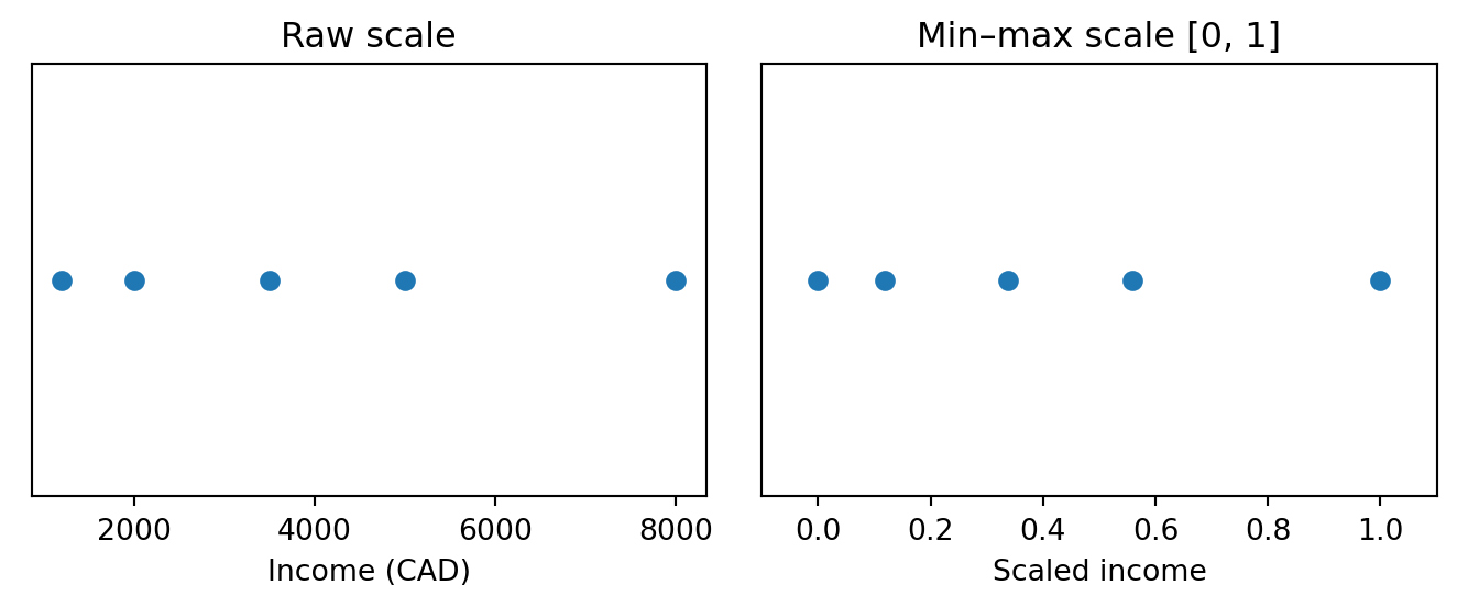
Intuition:
Represent each category as its own yes/no column.
Example: employment_status in {student, part-time, full-time}.
We create:
emp_student (1 if student, else 0)emp_part_timeemp_full_timeFor a part-time worker: \([0, 1, 0]\).
This avoids fake numeric ordering and lets models learn arbitrary patterns across categories.
Suppose you measure something precisely:
Why would you ever:
Why would a data scientist throw away precision?
Before we answer, pause and consider:
In the next section, we’ll see why binning is not a mistake — but a trade-off.
Intuition:
Sometimes, the exact value (e.g., age 41 vs 42) doesn’t matter; a range does (e.g., “middle-aged”).
Example: age → bins
youngmidseniorWe assign each person to a bin, and the model learns separate behaviours for each group.
Risks:
We’ll use a tiny synthetic dataset of past loans.
import pandas as pd
from io import StringIO
csv = """loan_id,age,monthly_income,debt_to_income,defaulted
1,22,1400,0.55,0
2,35,3200,0.40,0
3,41,5100,0.25,0
4,29,2100,0.65,1
5,60,2800,0.70,1
6,50,7200,0.30,0
7,33,2600,0.45,0
8,45,4100,0.80,1
9,27,1900,0.35,0
10,39,3500,0.60,1
"""
df = pd.read_csv(StringIO(csv))
df| loan_id | age | monthly_income | debt_to_income | defaulted | |
|---|---|---|---|---|---|
| 0 | 1 | 22 | 1400 | 0.55 | 0 |
| 1 | 2 | 35 | 3200 | 0.40 | 0 |
| 2 | 3 | 41 | 5100 | 0.25 | 0 |
| 3 | 4 | 29 | 2100 | 0.65 | 1 |
| 4 | 5 | 60 | 2800 | 0.70 | 1 |
| 5 | 6 | 50 | 7200 | 0.30 | 0 |
| 6 | 7 | 33 | 2600 | 0.45 | 0 |
| 7 | 8 | 45 | 4100 | 0.80 | 1 |
| 8 | 9 | 27 | 1900 | 0.35 | 0 |
| 9 | 10 | 39 | 3500 | 0.60 | 1 |
Units:
age: yearsmonthly_income: CADdebt_to_income: ratio in [0, 1]defaulted: 1 if they defaulted (binary outcome)| loan_id | age | monthly_income | debt_to_income | defaulted | |
|---|---|---|---|---|---|
| count | 10.00000 | 10.000000 | 10.000000 | 10.000000 | 10.000000 |
| mean | 5.50000 | 38.100000 | 3390.000000 | 0.505000 | 0.400000 |
| std | 3.02765 | 11.445038 | 1725.913607 | 0.183258 | 0.516398 |
| min | 1.00000 | 22.000000 | 1400.000000 | 0.250000 | 0.000000 |
| 25% | 3.25000 | 30.000000 | 2225.000000 | 0.362500 | 0.000000 |
| 50% | 5.50000 | 37.000000 | 3000.000000 | 0.500000 | 0.000000 |
| 75% | 7.75000 | 44.000000 | 3950.000000 | 0.637500 | 1.000000 |
| max | 10.00000 | 60.000000 | 7200.000000 | 0.800000 | 1.000000 |
Things to notice:
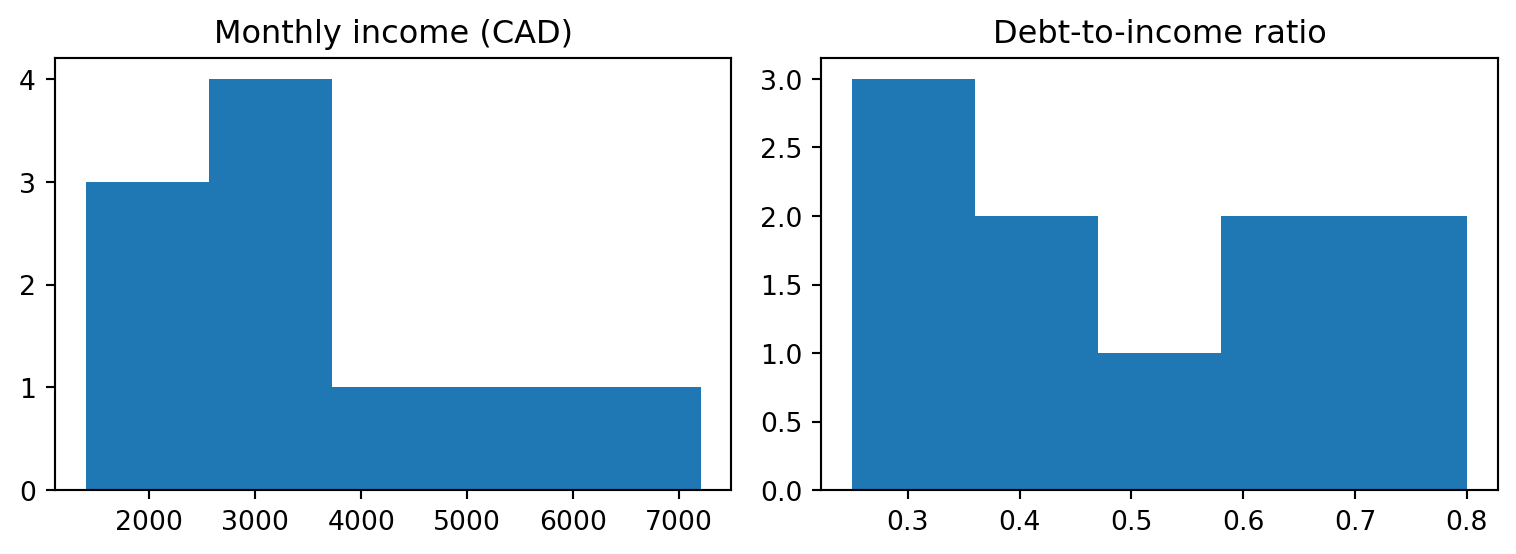
monthly_income is in thousands of dollars; debt_to_income is 0–1.monthly_income vs debt_to_income does not mean the same thing.Let’s visualize:
Pretend rows 1–7 are our training set and 8–10 are a tiny test set.
(age 38.571429
monthly_income 3485.714286
debt_to_income 0.471429
dtype: float64,
age 11.986387
monthly_income 1851.970820
debt_to_income 0.157791
dtype: float64)
Now scale using only training stats:
| age | monthly_income | debt_to_income | |
|---|---|---|---|
| count | 7.000000e+00 | 7.000000e+00 | 7.000000e+00 |
| mean | 1.506731e-16 | -2.379049e-17 | 9.912706e-17 |
| std | 1.080123e+00 | 1.080123e+00 | 1.080123e+00 |
| min | -1.382521e+00 | -1.126213e+00 | -1.403304e+00 |
| 25% | -6.316690e-01 | -6.132463e-01 | -7.695538e-01 |
| 50% | -2.979571e-01 | -3.702619e-01 | -1.358036e-01 |
| 75% | 5.780367e-01 | 3.586912e-01 | 8.148217e-01 |
| max | 1.787742e+00 | 2.005585e+00 | 1.448572e+00 |
Quick sanity checks:
fig, axes = plt.subplots(1, 2, figsize=(9, 3))
axes[0].scatter(train["monthly_income"], train["debt_to_income"])
axes[0].set_xlabel("Monthly income (CAD)")
axes[0].set_ylabel("Debt-to-income")
axes[0].set_title("Raw scale")
axes[1].scatter(train_scaled["monthly_income"], train_scaled["debt_to_income"])
axes[1].set_xlabel("Scaled income")
axes[1].set_ylabel("Scaled debt-to-income")
axes[1].set_title("Standardized scale")
plt.tight_layout()
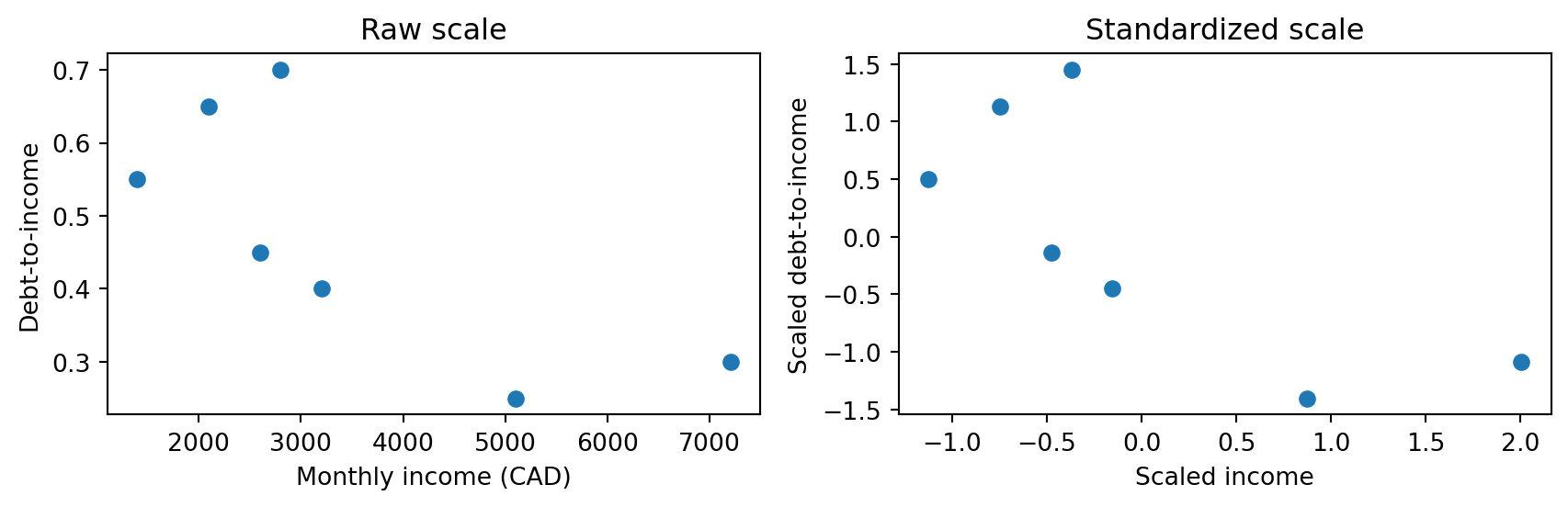
Interpretation:
csv2 = """customer_id,age,employment_status,city,monthly_income,defaulted
101,22,student,Halifax,1400,0
102,35,full-time,Halifax,3200,0
103,41,full-time,Sydney,5100,0
104,29,part-time,Truro,2100,1
105,60,retired,Halifax,2800,1
106,50,full-time,Sydney,7200,0
107,33,part-time,Halifax,2600,0
108,45,unemployed,Truro,4100,1
"""
df_cat = pd.read_csv(StringIO(csv2))
df_cat| customer_id | age | employment_status | city | monthly_income | defaulted | |
|---|---|---|---|---|---|---|
| 0 | 101 | 22 | student | Halifax | 1400 | 0 |
| 1 | 102 | 35 | full-time | Halifax | 3200 | 0 |
| 2 | 103 | 41 | full-time | Sydney | 5100 | 0 |
| 3 | 104 | 29 | part-time | Truro | 2100 | 1 |
| 4 | 105 | 60 | retired | Halifax | 2800 | 1 |
| 5 | 106 | 50 | full-time | Sydney | 7200 | 0 |
| 6 | 107 | 33 | part-time | Halifax | 2600 | 0 |
| 7 | 108 | 45 | unemployed | Truro | 4100 | 1 |
| employment_status | employment_code | |
|---|---|---|
| 0 | student | 0 |
| 1 | full-time | 2 |
| 2 | full-time | 2 |
| 3 | part-time | 1 |
| 4 | retired | 4 |
| 5 | full-time | 2 |
| 6 | part-time | 1 |
| 7 | unemployed | 3 |
Warning
pandasfrom IPython.display import display
df_encoded = pd.get_dummies(
df_cat,
columns=["employment_status", "city"],
prefix=["emp", "city"],
drop_first=False # keep all columns for clarity
)
def _color_blocks(col):
if col.name.startswith("emp_"):
return ["background-color: #e6f2ff"] * len(col) # employment_status
if col.name.startswith("city_"):
return ["background-color: #e8f8e8"] * len(col) # city
return [""] * len(col)
styled = df_encoded.head().style.apply(_color_blocks, axis=0)
display(styled) # <- key bit| customer_id | age | monthly_income | defaulted | emp_full-time | emp_part-time | emp_retired | emp_student | emp_unemployed | city_Halifax | city_Sydney | city_Truro | |
|---|---|---|---|---|---|---|---|---|---|---|---|---|
| 0 | 101 | 22 | 1400 | 0 | 0 | 0 | 0 | 1 | 0 | 1 | 0 | 0 |
| 1 | 102 | 35 | 3200 | 0 | 1 | 0 | 0 | 0 | 0 | 1 | 0 | 0 |
| 2 | 103 | 41 | 5100 | 0 | 1 | 0 | 0 | 0 | 0 | 0 | 1 | 0 |
| 3 | 104 | 29 | 2100 | 1 | 0 | 1 | 0 | 0 | 0 | 0 | 0 | 1 |
| 4 | 105 | 60 | 2800 | 1 | 0 | 0 | 1 | 0 | 0 | 1 | 0 | 0 |
Now each category is its own 0/1 feature, and no fake ordering is introduced.
We’ll bin age into groups and look at default rates.
| age | age_group | defaulted | |
|---|---|---|---|
| 0 | 22 | young | 0 |
| 1 | 35 | mid | 0 |
| 2 | 41 | mid | 0 |
| 3 | 29 | young | 1 |
| 4 | 60 | senior | 1 |
| 5 | 50 | senior | 0 |
| 6 | 33 | mid | 0 |
| 7 | 45 | senior | 1 |
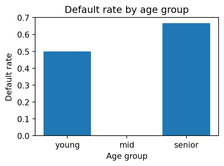
Now compute default rate by age group:
| age_group | default_rate | |
|---|---|---|
| 0 | young | 0.500000 |
| 1 | mid | 0.000000 |
| 2 | senior | 0.666667 |
Plot it:

🤔 Interpretation:
Even at the preprocessing stage, we should think about which metrics will matter later.
🏦 For the credit union scenario:
defaulted = 1): fraction of defaulters we catch.🧹 Preprocessing choices change:
🧑🔬 Example severe test you might run later:
Try these on your own; answers are in the comments below.
monthly_income after seeing which ranges have the highest observed default rate on the test set. Which threat have you introduced?