Web-centric Computing

Some Example Code

Text Buttons made with CSS

Screen Shots with long descriptions

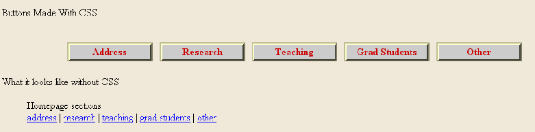
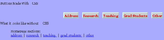
Here are samples of how four common graphical browsers (and two uncommon ones) display the menu. The four common browsers are: Mozilla, Internet Explorer, Opera, and Netscape. The uncommon browsers are Konqueror and WebTV.

After the screenshots are some questions (and possible answers) for you to think about.

Mozilla

the CSS example using Mozilla
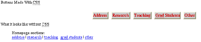
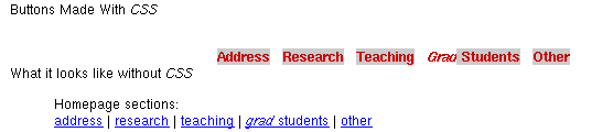
There is a big gap before the buttons. The text is red on a grey background. The buttons have very little space around the words. The top and left edge of the buttons is white and the other edges are purple. There is underling of the abbreviations.


Internet Explorer 5

the CSS example using Internet Explorer
The text in the buttons is centred in lots of space. The text is red on a grey background. The top and left edge of the buttons is yellow and the other edges are black.


Opera 5

the CSS example using Opera
The top and left edge of the buttons is light blue and the other edges are dark blue.


Netscape 4

the CSS example using Netscape version 4
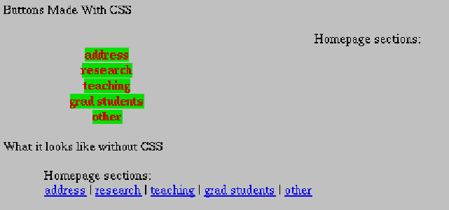
The words Homepage sections are centred in the middle of the screen. Each word of the text that should be in a button is in a vertical list. The text that should be in buttons is in red on a bright green background. There are no borders around the words (to make them appear to be buttons). None of the words that should be in the buttons are capitalized.


Konqueror 2.2.1

the CSS example using Konqueror
There are no edges around the words. The grad in Grad students has no background colour and is in italics. The grad leans right and is cut off by the first letter of Students.


WebTV

the CSS example using WebTV simulator
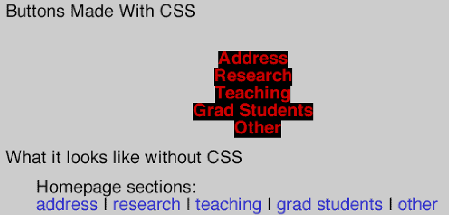
The buttons are shown as red text on black background. The font is very large.

The screen capture is from the WebTV simulator version 2.6 (from the developer.msntv.com website).


For another comparison of how well certain browsers support CSS see Eric Meyer's table (from webreview.com) which was last updated in January 2001.


Questions

Q: Which one of the above is the correct presentation?
A: Netscape 4, Konqueror, and WebTV are very different from what the author intended. Although some of the presentations are more like what the author intended, there is no single correct presentation because on the WWW authors cannot always know what software their webpages will be viewed with.
Q: What can WWW authors do to make their webpages appear more like they intended?
A: In computer science we are often more concerned with the content of the message and not the presentation. We don't want the presentation to be ugly or confusing but we usually care much more about the content. If the format of the presentation is very important then there are a few things we can do, including:
  1. realizing that not everyone will be able to view our content the way we want them too (for instance: people viewing the web on cell phones and non-human search engines) we concentrate on markup that should be presented in a reasonable manner even if the presentation details cannot be rendered.
  2. hope that users of browsers that do mangle CSS will deactivate the CSS use in those browsers.
  3. use CSS (or JavaScript, or both) to inform readers of the Browser Upgrade Campaign of The Web Standards Project with the hope that people will stop using those browsers.

http://www.cs.dal.ca/~jamie/course/CS/4173/examples/CSS/buttons/screens-long.html
Version:
10 October 2002
CS 4173 Prof.:
J. Blustein <jamie@cs.dal.ca>