
seven tricks that Web users don't know |
Web developers have all sorts of browsing tricks that they have gained from years of experience, to the point where they can't even imagine not knowing them -- right-clicking to open a new browser window, for instance, or using the arrow keys to navigate a list. To Web veterans, these things are so familiar that they seem obvious. The fact that many people don't know these tricks -- and can get completely stuck as a result -- comes as a shock. This article describes seven Web site features that typical non-technical users aren't familiar with, based on data collected from the author's own usability studies.
I don't like referring to people as ignorant. It's more appropriate -- and accurate -- to think in terms of specific things that people are ignorant of. Most of the tricks described here are conventions used on many Web sites, while a couple relate to the specific browser or operating system. What these things have in common is that people usually only need to see them once, think "Oh, that's useful," and then use them forever afterward. But until they've seen them once, they have no way of knowing about them.
Focusing on the challenges themselves instead of the people facing them also helps me to come up with potential solutions once I've observed a problem. I've included some suggestions below, but bear in mind that these aren't guarantees for success.
A friend of mine was surprised to learn that a company logo is usually a link to the home page. What's more surprising is that he's run a successful software development business for 20 years -- even experienced geeks don't know all the tricks! And by the way, nowhere is it written that this is a design standard -- it's just a useful convention that many sites have adopted.
When I first noticed that the majority of users (two-thirds in one study -- see "How the data was collected" -- didn't click logo links, simply didn't use them. To find out, I started asking users whether they knew that the logo was a link to the home page. (I'm always careful to ask this kind of question at the end of a usability test, otherwise I could change the very behavior I'm trying to observe.) Sure enough, most of the non-clickers confirmed that they didn't know this trick.
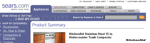
Suggestion: It's fine to use logo links, but incorporate the word "Home," or possibly ".com" (see Figure 1). It sounds painfully obvious, but it really does help -- people know what "Home" means and they do click on logo links when this word is visible. Plus, this approach could teach users to start clicking logos on other sites.
Figure 1. Including "Home" with the logo can help users recognize it as a link to the home page.
To developers, security and privacy are separate concepts -- security
pertains to technical aspects of the site such as encryption and
firewalls, while privacy is about the policies the site has regarding
the use of users information. But in the mind of a
Although the privacy / security confusion sounds like a minor semantics issue, some users will leave a Web site if they can't find the answer to an important question like whether their credit card data is properly safeguarded (and only a small minority of users is aware of the security icon in the browser).
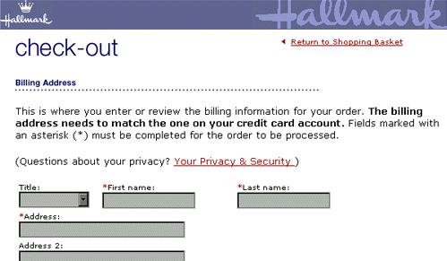
Suggestion: Users who click a link that says "Privacy" may actually have a question about security, or vice versa. Consider providing privacy and security information on the same page (such as in Figure 2), or by using cross-links.
Suggestion: It's O.K. to have a link to the privacy policy at the bottom of your page, but many users don't bother to look there. Consider putting a prominent link on any forms that ask for personal information (see Figure 2). I've seen evidence that this approach encourages users to review the privacy policy right when they need it most.
Figure 2. It's often helpful to place privacy policy links prominently within forms.
People use various terms to describe these menus -- rollover, fly-out, pop-up, hierarchical, or cascading. These are menus that pop up automatically when the user positions the cursor over a particular item onscreen. Whatever you call them, these things can be so difficult to use that they border on evil.
I don't care that prominent software vendors have been using cascading menus for years -- obviously they have forgotten that the shortest distance between two points is a straight line. And that's exactly what users do -- they try to take the diagonal route to their desired menu option rather than across and down. And as soon as they move off the menu, they lose it (or even worse, get an unrelated one). Depending on where the user leaves the cursor after clicking, another menu might pop up, possibly covering part of the page the user wanted.
I recently tested a site that used rollover menus. Of the 17 users who took part, four complained of difficulty using the menus, and one was so stymied that I had to help him. Even users who understood this interaction model sometimes had difficulty selecting the menu options they wanted.
Figure 3 presents an example of a menu that pops up when the cursor is positioned over an item in the left nav bar. A user who tries to move the cursor diagonally to "Mortgages" will lose the menu. And if the user clicks the M in Mortgages, the Demos menu will pop up on top of the Mortgages page.
Suggestion: If you must use rollover menus, at least make them persistent, so that a click on the high-level menu anchors the pop-up menu until the user's next click. I noticed that many users did make that initial click on the menu option, even with the initial version of the design where it had no effect. The developers changed the design to support the way that users had behaved in testing, and although we didn't have the chance to usability test the refined design, even the developers found this approach easier to use. Yes, this approach requires two clicks instead of one, so it's a trade-off: Most users pay a very small price (in terms of effort) to avoid a few users paying a huge one.
Figure 3. An example of a menu that pops up when the cursor is positioned over an item in the nav bar.

This one applies to all software, not just Web sites: The vast majority of users doesn't realize that the arrow keys can be used to navigate a drop-down list. In one study, I watched 39 users fill out order forms, and only one used the arrow keys. Everyone else used the mouse.
If I could put a microphone into the user's subconscious mind, it might pick up the following train of thought: "Type the city, hit the tab key. Oh, wait, it's a drop-down -- I need to use the mouse. Lemme look for it and move my hand off the keyboard to grasp it. Back to the screen ... now I'll click that drop-down arrow and yup, it gives me a list. But I don't see New Hampshire, so I've gotta scroll ... how come I can't just type it in?" (This complaint was often voiced aloud -- by one-third of the users in this study, in fact.)
It took people about as long to perform these actions as it just took you to read about them; this back-and-forth between the keyboard and mouse is quite inefficient. And a few users (I estimate 5-10%) don't even know about the tab key, and use the mouse for all field-to-field navigation -- especially painful to watch!
Suggestion: Avoid mixing drop-down lists with edit fields. Consider grouping edit fields together in forms to minimize the number of mouse-keyboard transitions.
Suggestion: Use an edit field for the state. (For those who believe that a drop-down field eliminates errors, think again. I've seen users select the wrong state because they typed both letters of the abbreviation. More commonly, users enter typos in the city or zip code field. Thus, the state field must always be validated against the city and zip. And as long as you have to validate that state field anyway, you might as well just let the user type it in.)
Only techie people glean information about the structure of a site by examining the words between all those forward slashes. Most users ignore the URL field except for typing in a top-level domain. In testing hundreds of users over a period of several years, I've never seen a non-technical user navigate by modifying the URL. Not once.
(There's no suggestion here; just an interesting factoid that "real people" don't do this -- they use the site's navigation and the "Back" buttons.)
Here's some good news: People do understand how to scroll on Web sites (whether they do or not is another story) and virtually every user understands what the "Back" button is for. Perhaps through serendipity, some users find the drop-down list of previously visited pages and infer its use -- I've seen this happen a couple of times in usability tests. Most users seem to understand the "Forward" button, though that's only of minor benefit because its use is not essential to Web site navigation.
Comprehension of browser controls gets pretty sketchy after that. On several occasions I've seen users click the browser "Home" button when trying to get to a site's home page. Many users can't explain what all the browser buttons do -- in particular the "Stop" and "Refresh" buttons. Users who don't understand these two are especially vulnerable to technical problems, because if the site hangs they don't have any recourse but to close the browser window -- usually after waiting far longer than you or I would -- and try again from the beginning. Some users will simply give up or go to another site instead. (My favorite was the online shopper who said, "I'd take it as a sign that God doesn't want me to buy this." She was joking about the divine intervention part, but was sincere that she would abandon the site.)
Unfortunately, I don't have any ideas for fixing the stop/reload issue, but it's a good reminder that a site's reliability also affects its usability.
I've saved this one for last because it's especially hard to believe -- some people can use Windows applications for years without understanding the concept of task switching. (When I point to the task bar and ask them what it's for, they can't tell me.) Thus, spawning second browser windows can completely throw users off track because it removes the one thing they are sure how to use: the "Back" button.
In one study, a site provided links to related books on Amazon.com, which opened in a second browser window. Using Amazon wasn't relevant to our test, so as soon as the page came up the users tried to back out. One pair of users, upon discovering the grayed-out "Back" button, looked at each other with something akin to horror. They were quite honestly stumped and had no idea how to proceed. After a couple minutes of discussion, they finally closed the second window. In another recent study, six out of 17 users had difficulty with multiple windows, and three of them required assistance to get back to the first window and continue the task.
Suggestion: Avoid spawning multiple browser windows if at all possible -- taking the "Back" button away from users can make their experience so painful that it usually far outweighs whatever benefit you're trying to provide. One common theory in favor of spawning the second window is that it keeps users from leaving your site, but ironically it may have just the opposite effect by preventing them from returning when they want to.
Suggestion: If a second window is necessary, provide an obvious "close" or "back" link and don't provide navigation to other parts of the site; some users will blithely continue their task in the second (often smaller) window, which can lead to further confusion.
It's possible that non-technical users in high-tech areas such as the Silicon Valley may learn these tricks sooner than users in other places. I don't have proof that this geographic effect exists, but I became aware of the possibility when comparing notes with another usability specialist from San Francisco. She'd been conducting usability tests for years, and had never seen some of the problems I've described. We theorized that she was drawing her test participants from a pool of people who had an unusually high probability of learning Web-browsing tricks from tech-savvy friends or family.
Suggestion: If you're located in a high-tech area, it's a good idea to screen out usability test participants who have anything to do with Web site development unless they actually are your target market. And talk to people who are developing and testing sites in other parts of the country (or world) to hear what they're finding.
We've learned all these tricks and more because we're familiar with Web technology from the inside. Simply using the Web every day isn't enough to teach a non-technical user the tricks any more than driving a car every day teaches a person how to diagnose engine trouble. The hope that someday all users will somehow know these tricks is probably not realistic, but proactive designers can improve site usability by removing the need to know each trick. The bottom line is that it's easier to change your site than it is to change the behavior of millions of people you'll never meet!
My definition of a non-technical user is someone who visits Web sites for information and/or shopping but doesn't work in a Web-related profession. The evidence cited in this article comes from several usability studies I conducted in 2000 for various clients. In each study, we recruited users who used the Web regularly for news, research, and shopping. In other words, we were not studying people who were new to the Internet. At the high end, we screened out people who knew a programming language or had created a Web page. Thus, these people can reasonably be described as "non-technical Web site users."
Snyder Consulting * (603) 216-2255 * csnyder at snyderconsulting dot net